Project 01
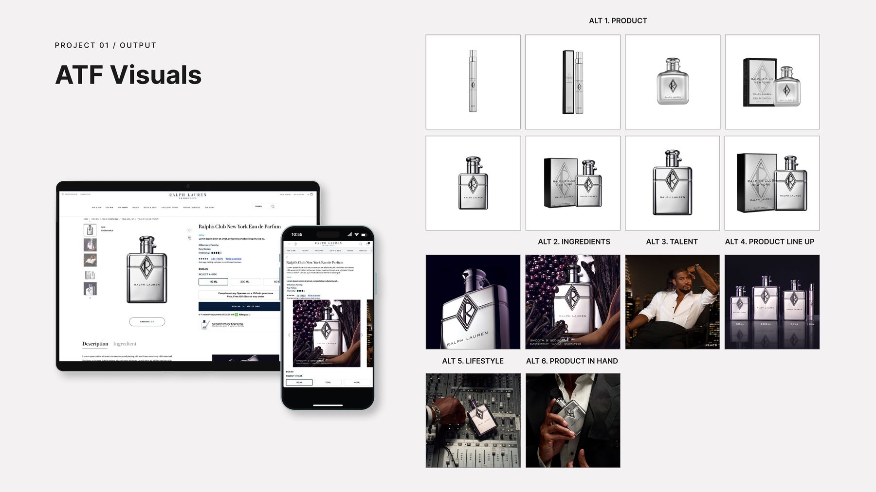
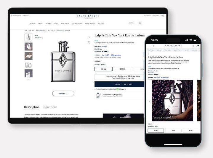
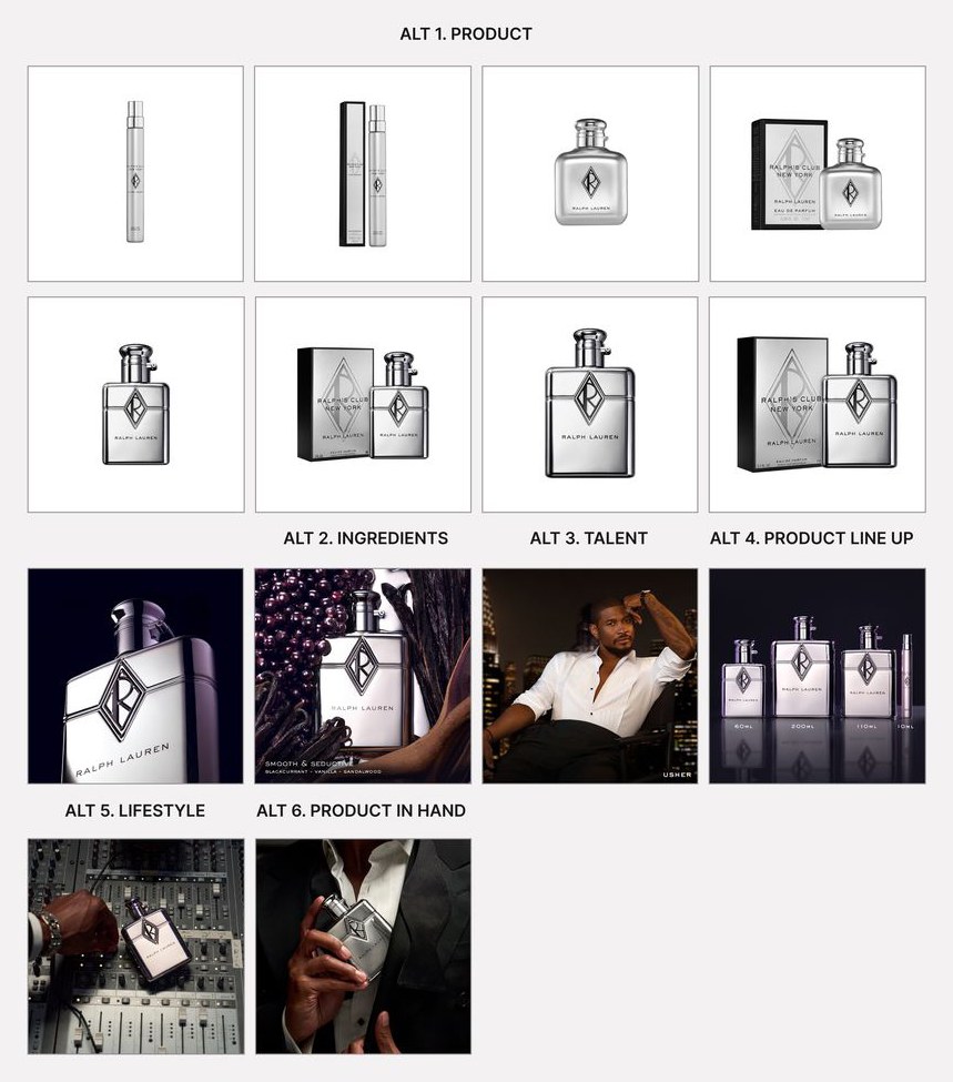
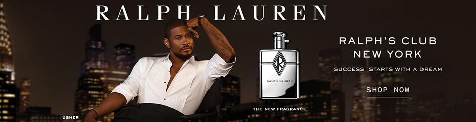
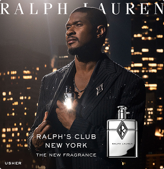
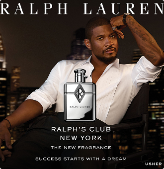
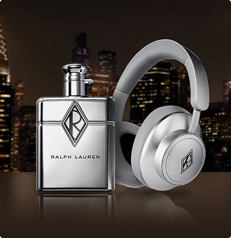
Ralph's Club NY Launch
Ralph Lauren · 2025 · Digital & E-Commerce

Art director with 10+ years in beauty, fragrance, and luxury — currently on Ralph Lauren Fragrance at L’Oréal Luxe, designing promotional packaging and leading go-to-market creative across DTC, Amazon, CRM, and social. I take work from brief to final file, and I’ve built AI into production itself: hero imagery for launches with no shoot budget, and workflows that halve production timelines. Before that, at KISS, I designed packaging for lash and nail lines that held #1 category rank at Walmart, Walgreens, and Ulta. The vision is fixed. The method isn’t.
Ralph Lauren · 2025 · Digital & E-Commerce
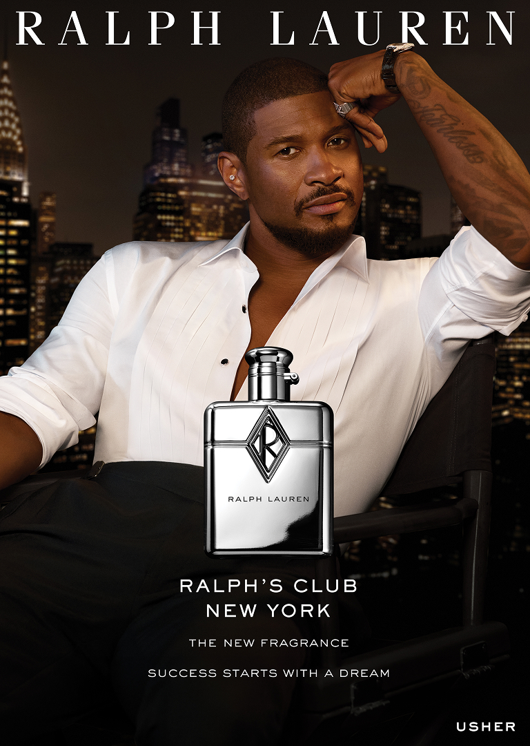
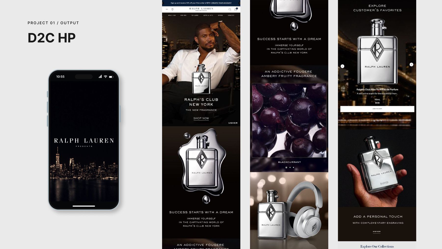
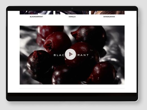
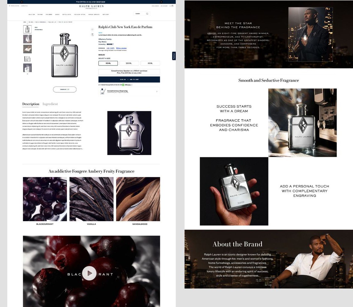
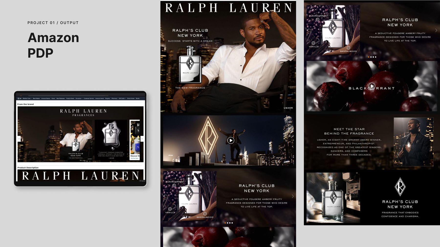
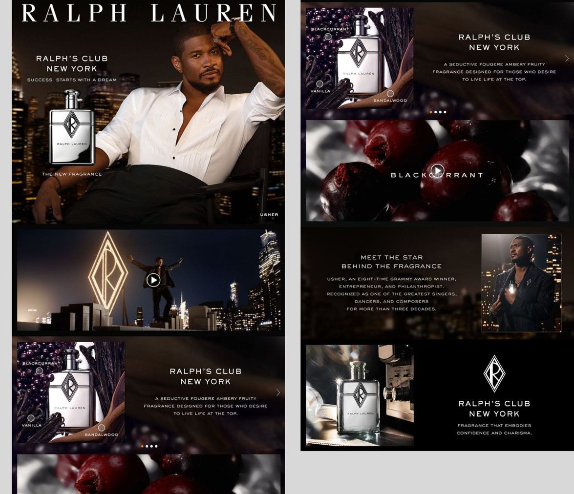
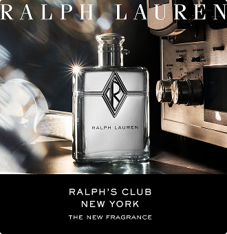
Ralph's Club NY had to break from the original Ralph's Club — its conservative, gentlemen's-club aesthetic — and bridge Manhattan nightlife glamour and raw sensuality with Ralph Lauren's legacy prestige. The challenge: make luxury feel electric and contemporary without diluting what made the brand aspirational.
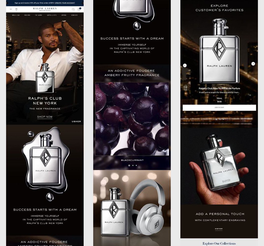
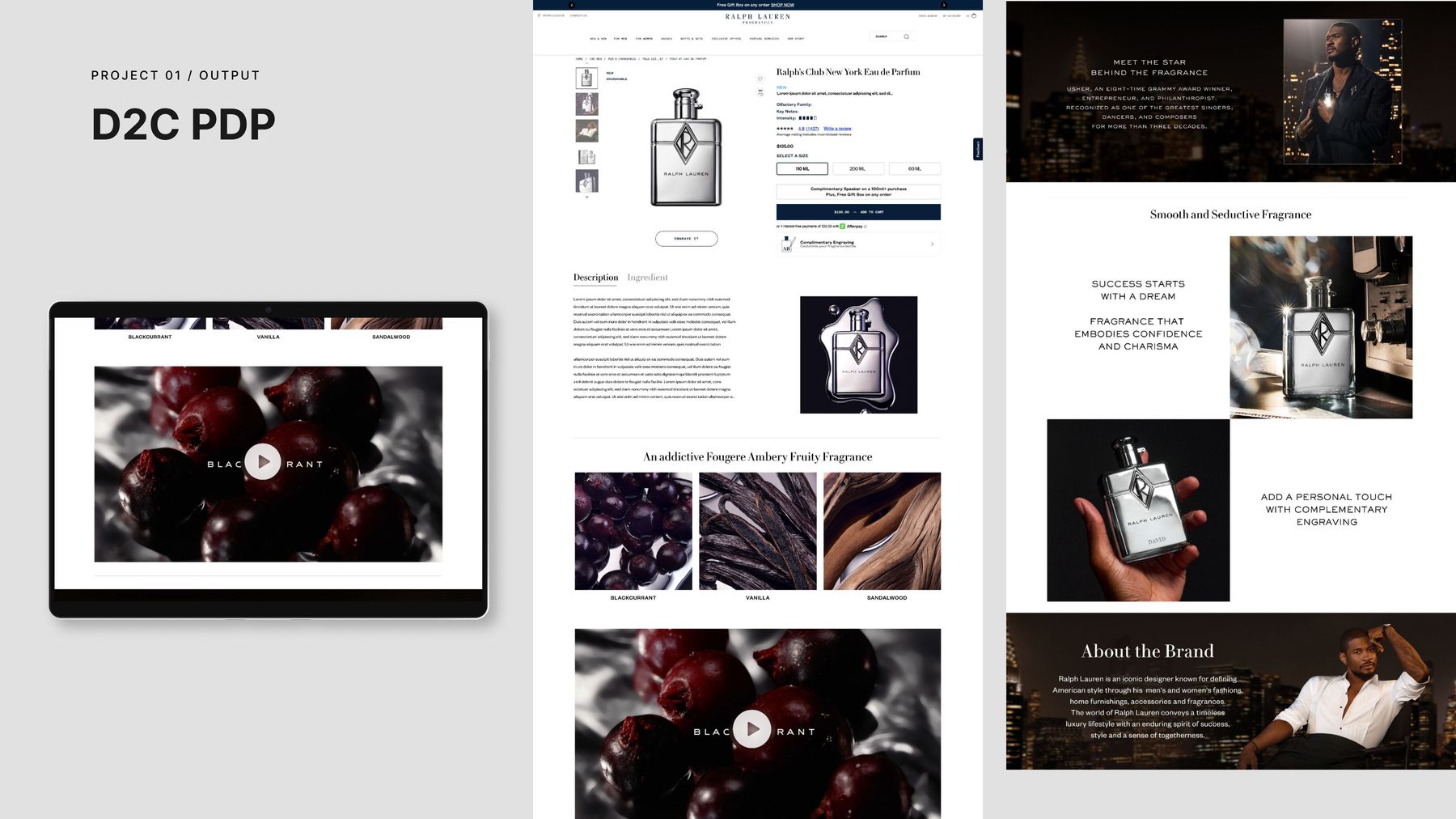
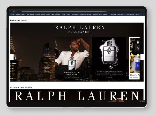
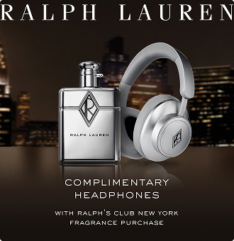
Sole creative lead on digital, across every channel. Directed ATF visual concepts, defined banner hierarchy and visual flow, and delivered the full digital ecosystem in three weeks — D2C site (HP, LP, PDP), Amazon Brand Store (HP, LP, PDP), programmatic banners, and social.
Ralph's Club NY won a 2026 Fragrance Foundation Award.
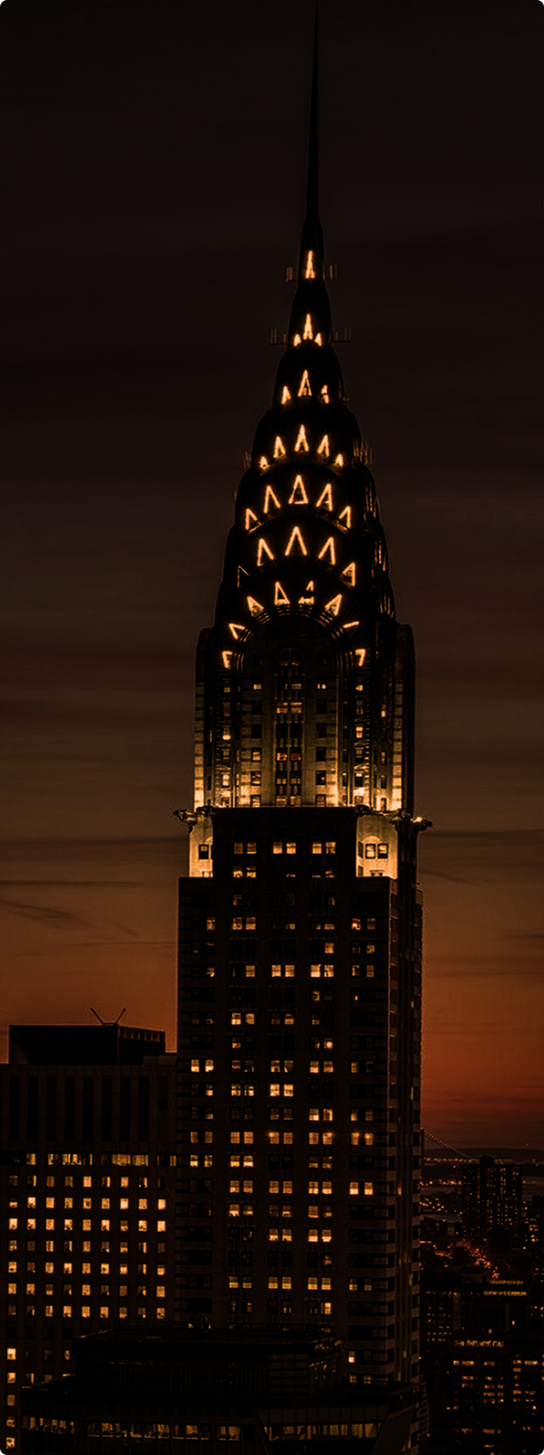
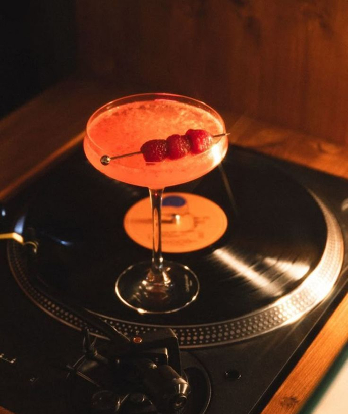
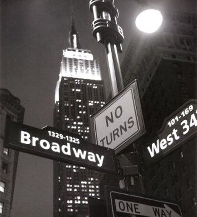
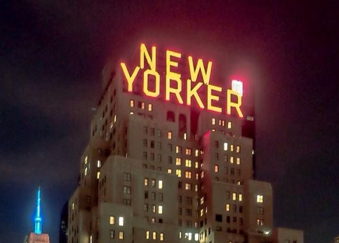
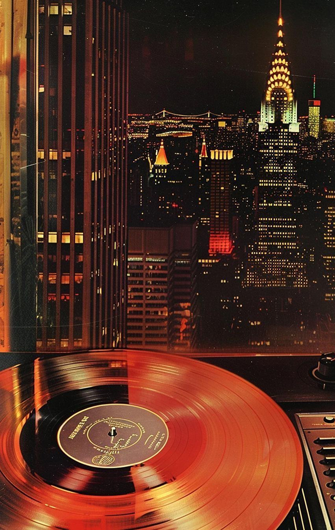
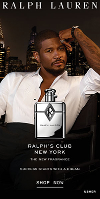
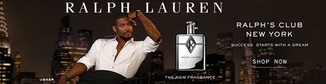
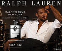
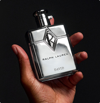
The launch visual world was built around Manhattan after dark — the energy of the club, warm light against deep shadow, luxury with pulse. Every asset in the system, from the D2C homepage to a 320×50 banner, holds the same night.



Ralph Lauren · 2025–2026 · AI Production & E-Commerce
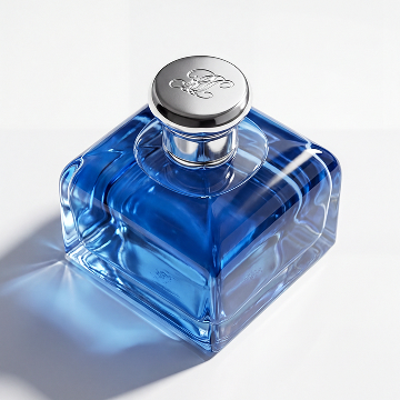
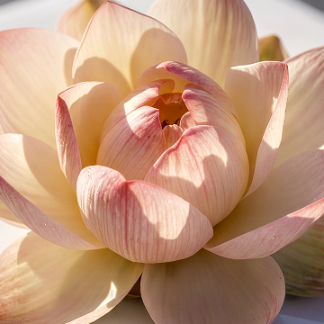
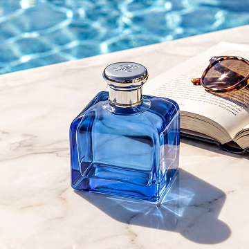
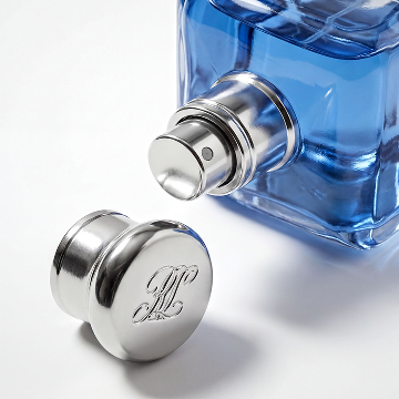
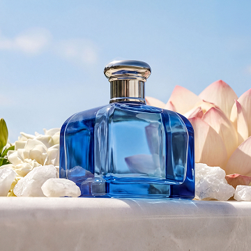
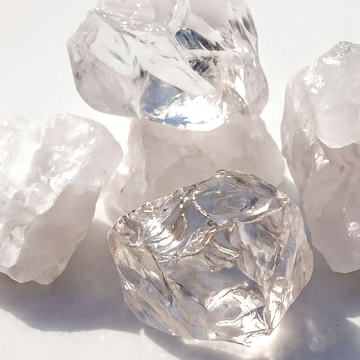
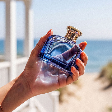
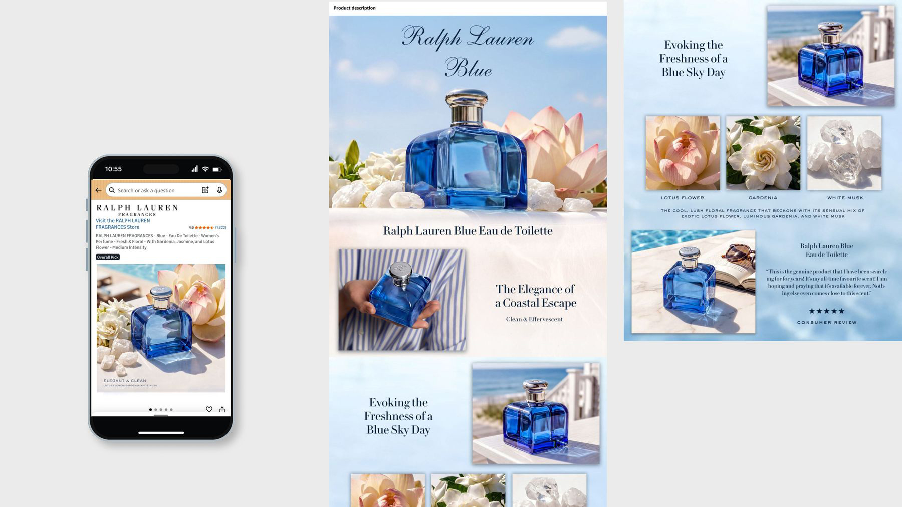
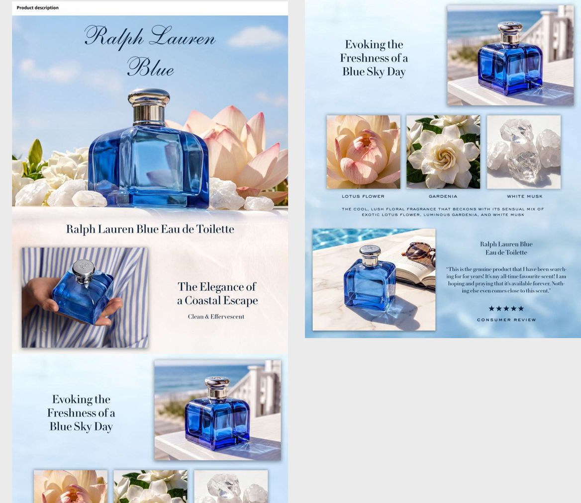
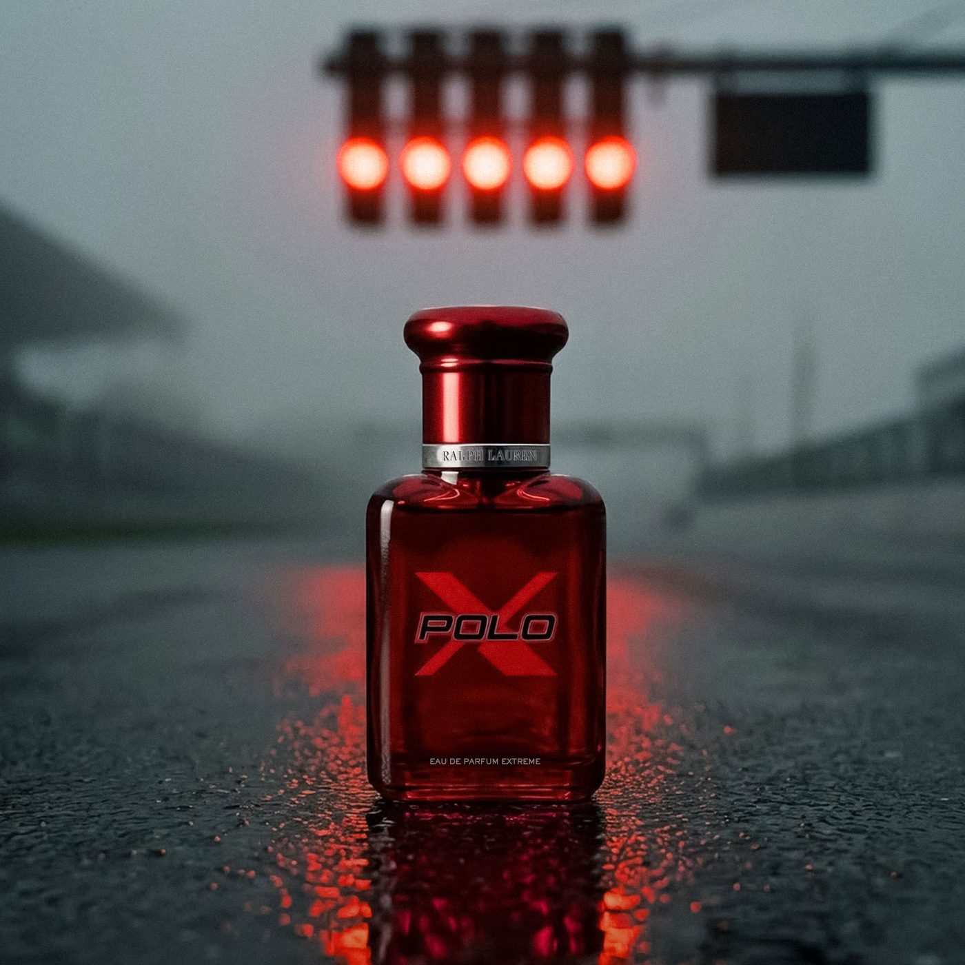
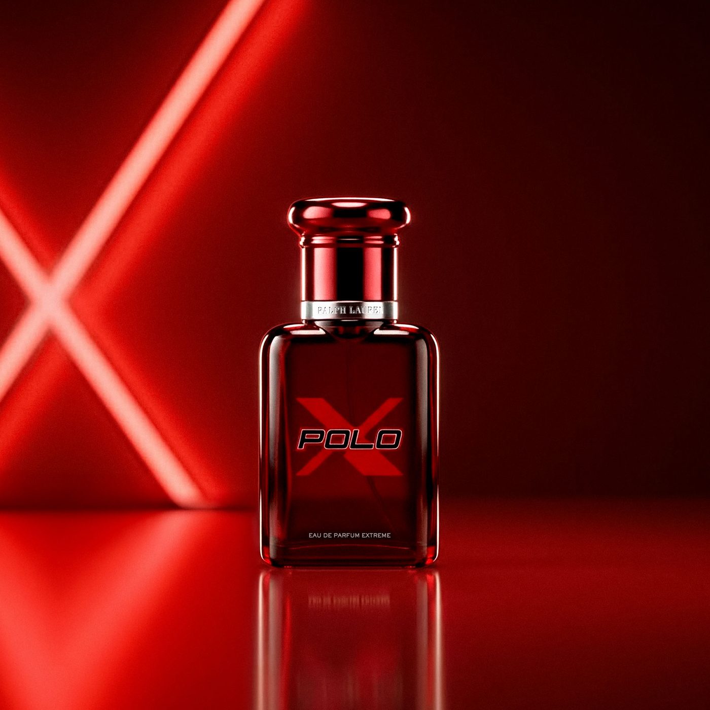
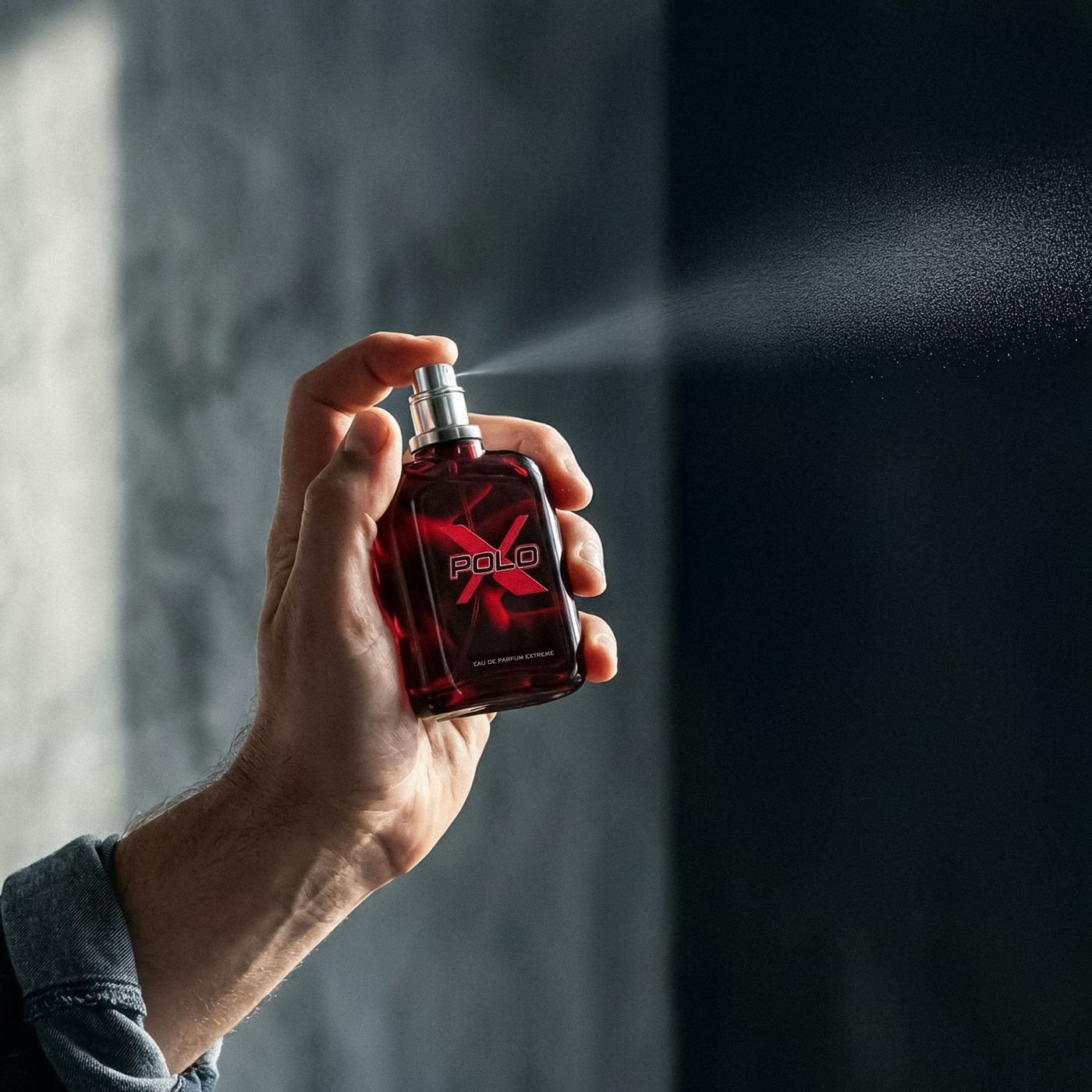
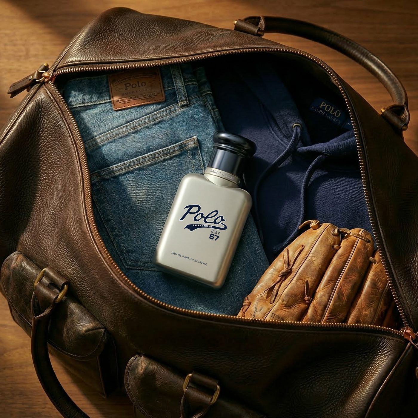
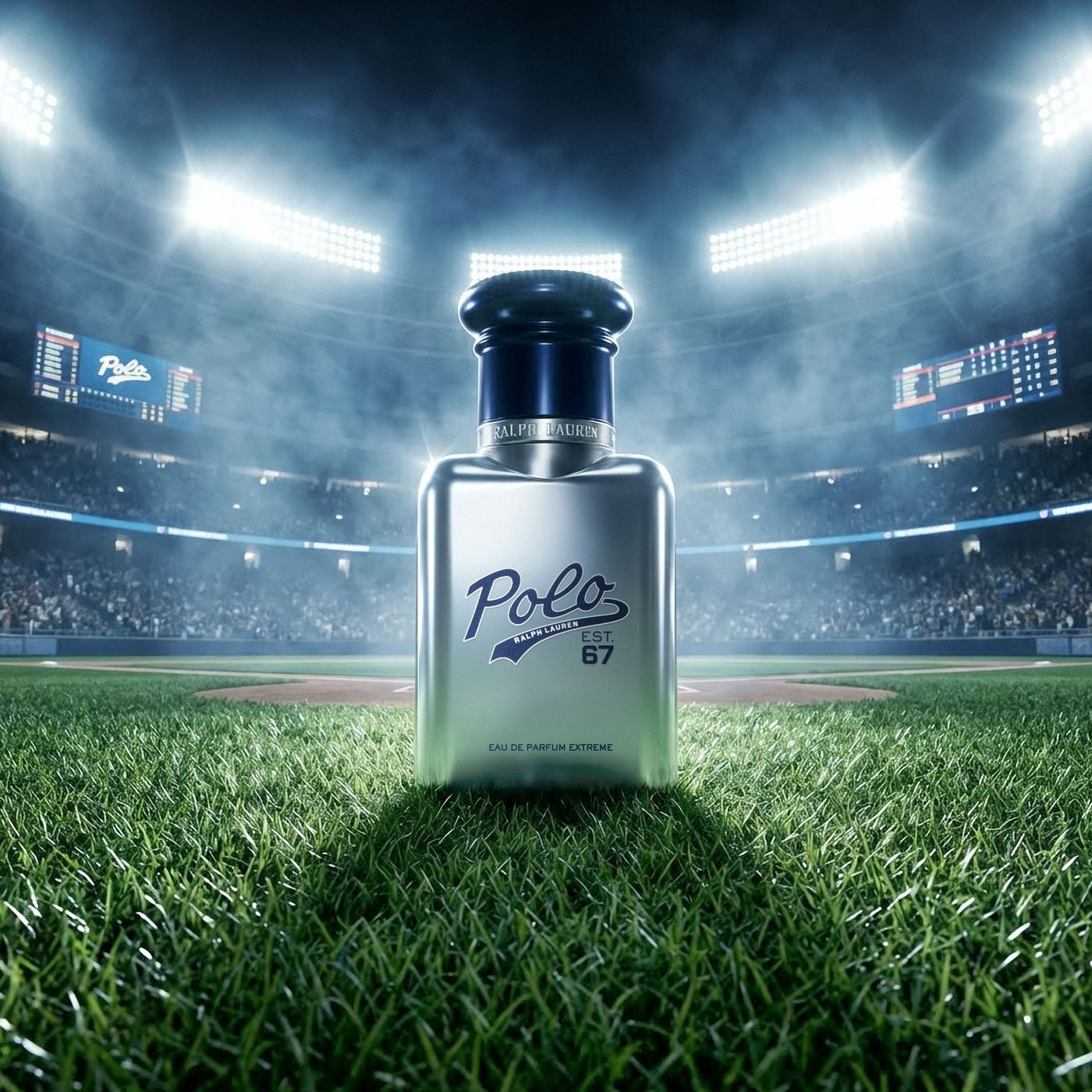
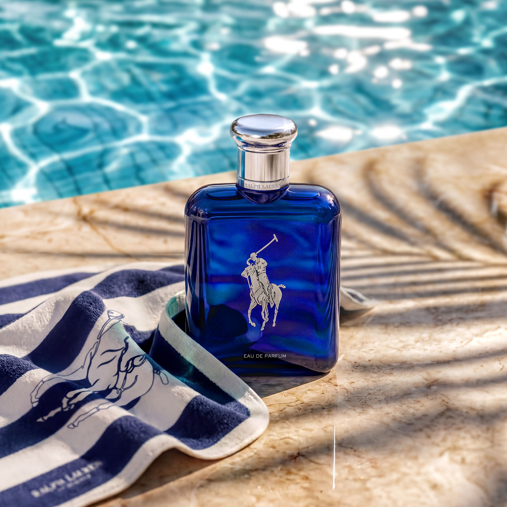
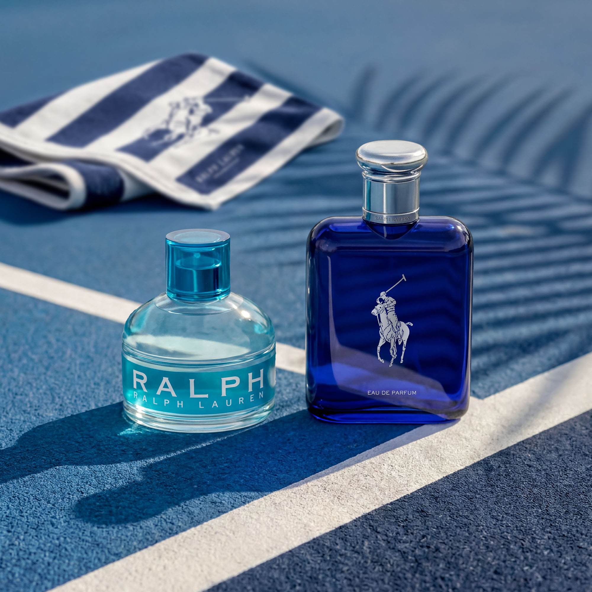
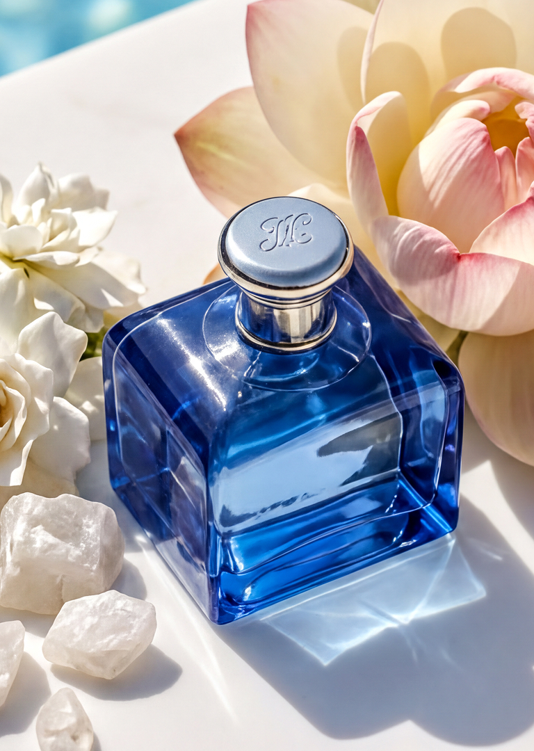
Ralph Lauren Blue had the brand equity — two decades of coastal luxury, a clear aesthetic, a loyal consumer. What it lacked was digital assets that matched. Existing visuals were dated, inconsistent across channels, and no longer competitive at the PDP level. A full photography production wasn't on the table. The challenge: modernize the visual ecosystem to premium standard without a shoot.
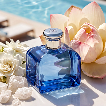
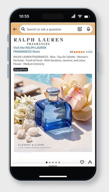
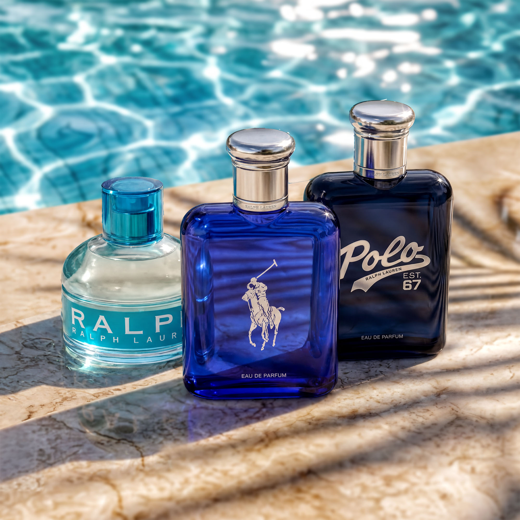
Built a repeatable AI visual production system using Adobe Firefly and Nano Banana Pro — developing separate prompt frameworks calibrated to RL Blue's coastal, sensual aesthetic. Directed the full visual concept, QA'd every output against brand standards, and deployed production-ready assets across PDP ATF/BTF, top banners, and in-situ lifestyle visuals.
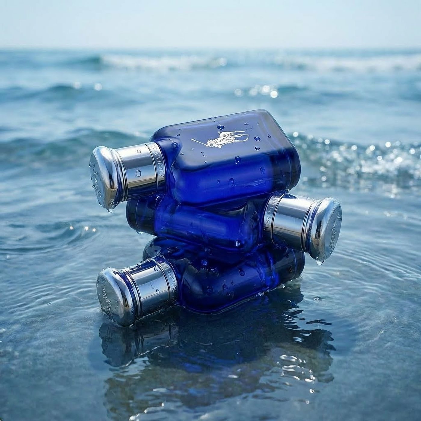
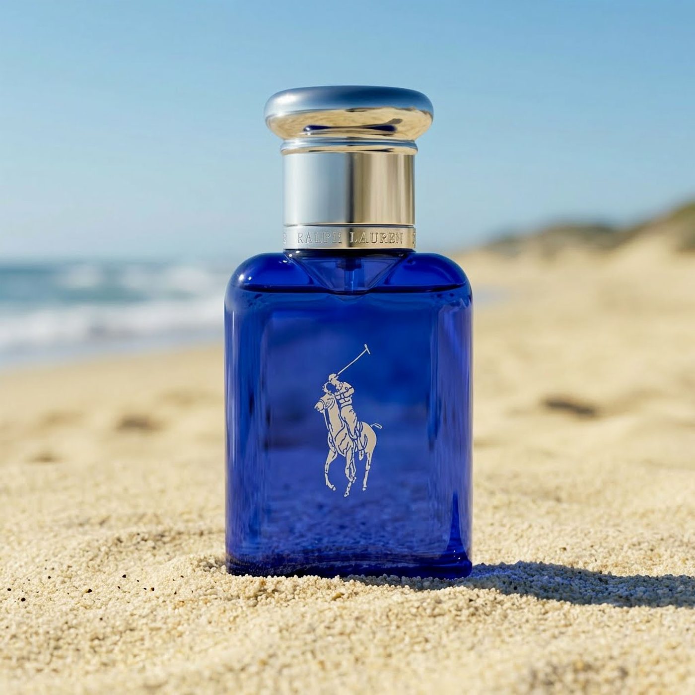
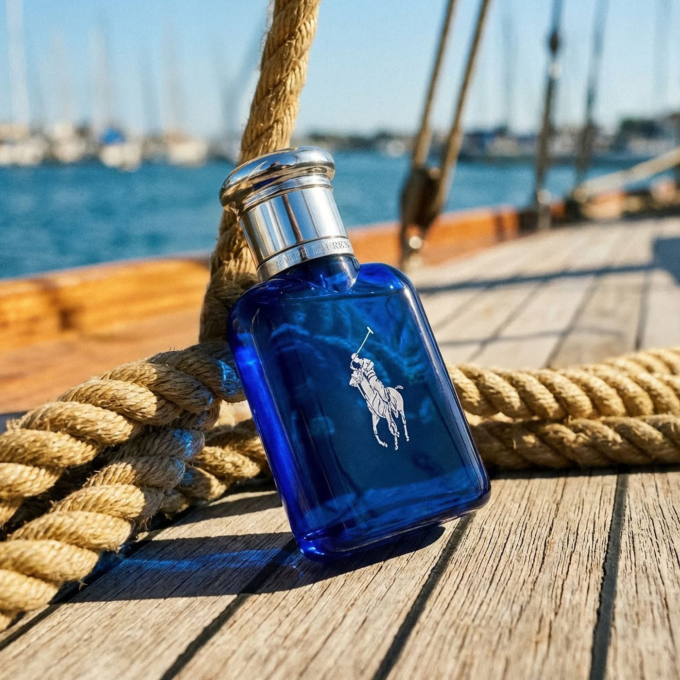
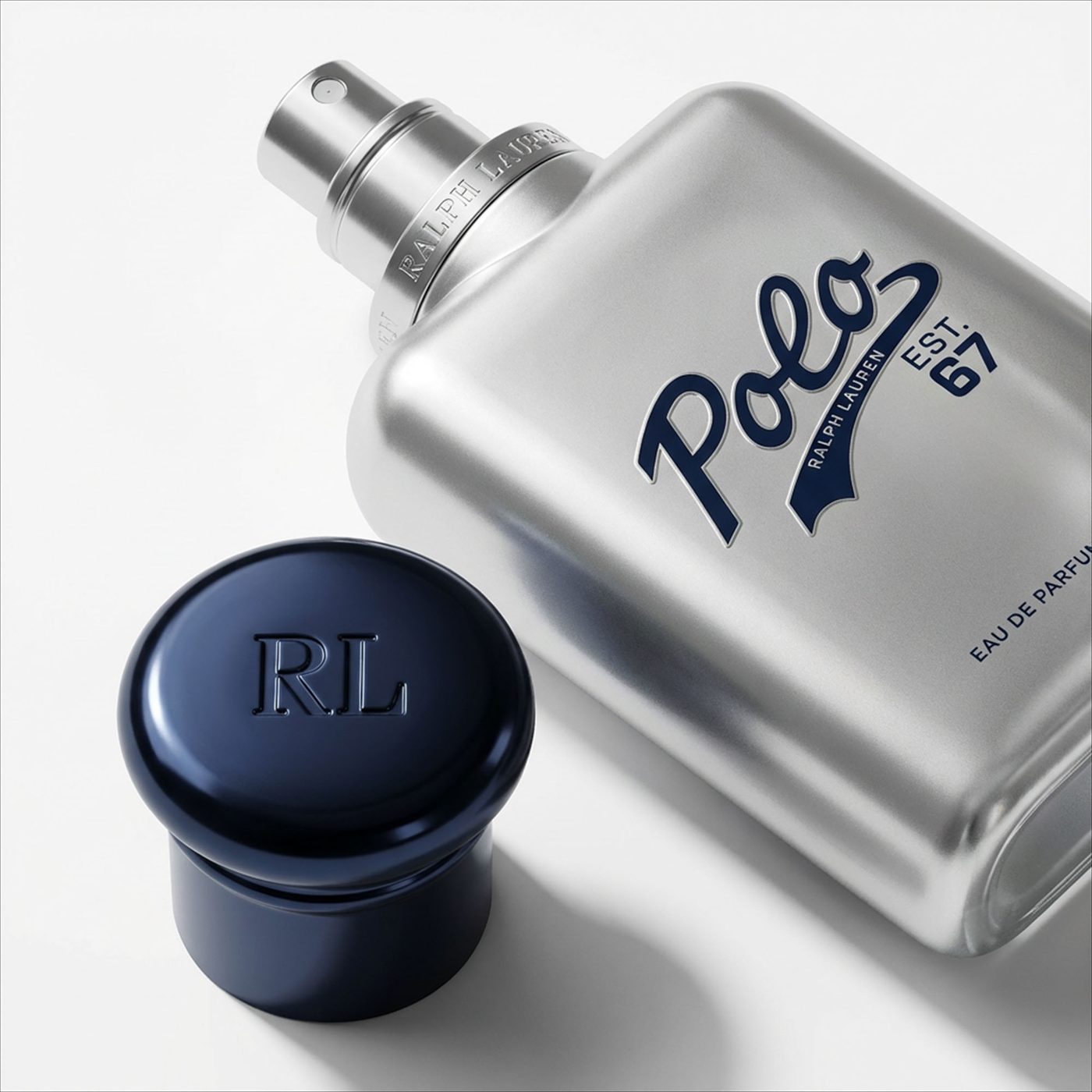
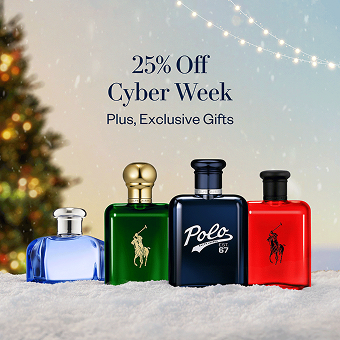
Production-ready visuals live on Amazon PDP; the system extended across the franchise — Polo Blue, Polo Red, Polo 67.
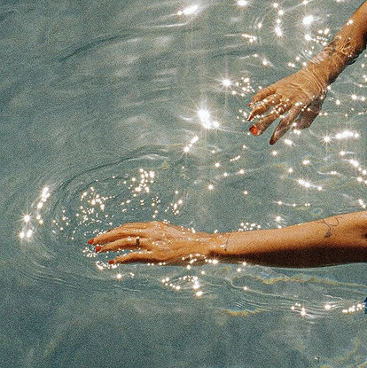
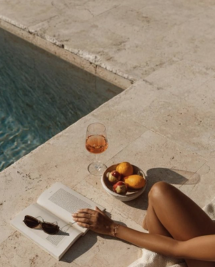
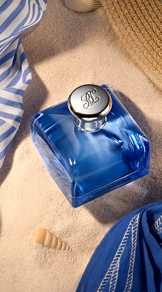
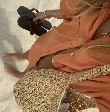
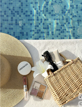
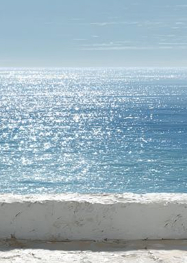
The ocean as backdrop and sensory extension of the fragrance — editorial composition, minimal luxury framing. Sand neutrals, soft blues, warm ivory under high-noon diffused light.
Ralph Lauren · 2025 · Digital & E-Commerce
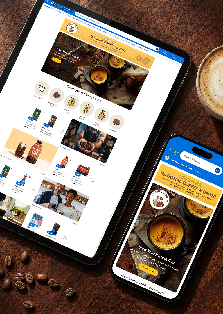
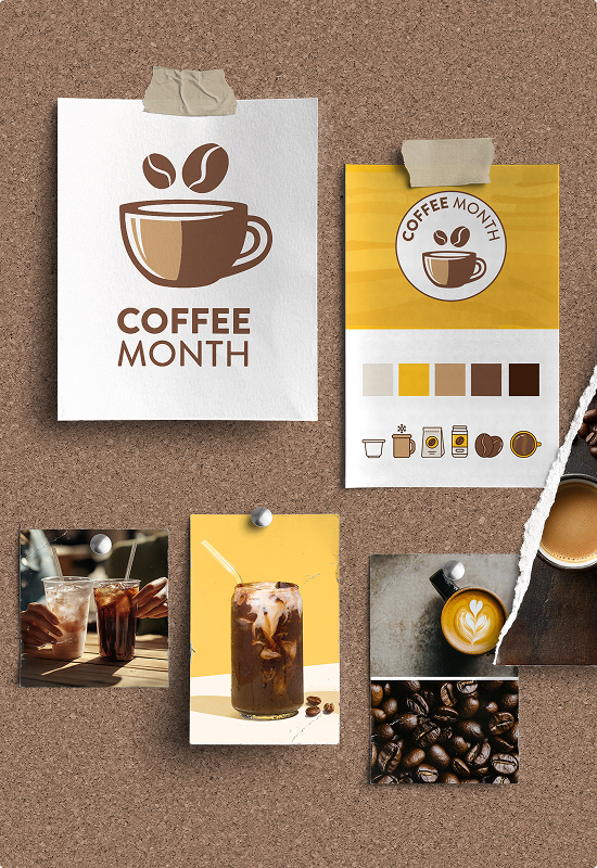
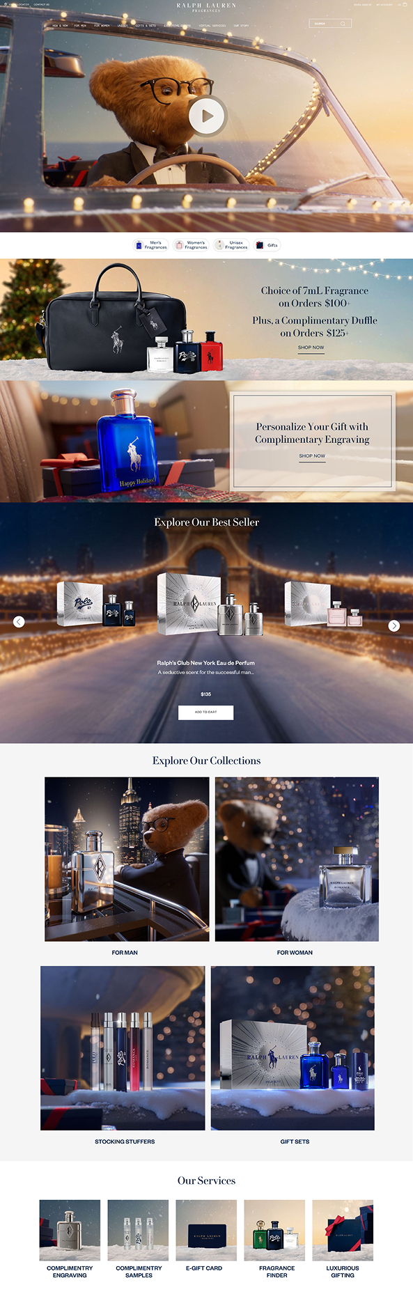
The only asset from marketing was a single hero video. From that, a complete campaign system had to be built — five distinct key moments, each requiring its own homepage, landing page, social assets, and programmatic banners across D2C, Amazon, and Ulta. The second challenge was tonal: social content had to be eye-catching enough to stop the scroll — without breaking the quiet luxury standard Ralph Lauren holds in every other channel.
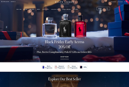
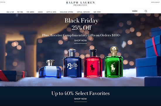
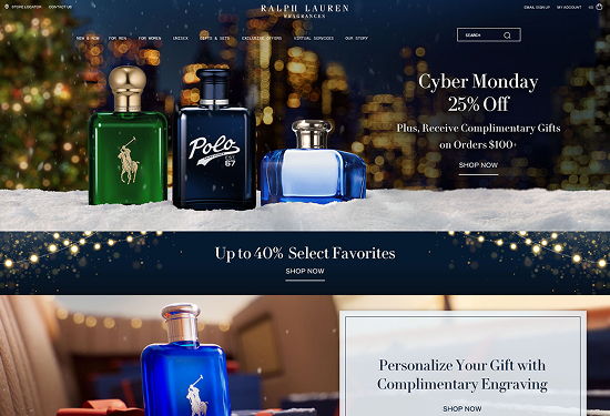
Built the entire visual system from a single hero video — extracting stills, generating AI in-situ imagery with Adobe Firefly, and developing a visual language that held across five distinct campaign moments. Delivered D2C (HP, LP, PDP), Amazon Brand Store (HP, LP, PDP), Ulta, social assets, and programmatic banners — across Before Holiday, Black Friday Early Access, Black Friday, Cyber Monday, and Holiday. Three weeks, solo.
Five key moments shipped on time across three retail channels — one visual world, zero photography budget.
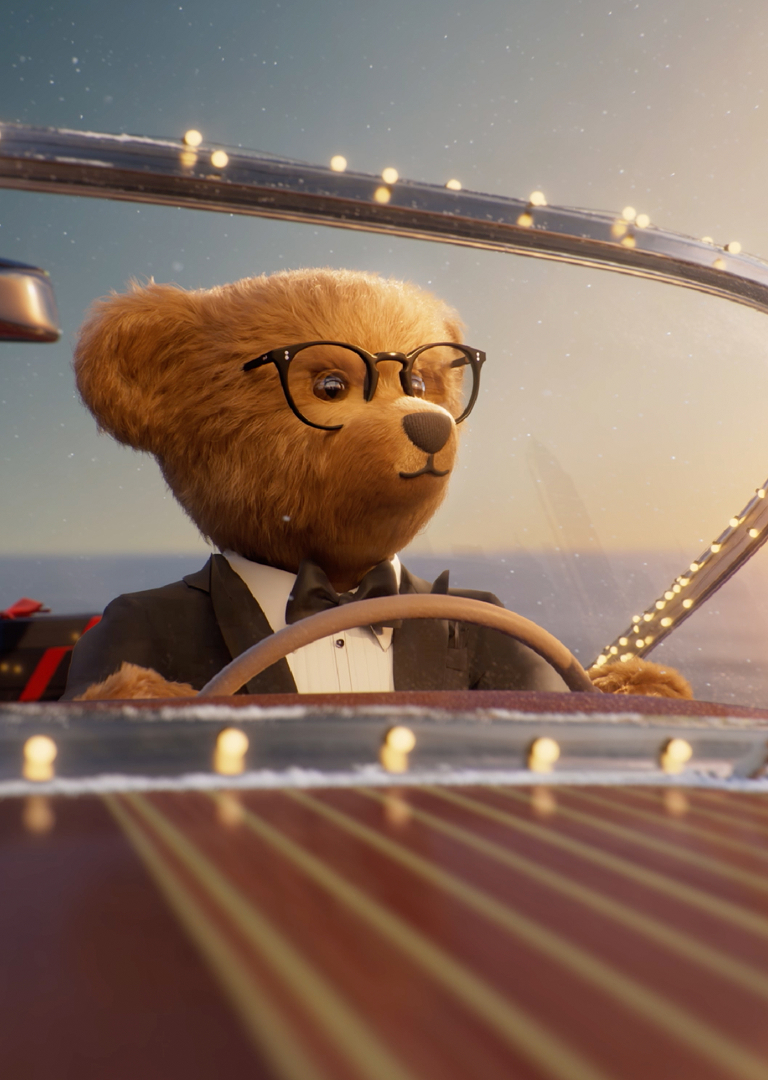
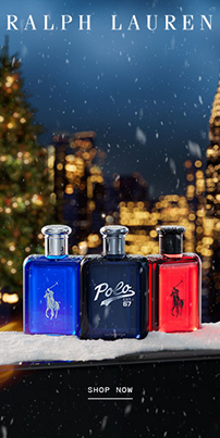
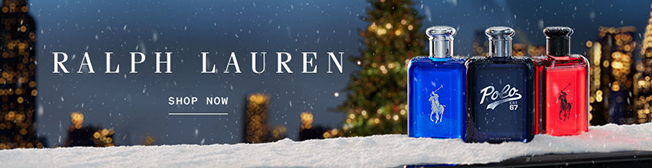
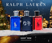
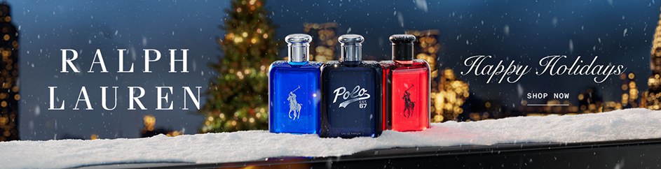
The Polo Bear had been off the table for three years. When the brand brought it back for Holiday 2025, the campaign concept came with it: the Bear drives across the Manhattan Bridge, arrives in Central Park, and lights the Christmas tree. That world — dusk settling over a snowy Central Park, warm light against a darkening skyline — became the visual foundation for every banner in the system.



KISS · 2022 · Packaging & Campaign & Digital
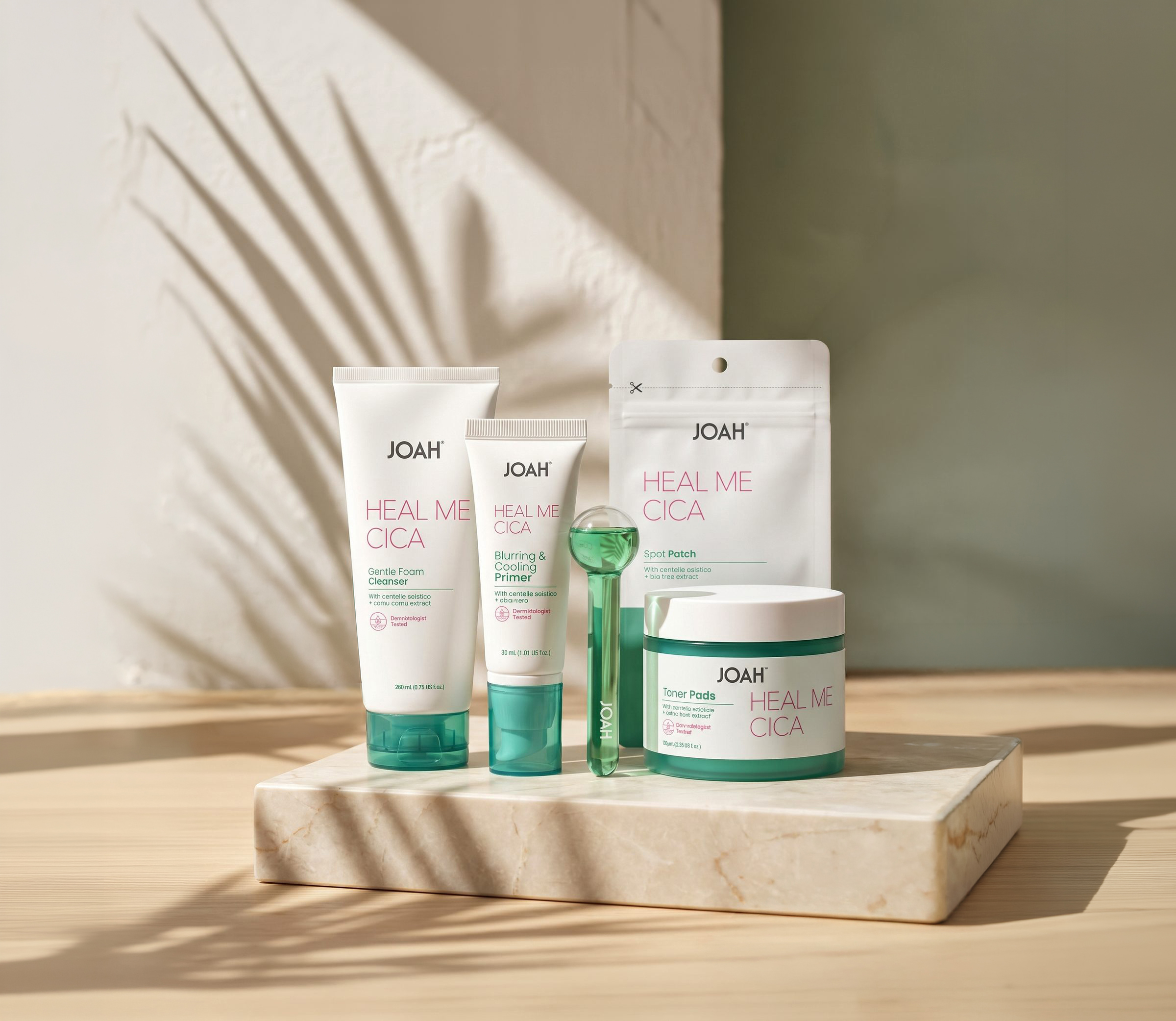
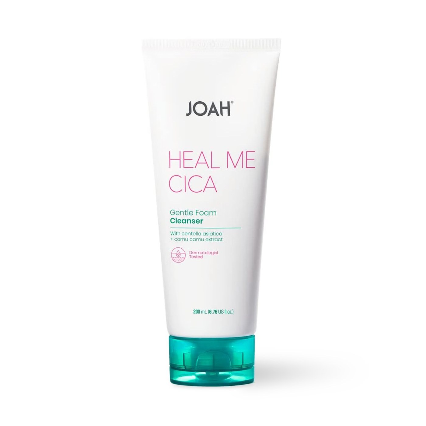
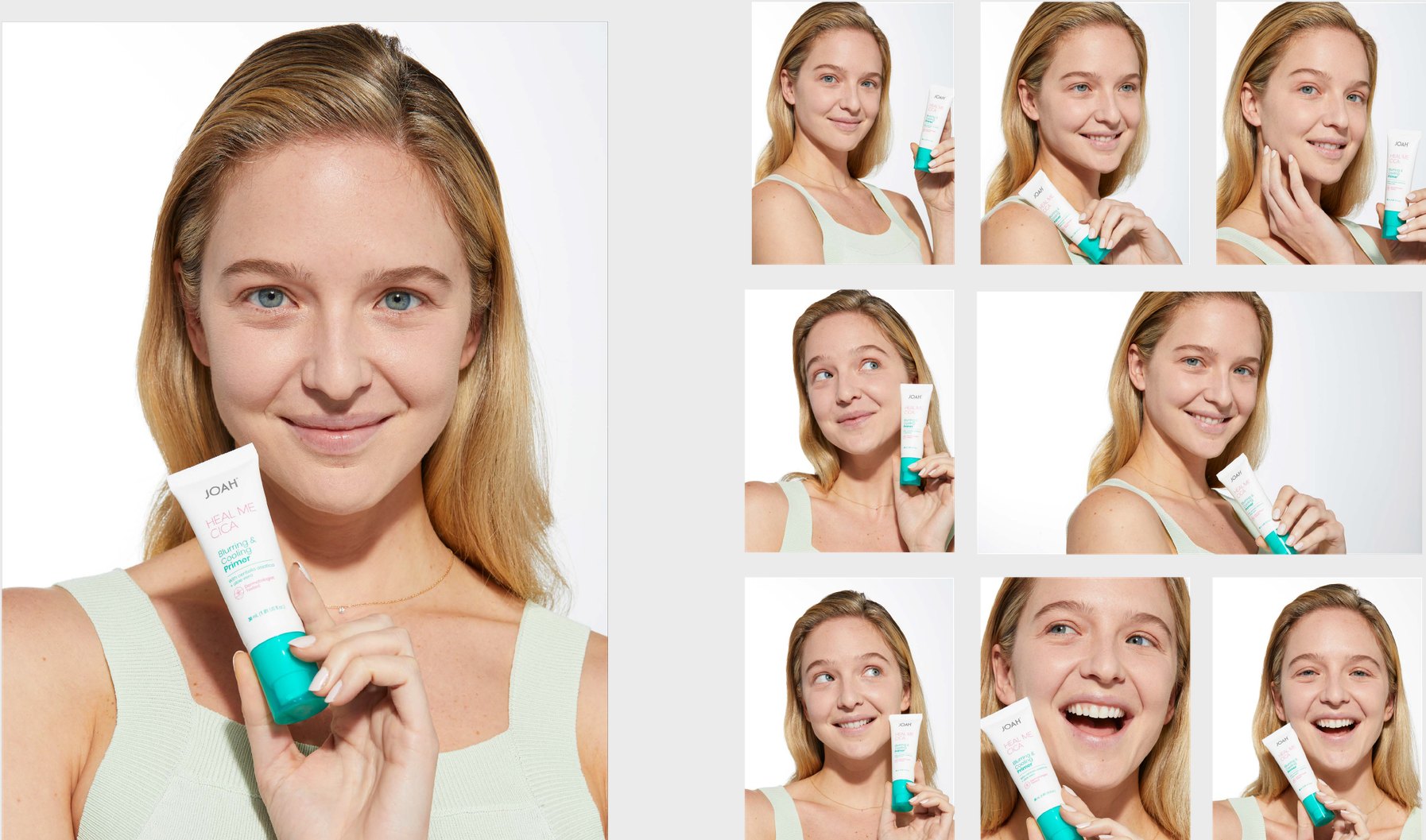
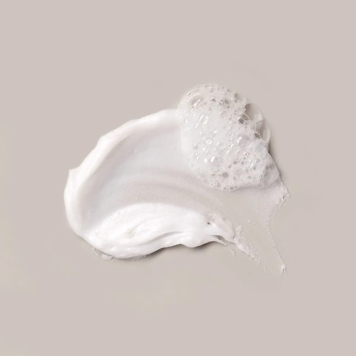
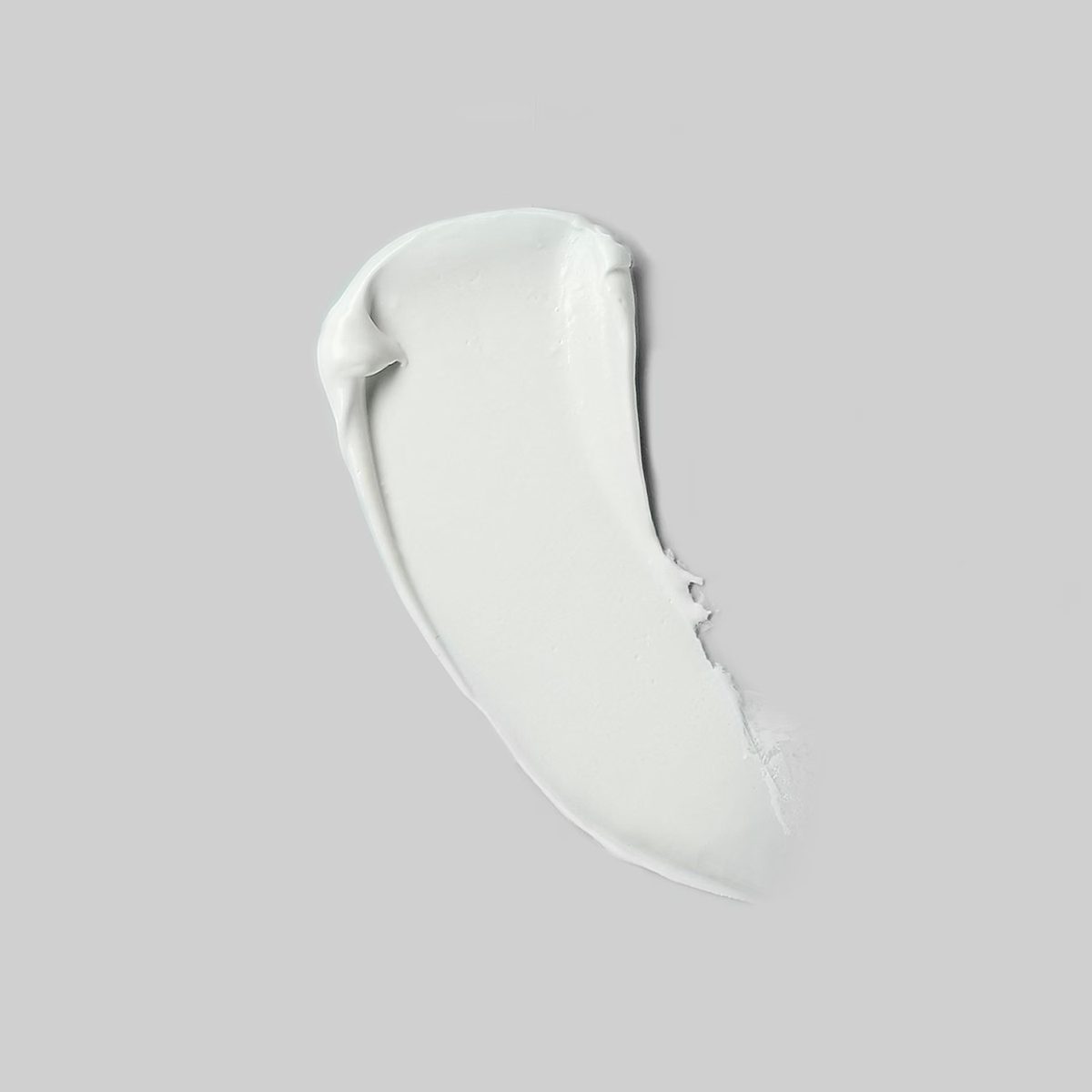
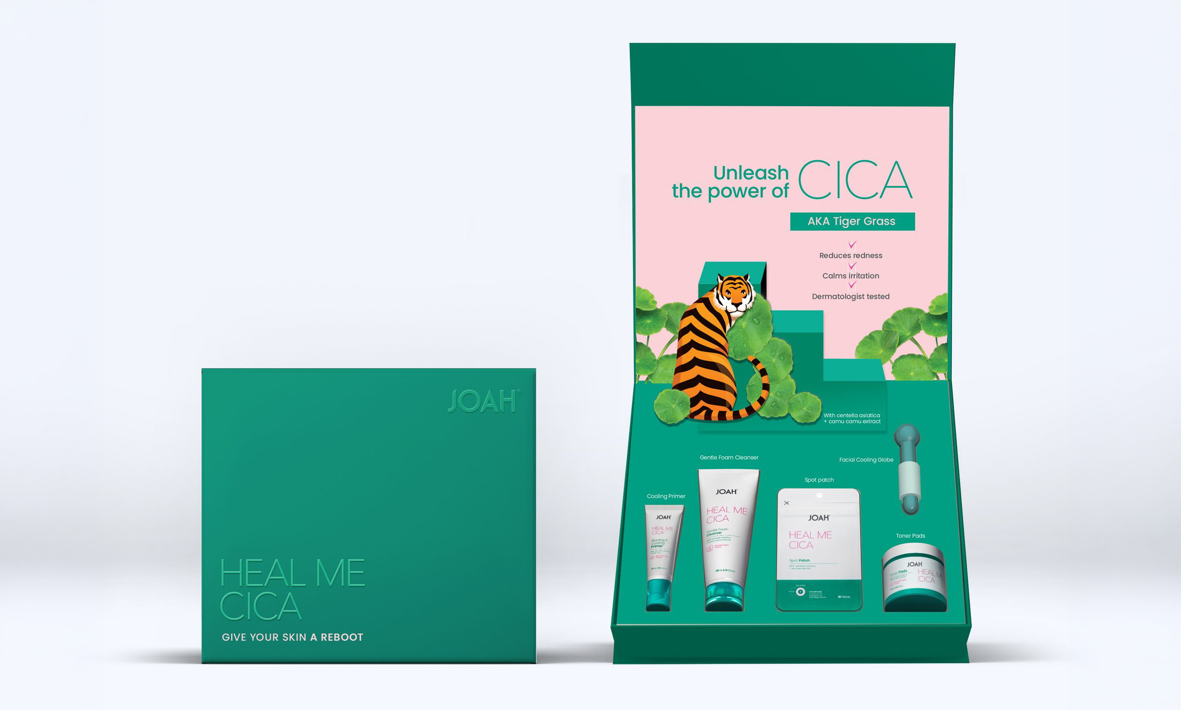
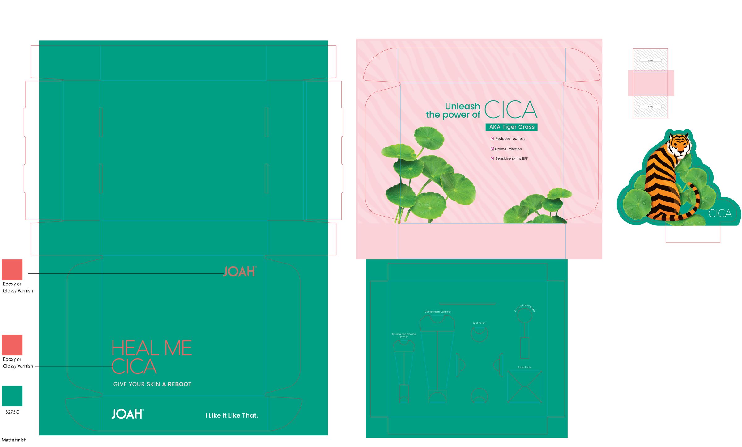
CICA — centella asiatica, or tiger grass — is a K-beauty staple, but to a US mass-retail shopper it is an unfamiliar word on a box. JOAH's Heal Me CICA line, a five-piece routine for stressed, sensitive skin, needed packaging and a launch campaign that made the ingredient feel understood at the shelf and on the phone — before anyone reads a claim.
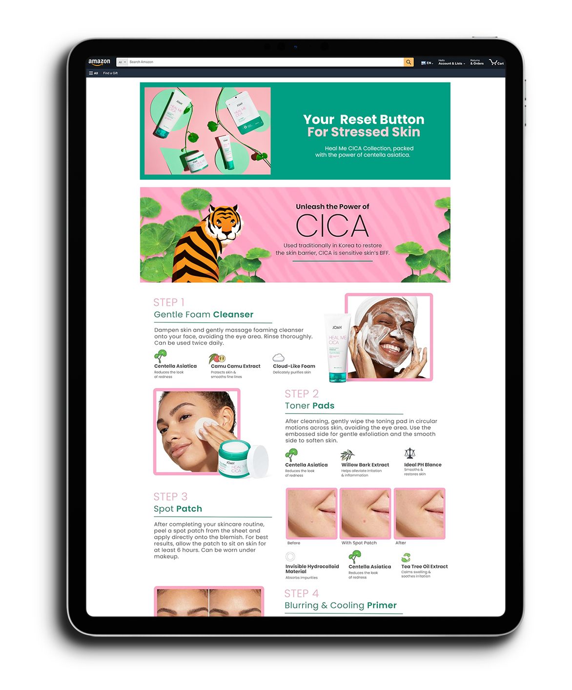
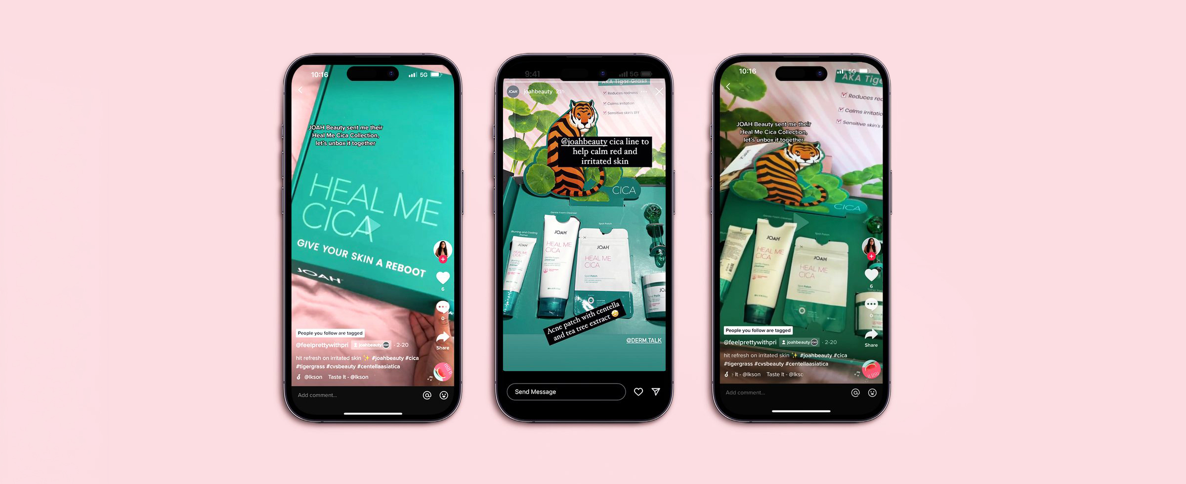
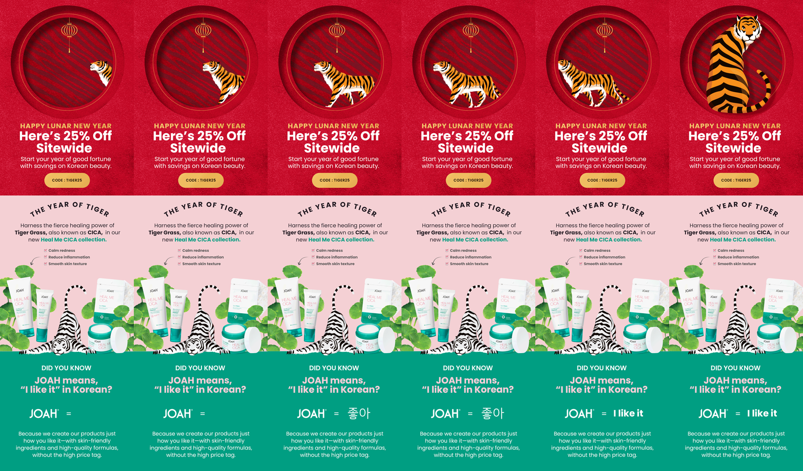
Led the line end to end: the packaging system, the promotional seeding box with its die-cut tiger, model and product photo direction, Amazon A+ content, Instagram, and the email program. Built the “calm tiger” key visual and carried it through every touchpoint.
A full launch system shipped — packaging, seeding box, campaign shoot, Amazon A+, social, and email.
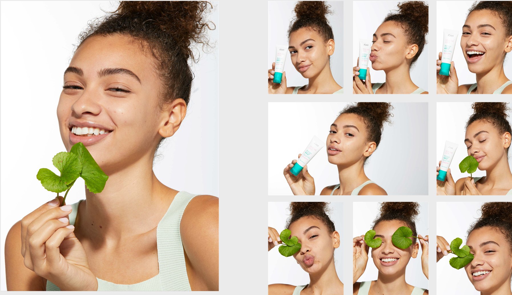
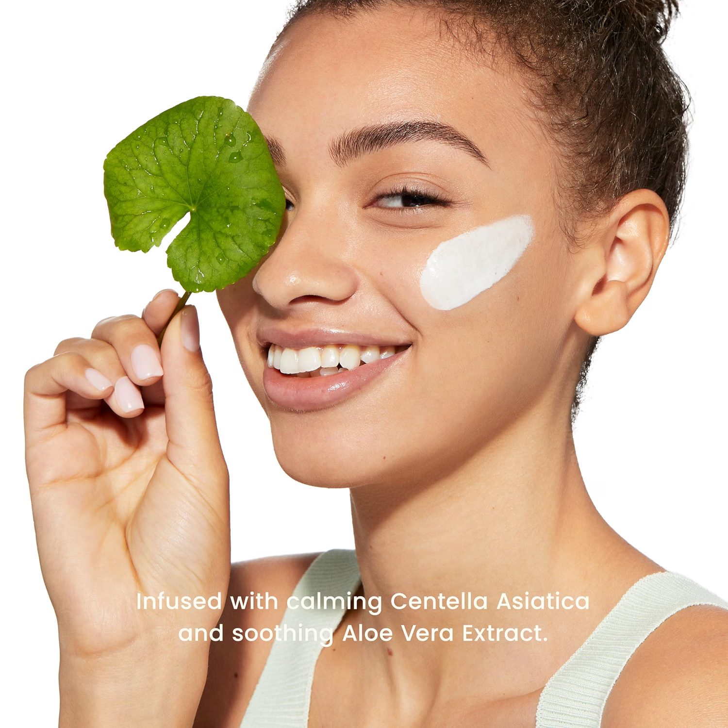
Tiger grass gets its name from the folklore of wild tigers rolling in centella to heal their wounds. So the tiger became the key visual — not fierce, but calm, resting in the leaves. Pink for the skin, green for the plant. And with a 2022 launch in the Year of the Tiger, the Lunar New Year campaign wrote itself.
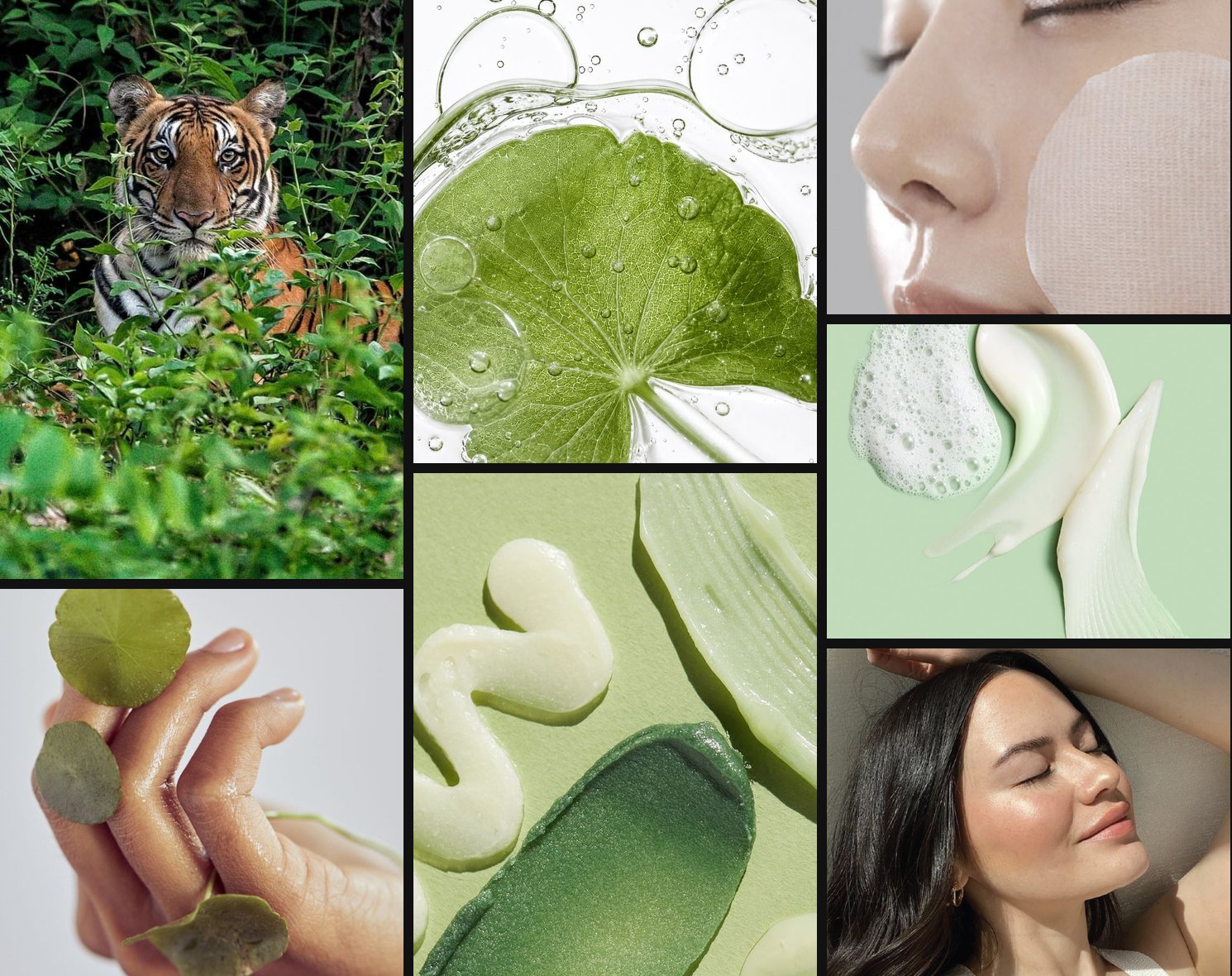
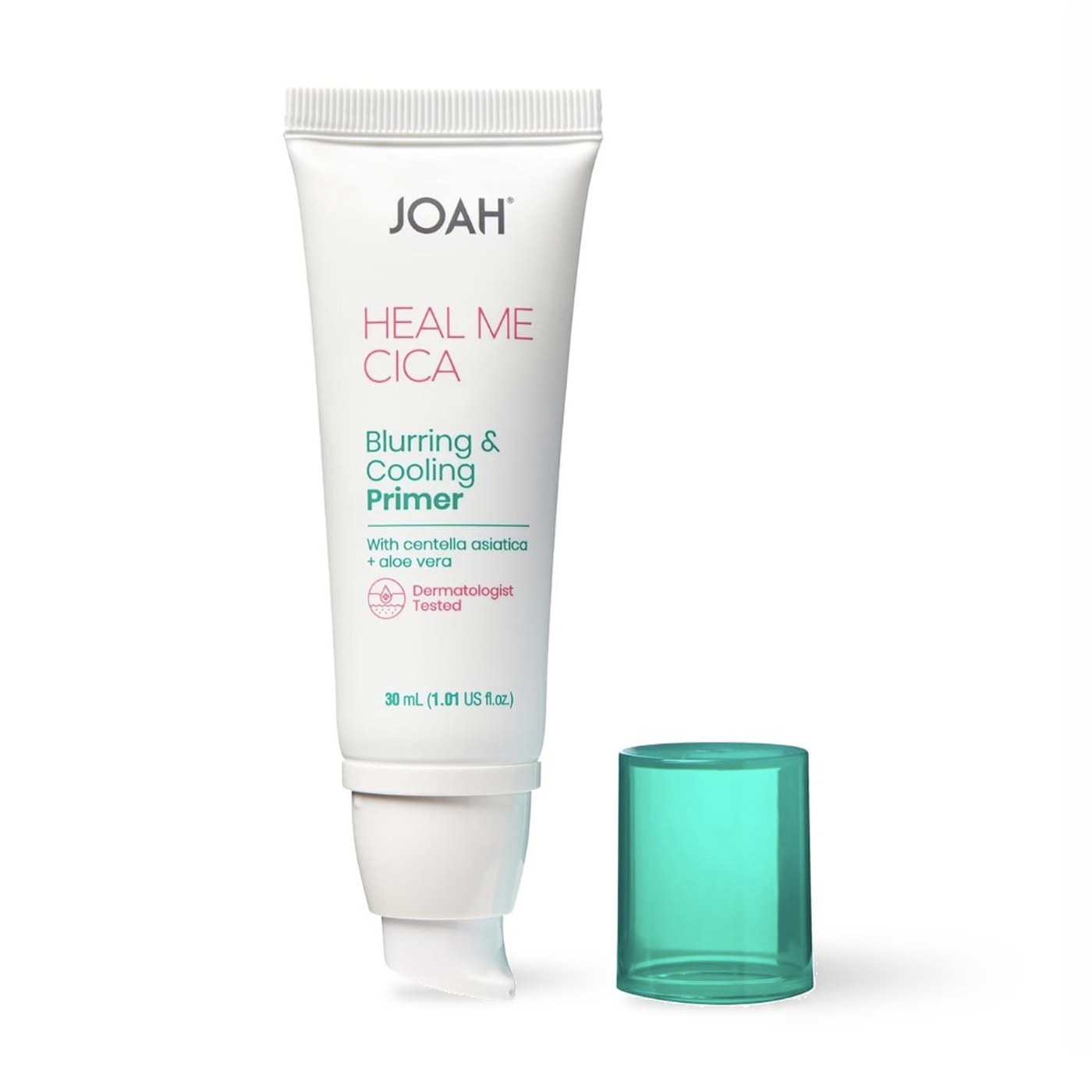
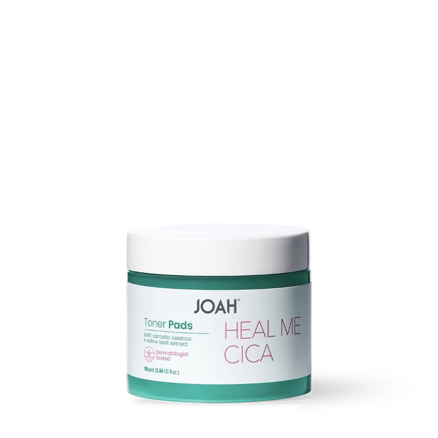
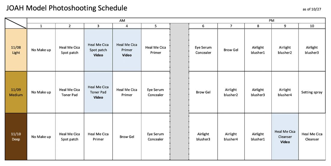
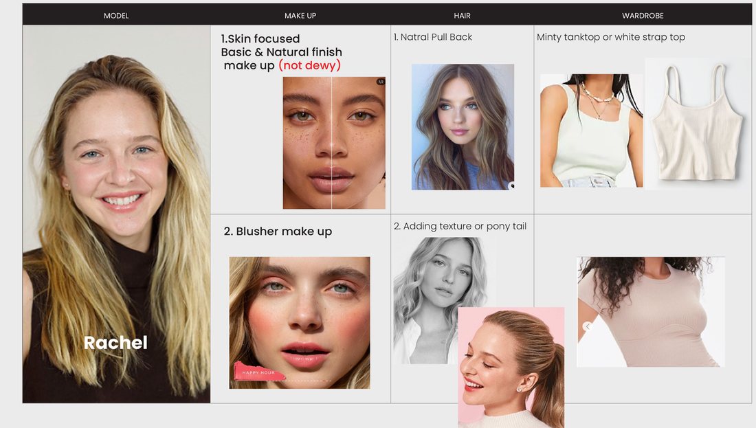
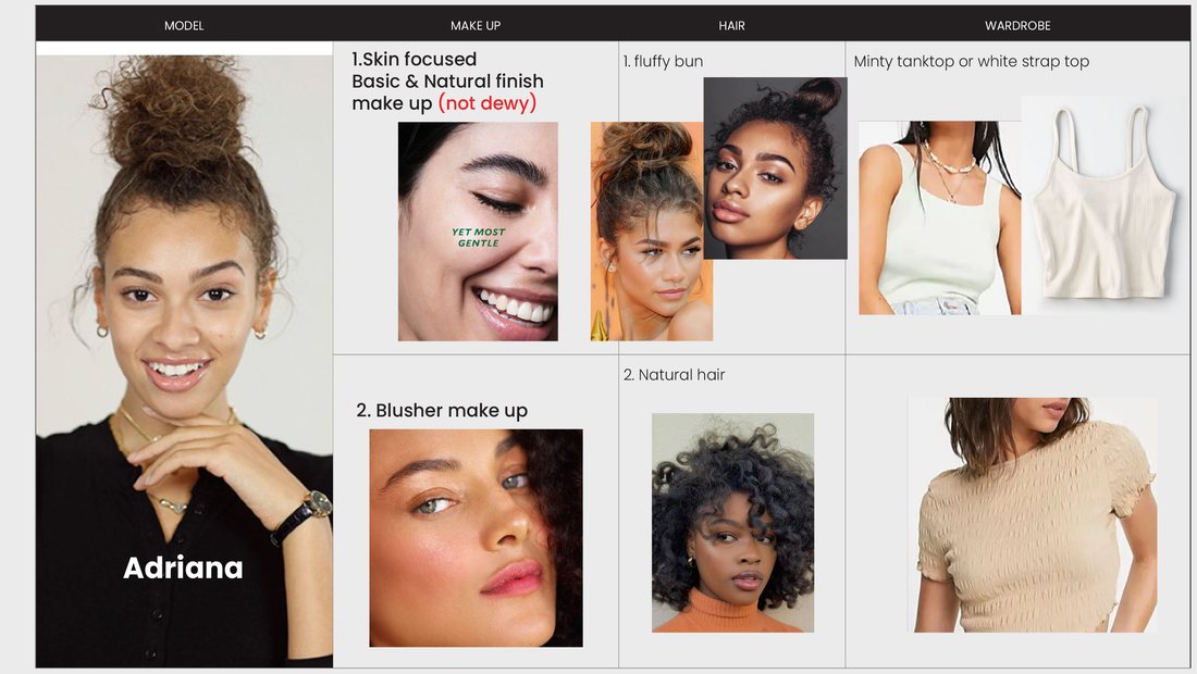
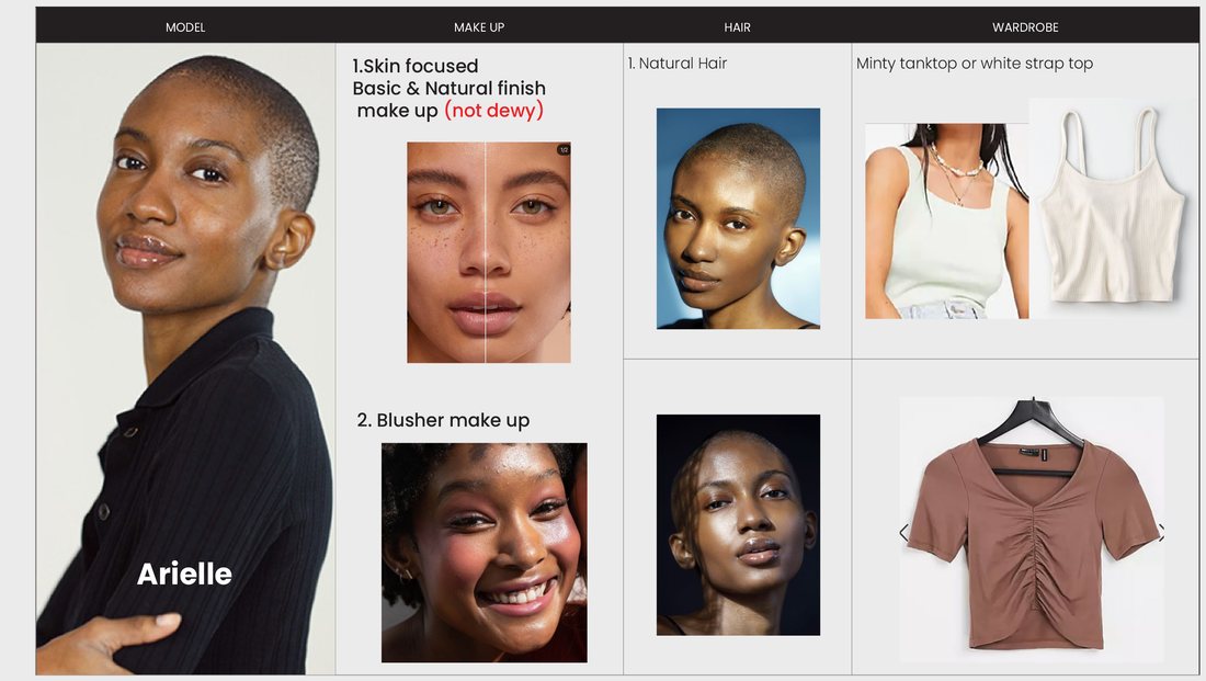
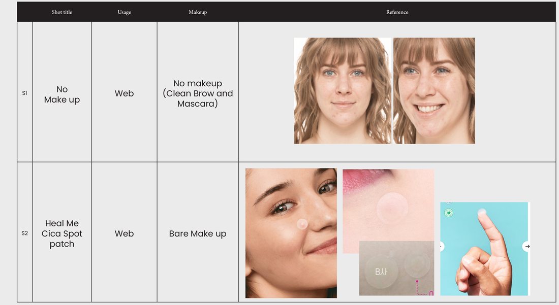
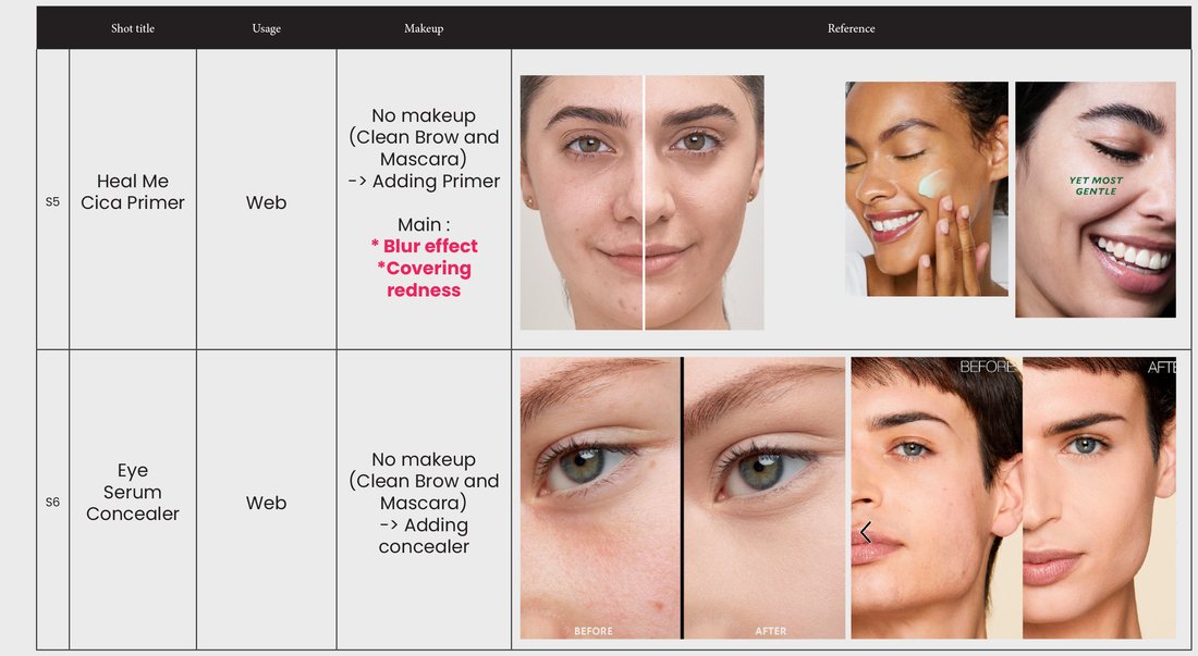
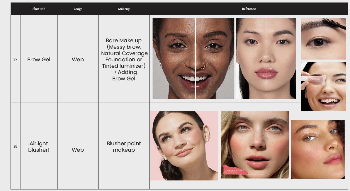
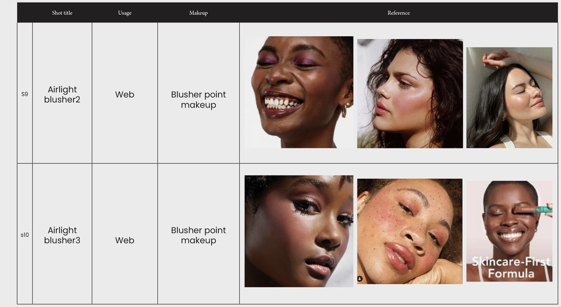
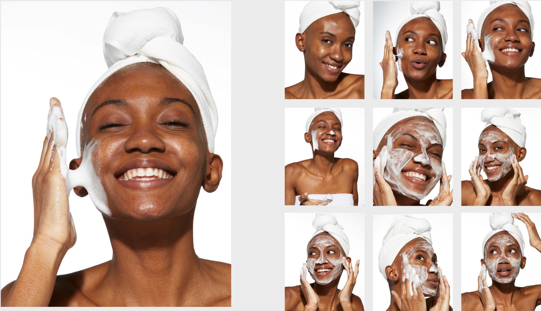
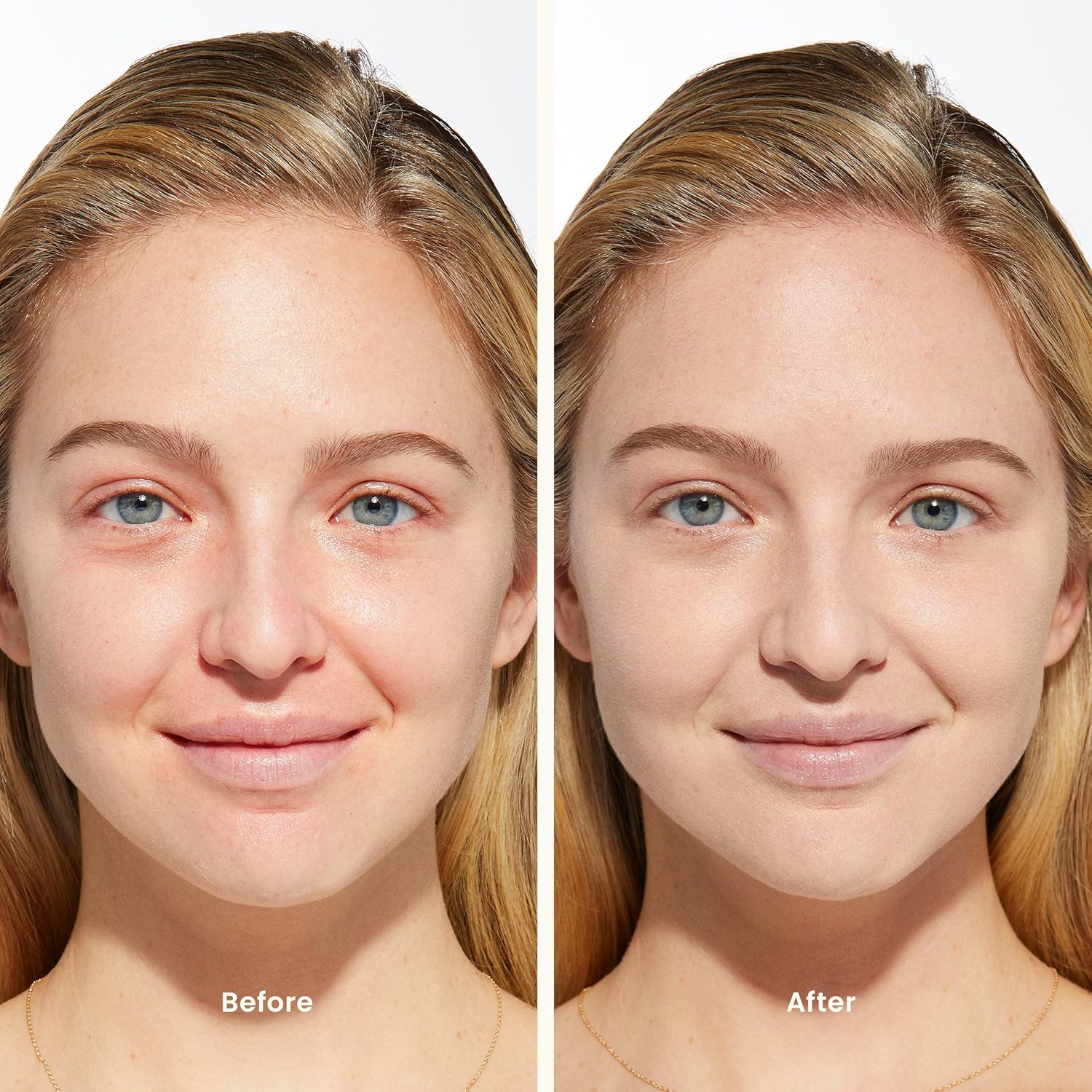
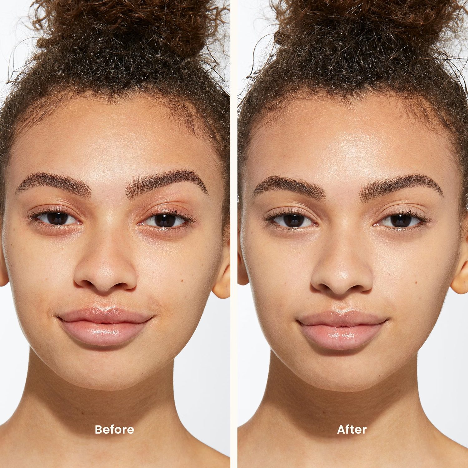
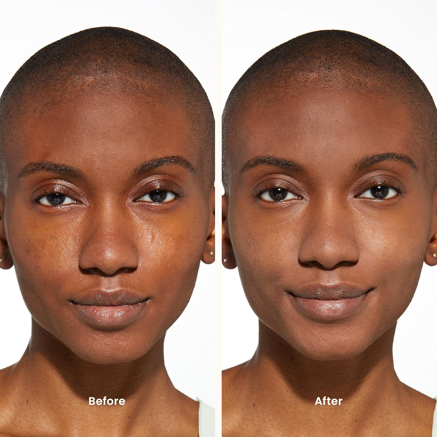
Directed the model and product shoot from shot list through selects — one look per product, three skin tones, the centella leaf as the recurring prop.

KISS · 2022 · Brand Identity & Packaging & Digital
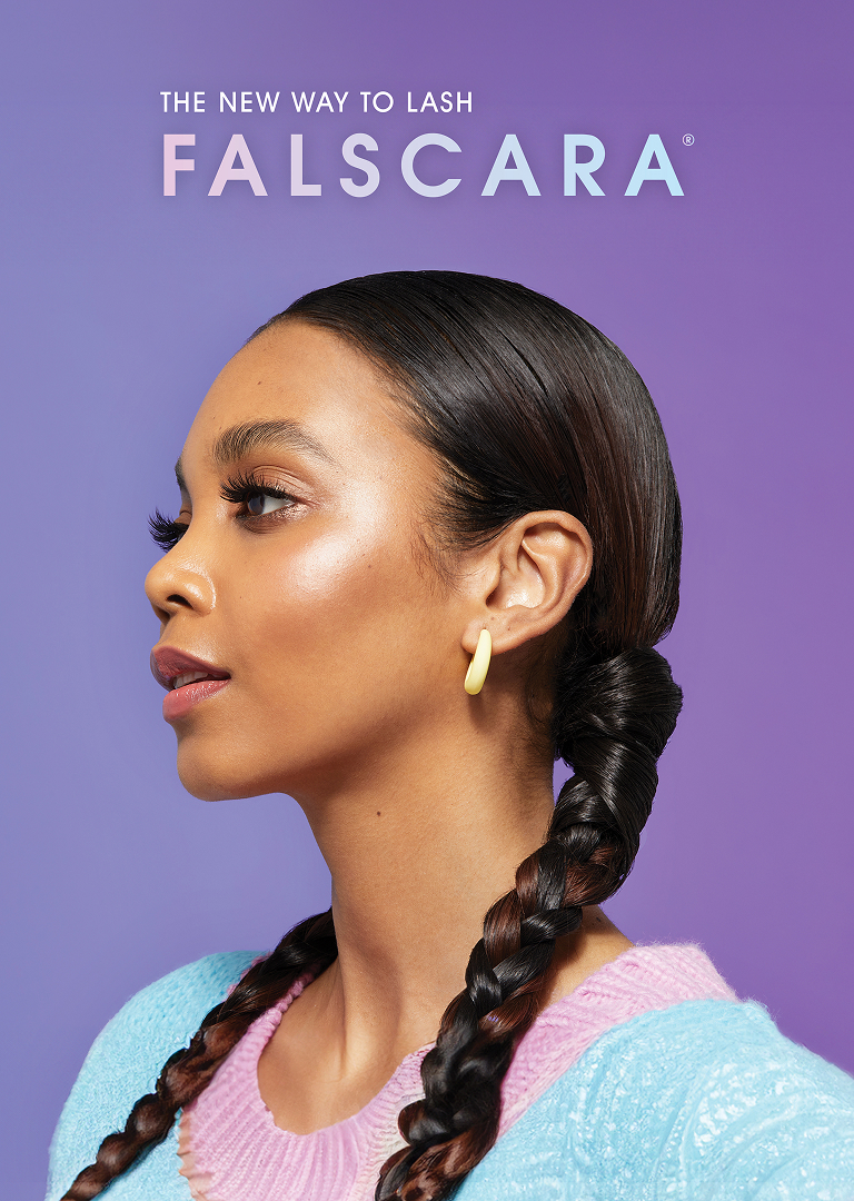
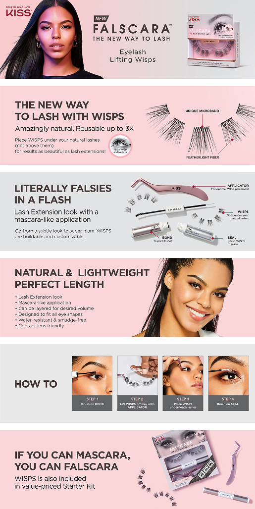
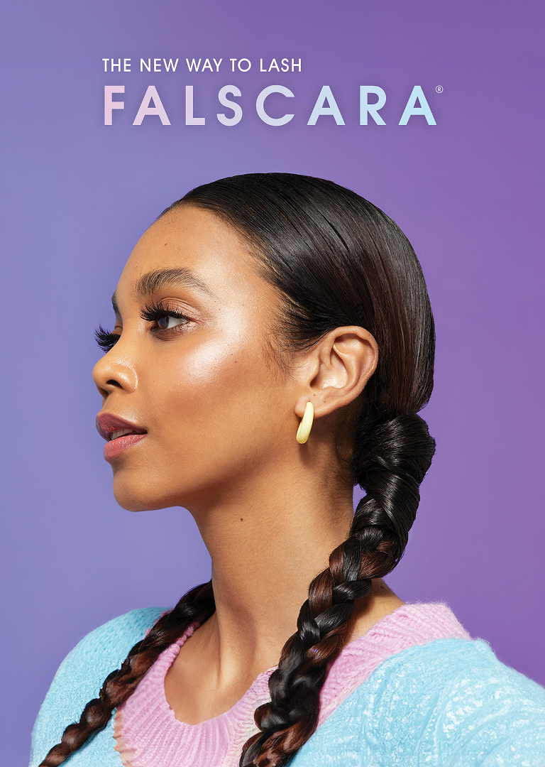
Falscara applies under the natural lash, not over — a technique most consumers had never seen before. The packaging had to teach that behavior at the moment of purchase, with zero guarantee anyone would read the instructions. The 2.0 revamp added a second layer: rebuild the entire visual system — without losing the brand recognition Falscara 1.0 consumers had already built.
Rebuilt the full packaging system around the 2.0 visual concept — new color palette, new hero visual, cleaner application sequence. Designed the Target-exclusive FALSCARA + OVERNIGHTER value pack, which became a top-seller in the false lash category at Target. Updated Amazon PDP to align with the new direction.
2026 Cosmopolitan Readers’ Choice winner. The Target-exclusive value pack became a category top-seller.
The moment the wisp locks under the lash — that's the decisive moment Falscara is built around.
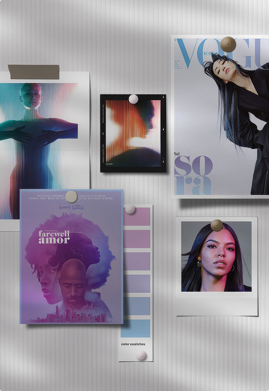
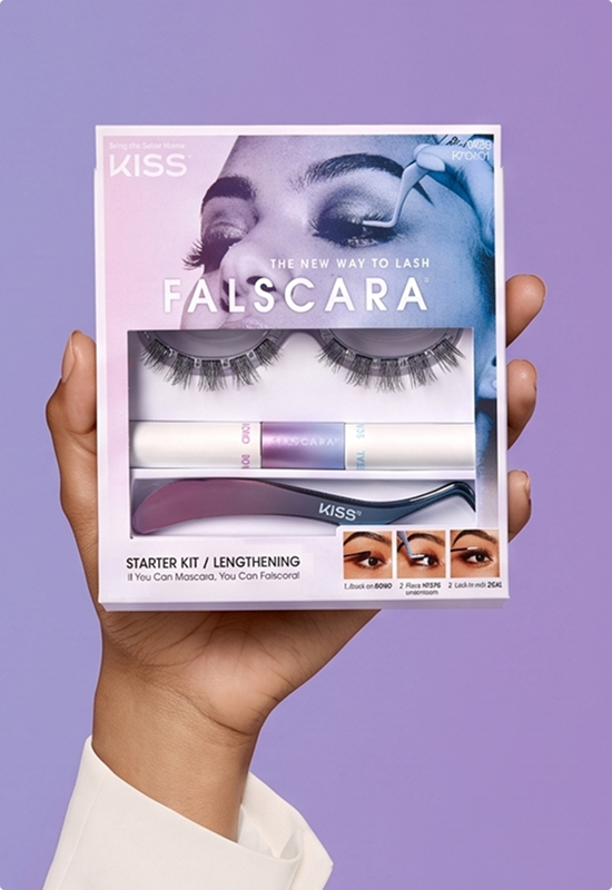
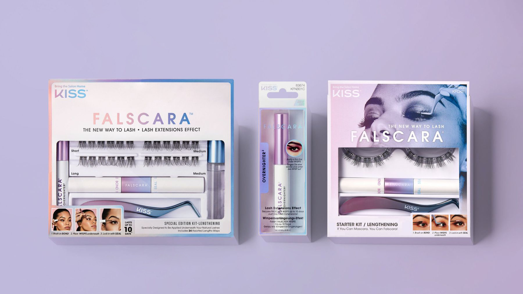
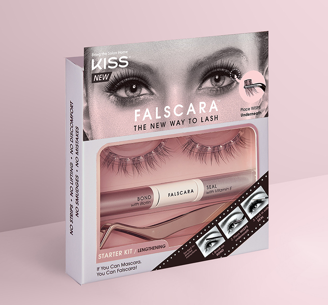
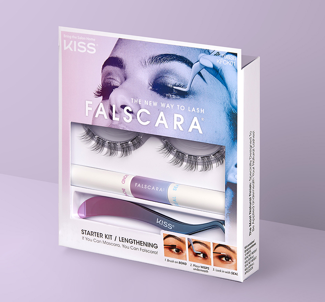
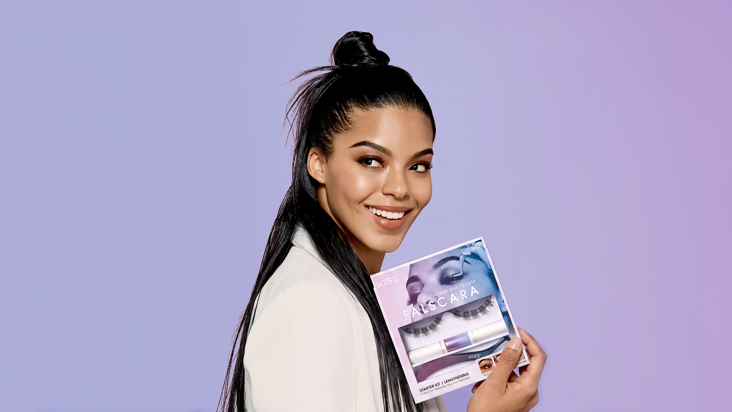
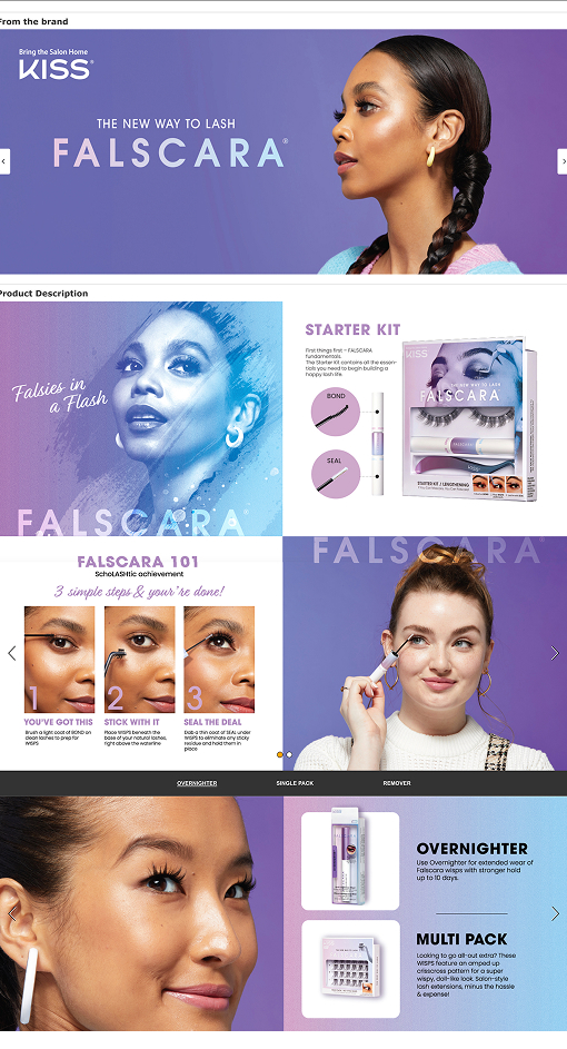
The original Falscara PDP was built around the 1.0 visual — dated color, dense copy, no clear hierarchy. The 2.0 redesign rebuilt the ATF around the application moment, introduced the new purple-and-blue palette, and simplified the how-to sequence into three scannable steps.
The goal: make the technique obvious before a single word gets read.
Self-initiated · 2026 · AI Art Direction & Production
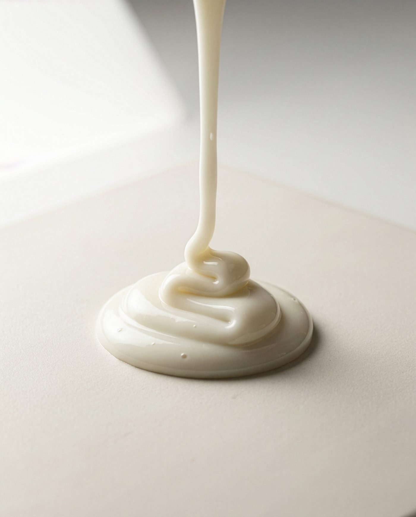
Texture is asked for late — a PDP module, an ingredient banner, a story frame — and a macro tabletop shoot cannot turn around in a day. Generative AI can, but it fails quietly: a smear can look beautiful and still lie about how the formula behaves. The question was whether a pipeline could hold a real product’s viscosity, finish and drag closely enough to pass as photography.
Photographed four real formulas as the viscosity standard, wrote one style-lock system so every frame shares the same lens, light and surface, then directed the generation and selection across stills and motion — reference-locked, not prompt-and-hope.
24 stills and 6 motion loops across four formulas, close enough to the reference to sit next to it — one afternoon, no shoot day.
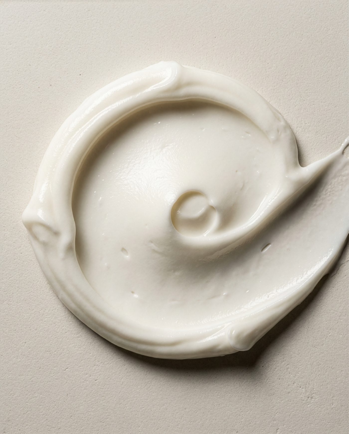
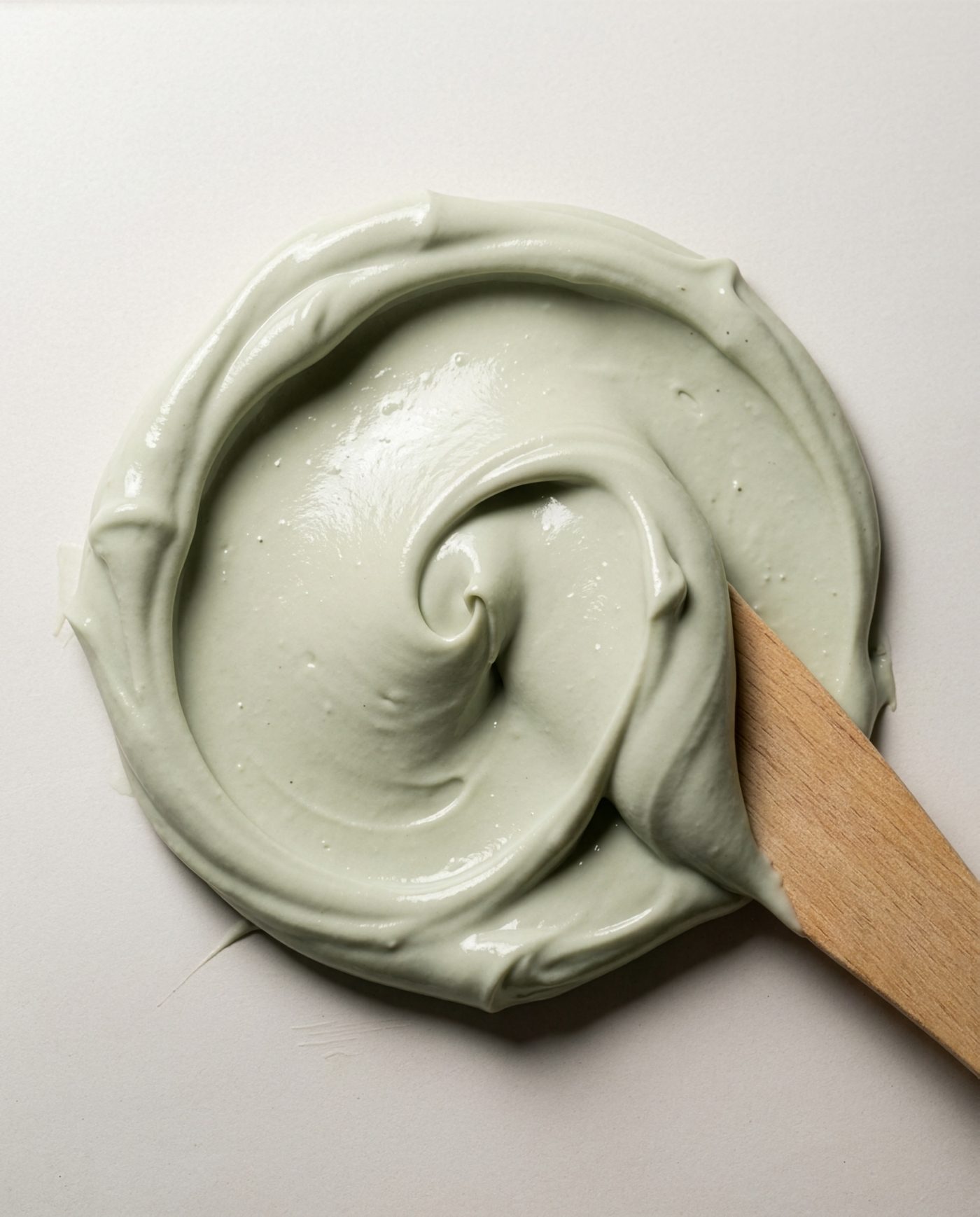
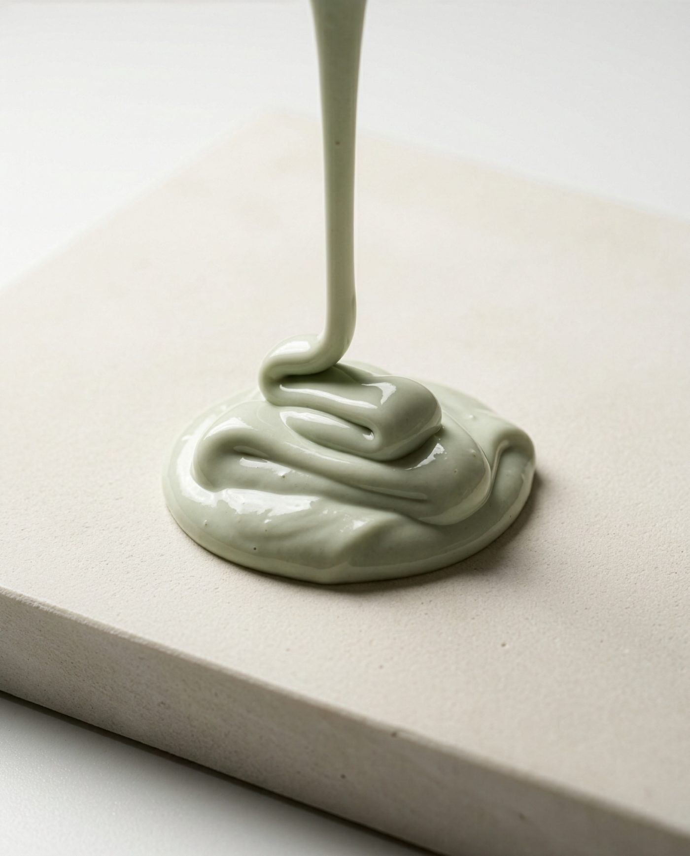
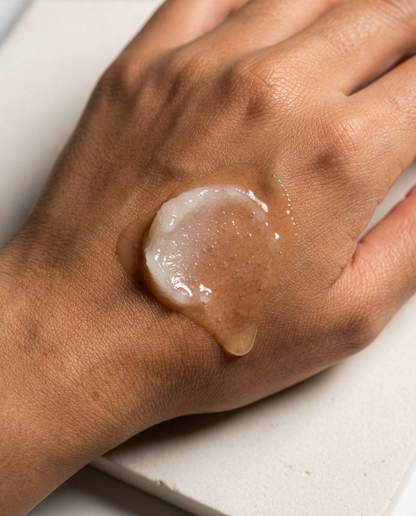
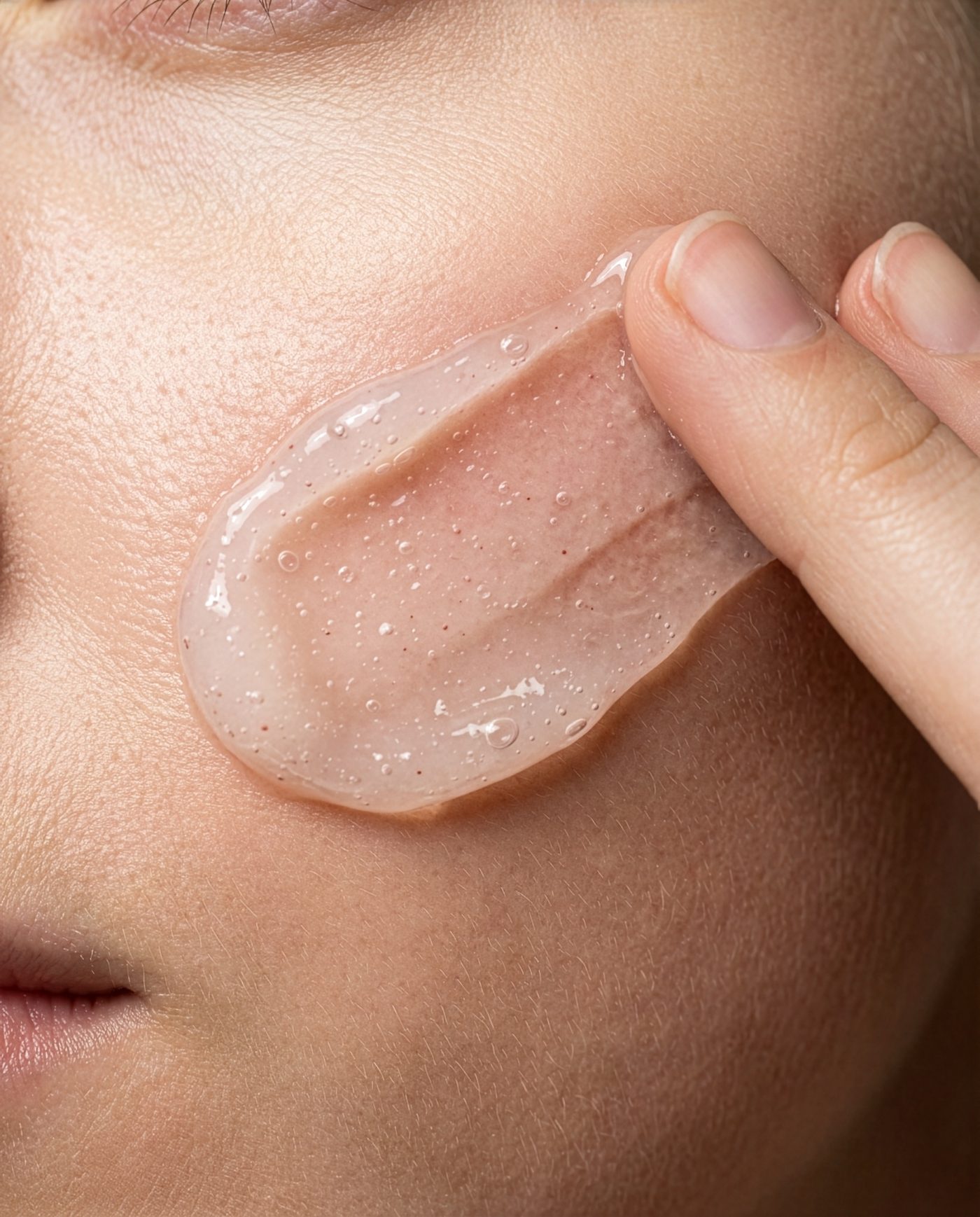
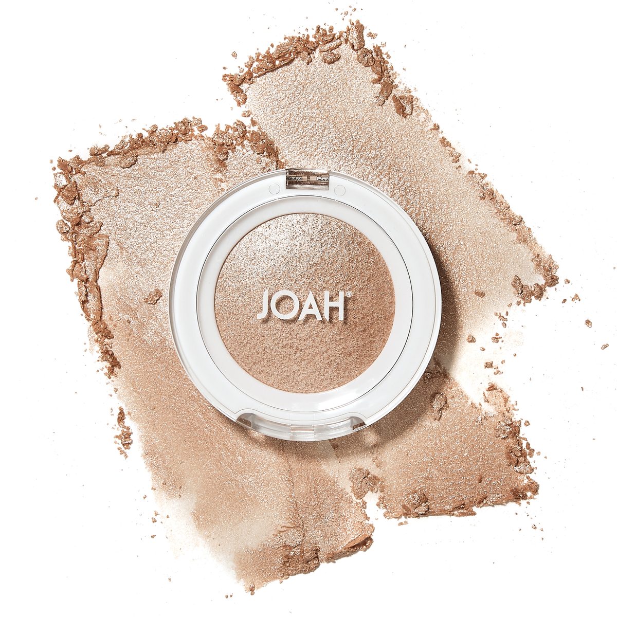
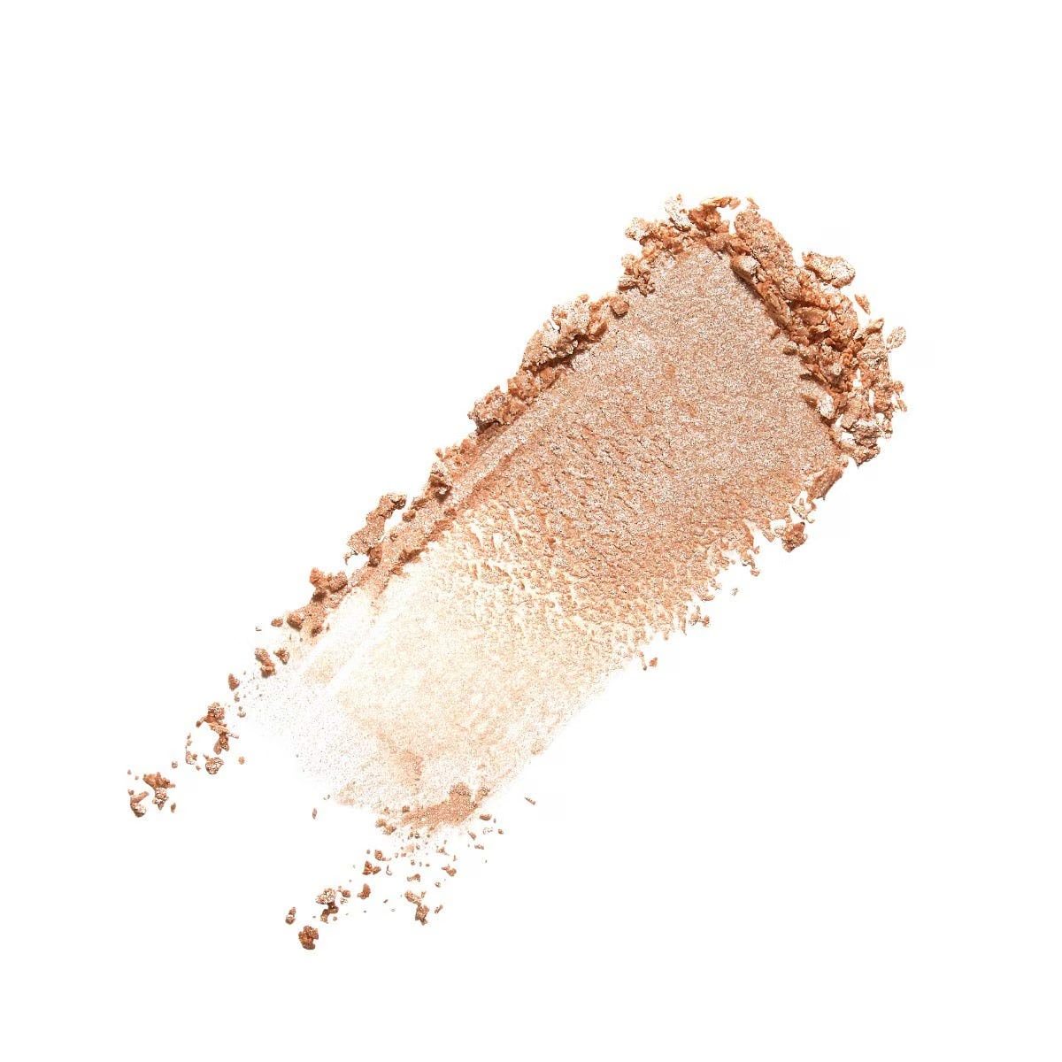
Every set starts with a photograph of a real formula on a white tile. That frame sets the truth: how thick it sits, how it catches light, how the edge tears when it drags. The AI is then directed to extend that exact behavior into shots a phone can’t take — the pour, the spatula pull, the cheek at macro range. Nothing invents a finish the reference doesn’t already prove.
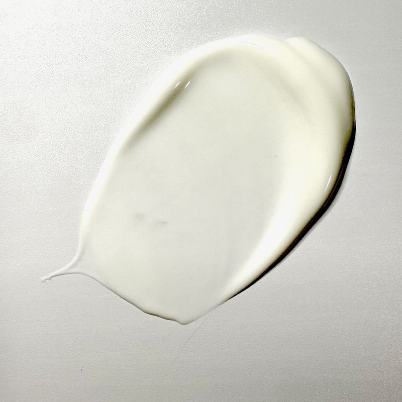
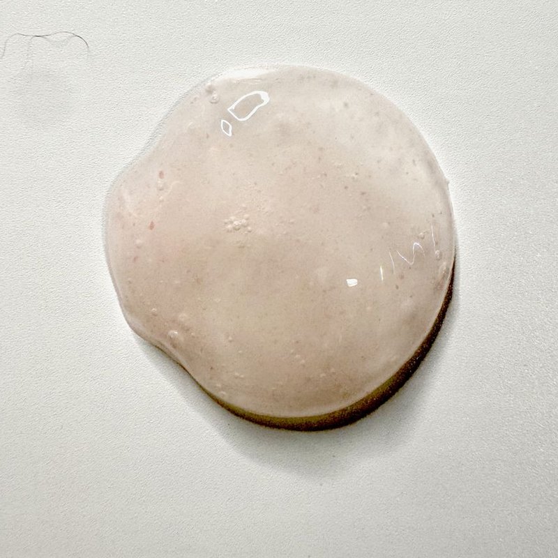
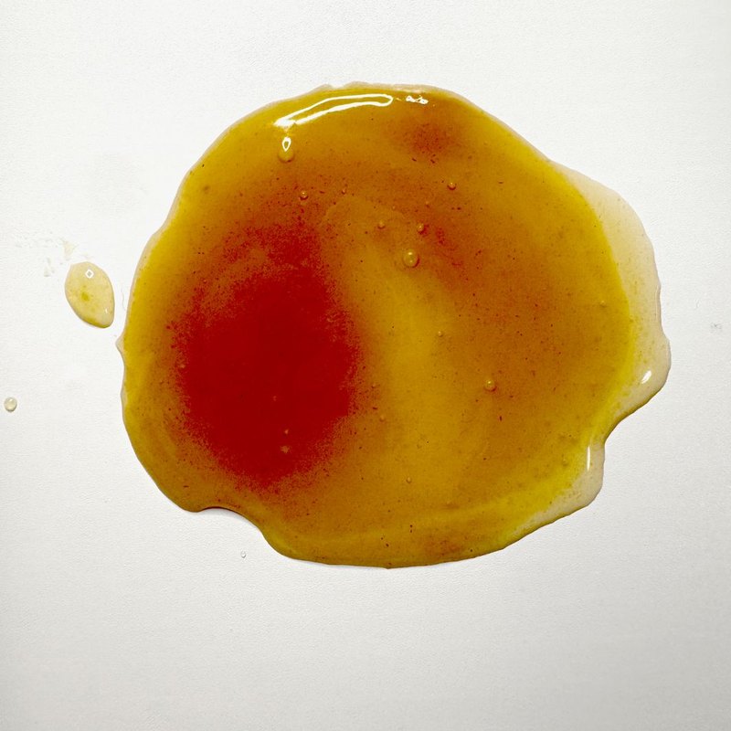
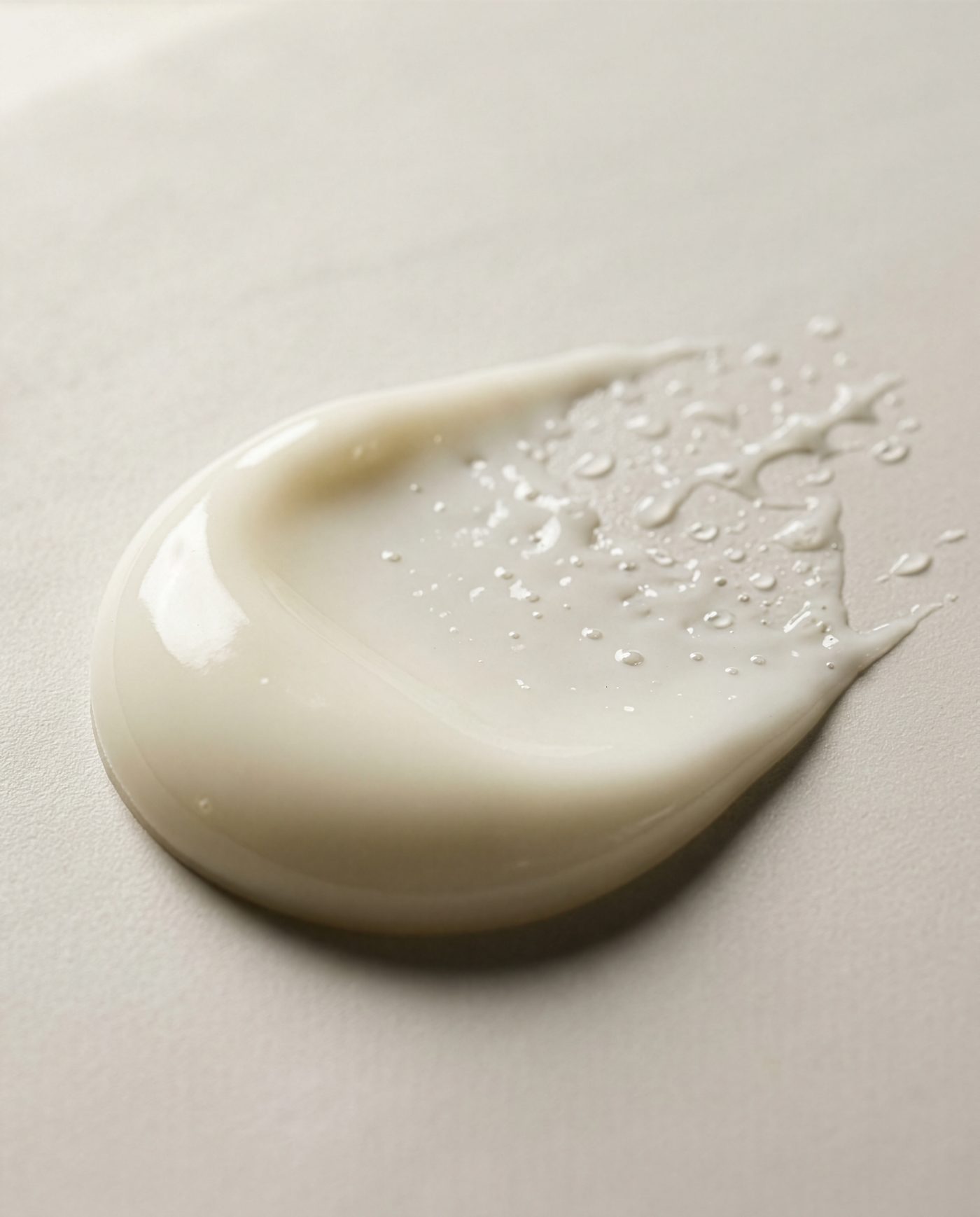
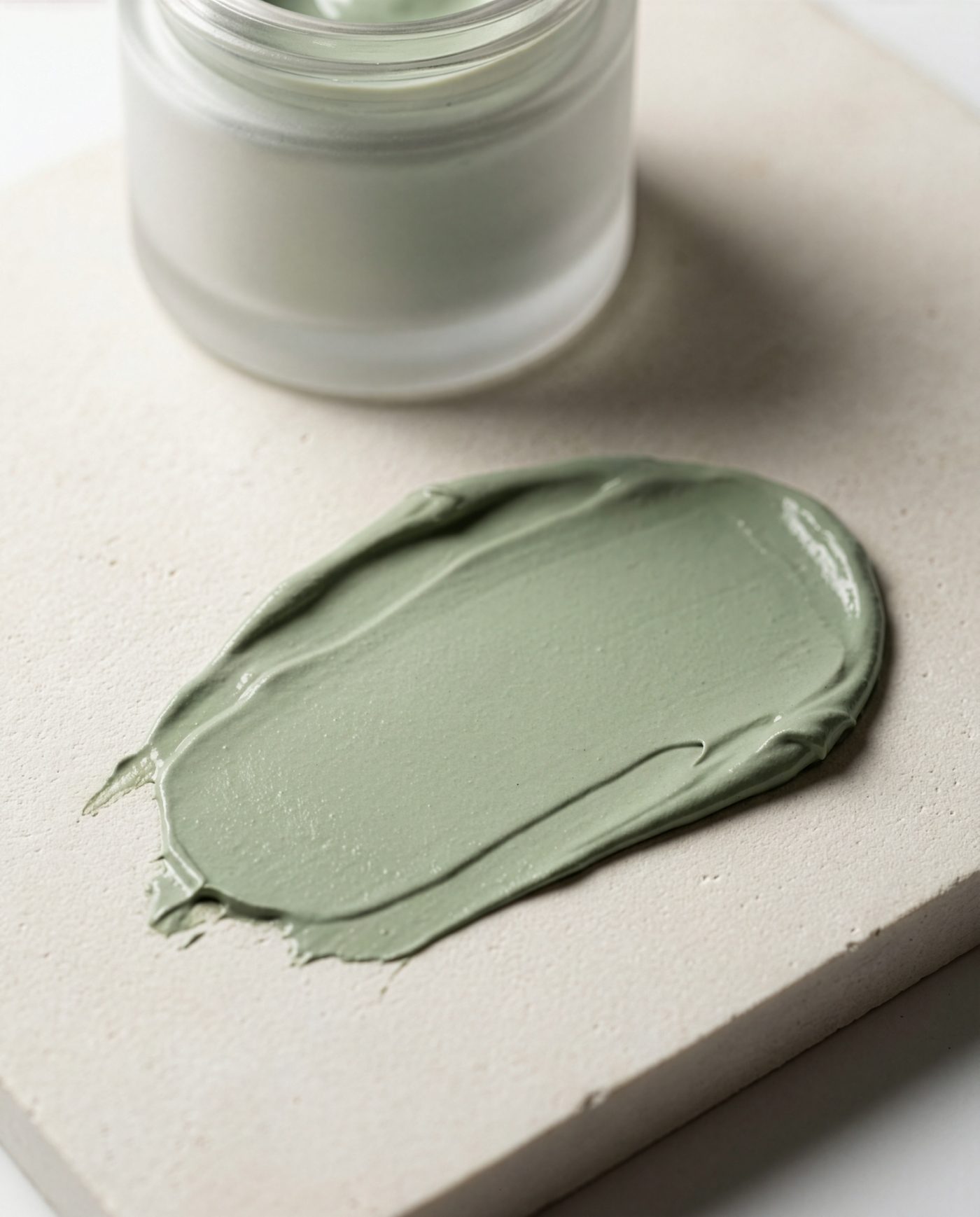
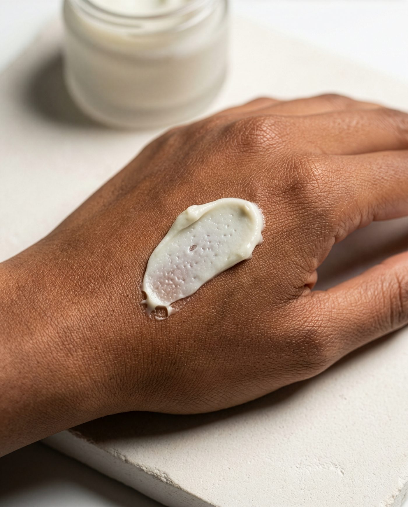
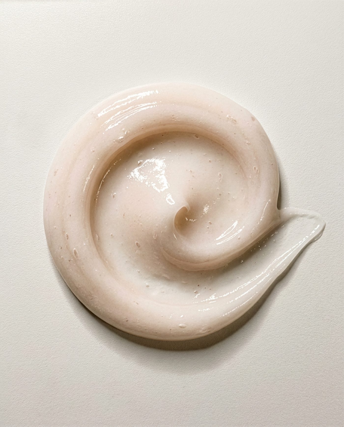
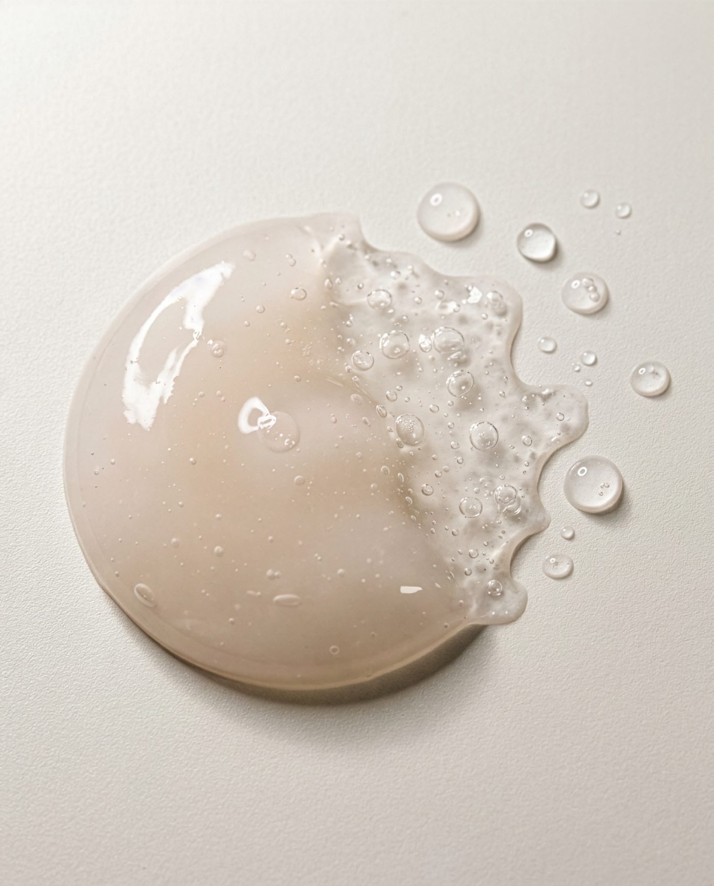
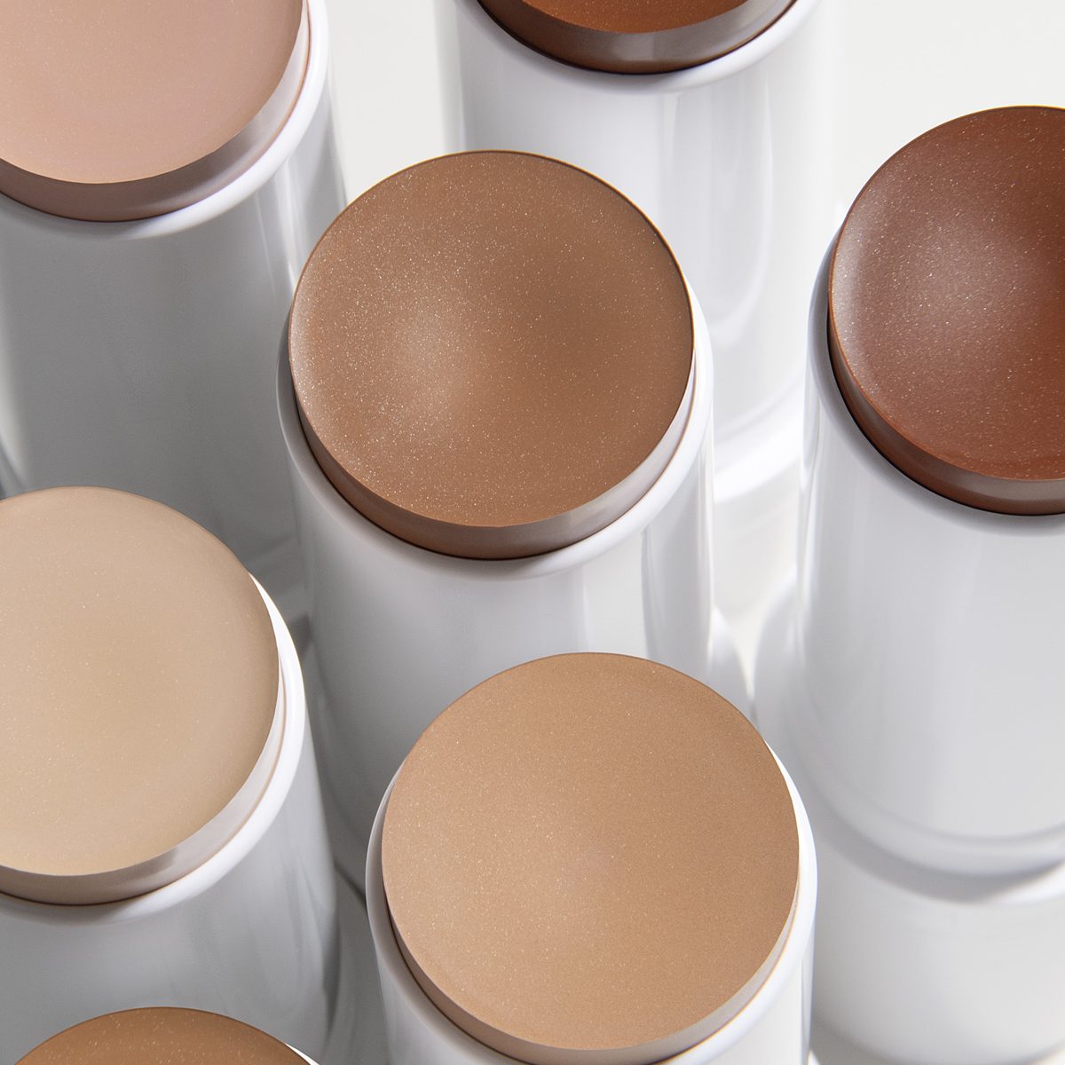
Four formulas photographed on the same tile under the same window light — a rich cream, a cooling primer, a hydrating jelly and an overnight oil pack. These are the viscosity standard every generated frame is matched against.
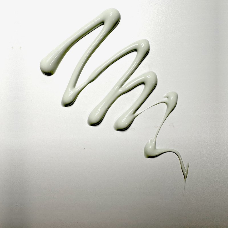
A dense, whipped moisturizer. The reference fixes how the peaks hold and where the satin sheen breaks.
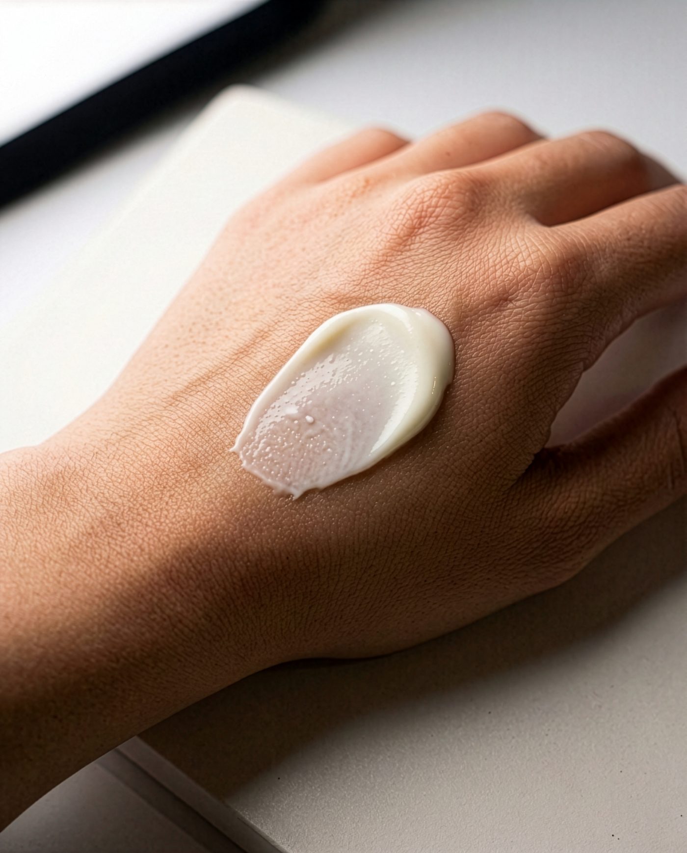
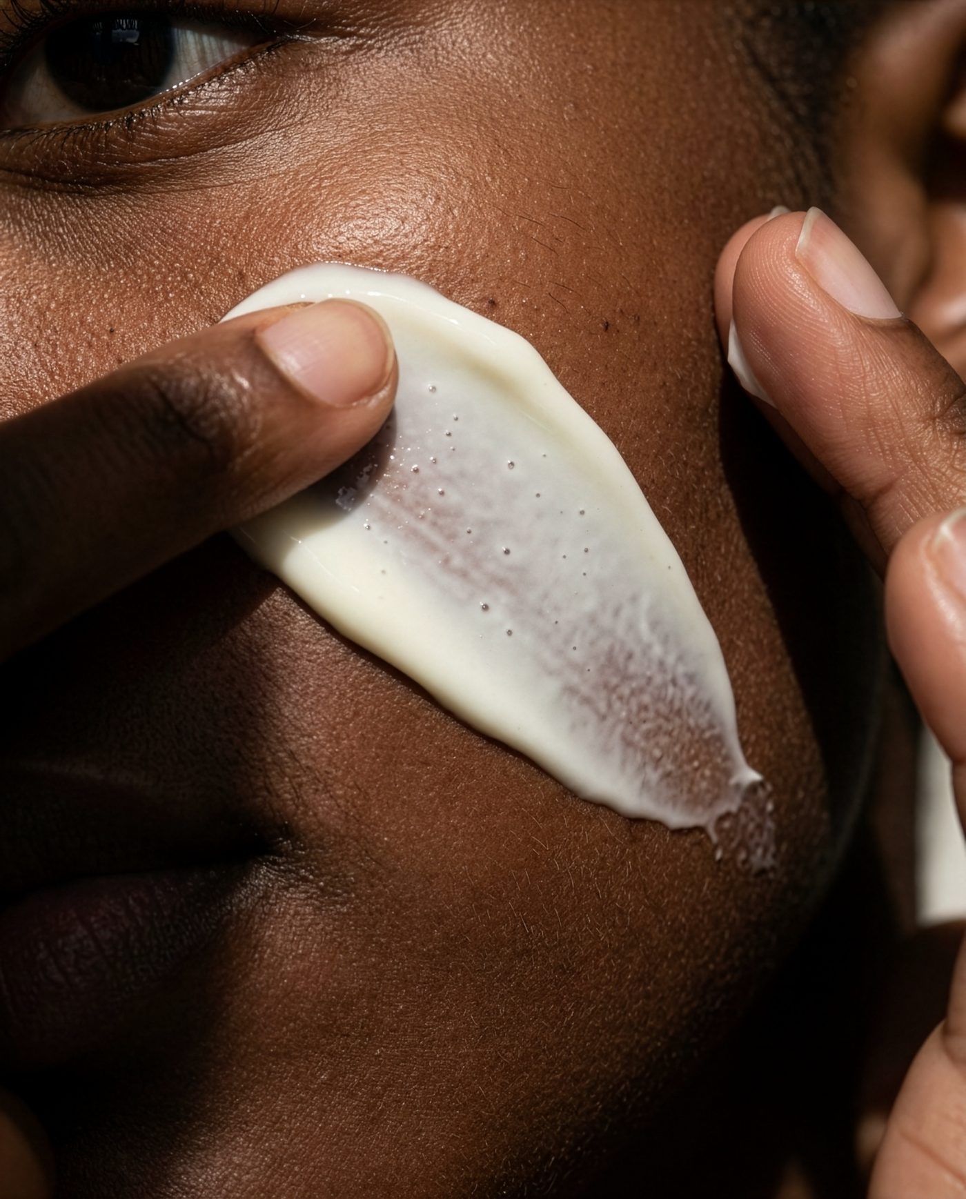
A clay-toned cooling primer — matte, heavier than it looks. The drag marks keep it from reading as whipped cream.
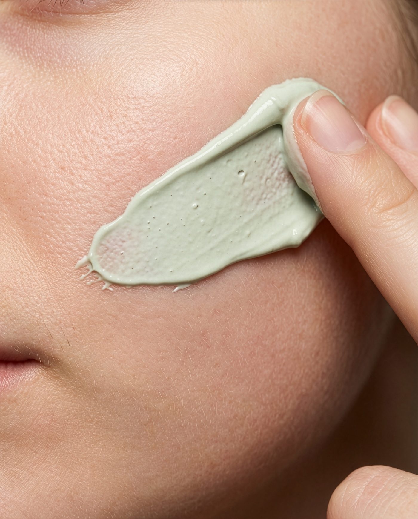
A translucent jelly that breaks into water beads. Refraction and a wet edge keep it reading as gel, never cream.
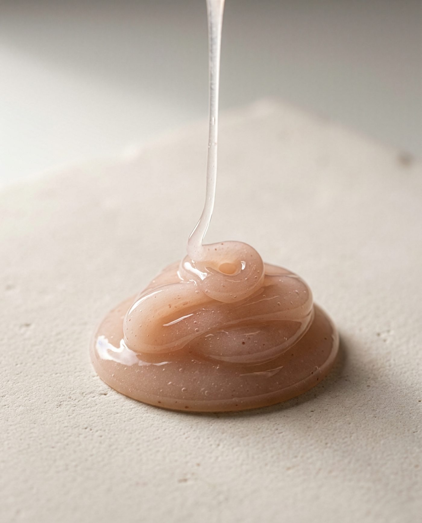
A thick amber sleeping pack, glossy and slow. The reference sets how far the specular can go before it turns to syrup.
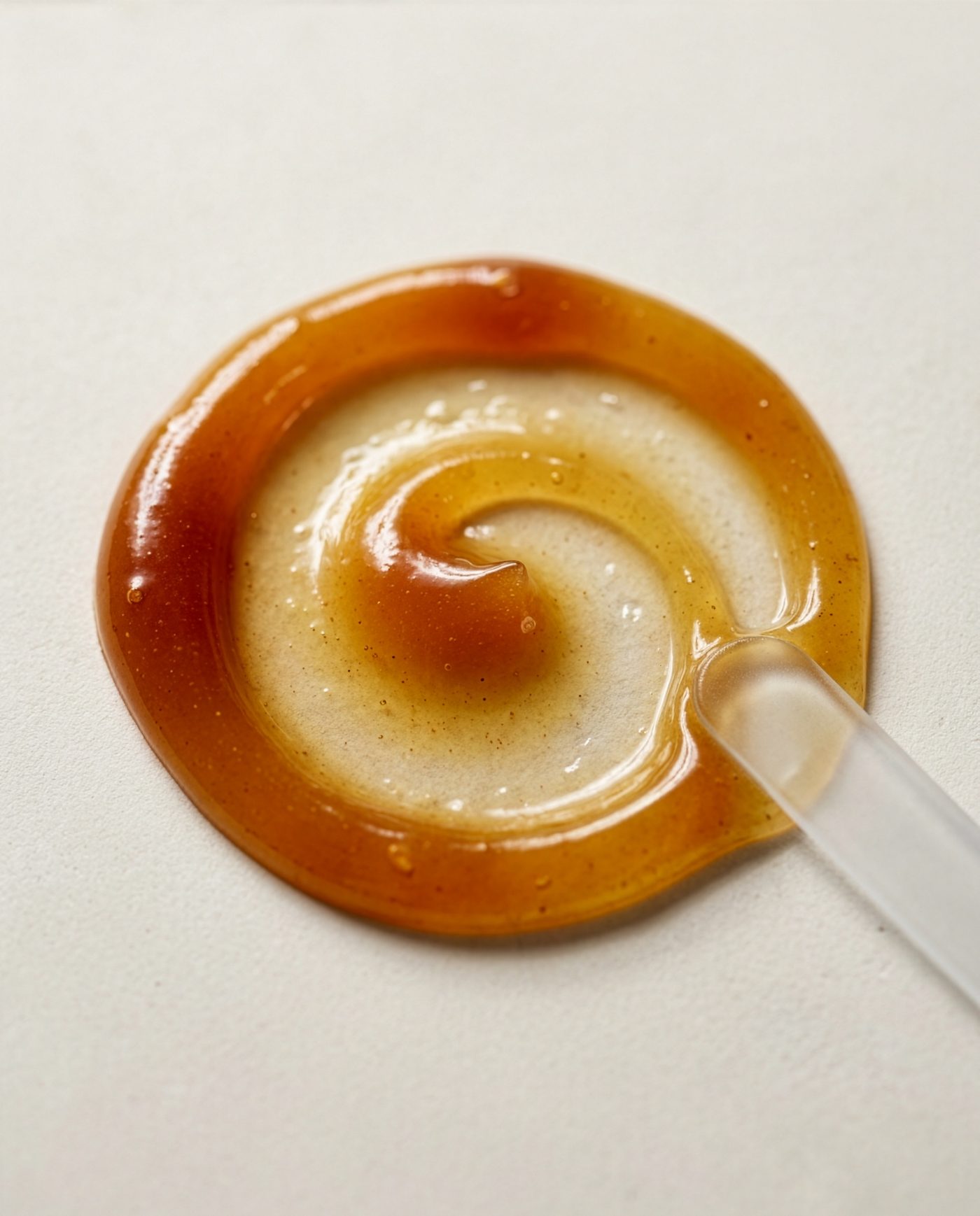
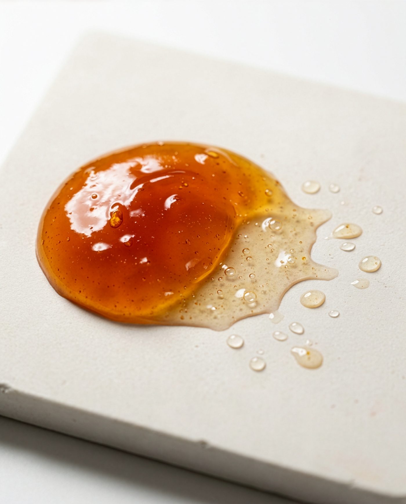
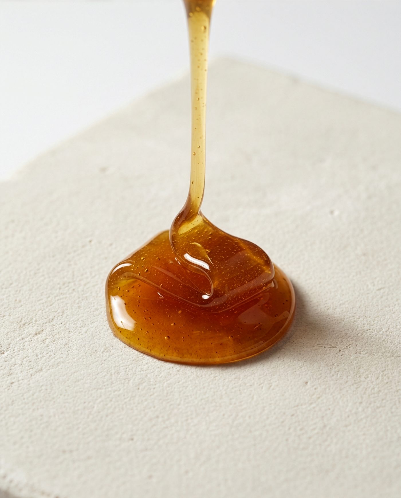
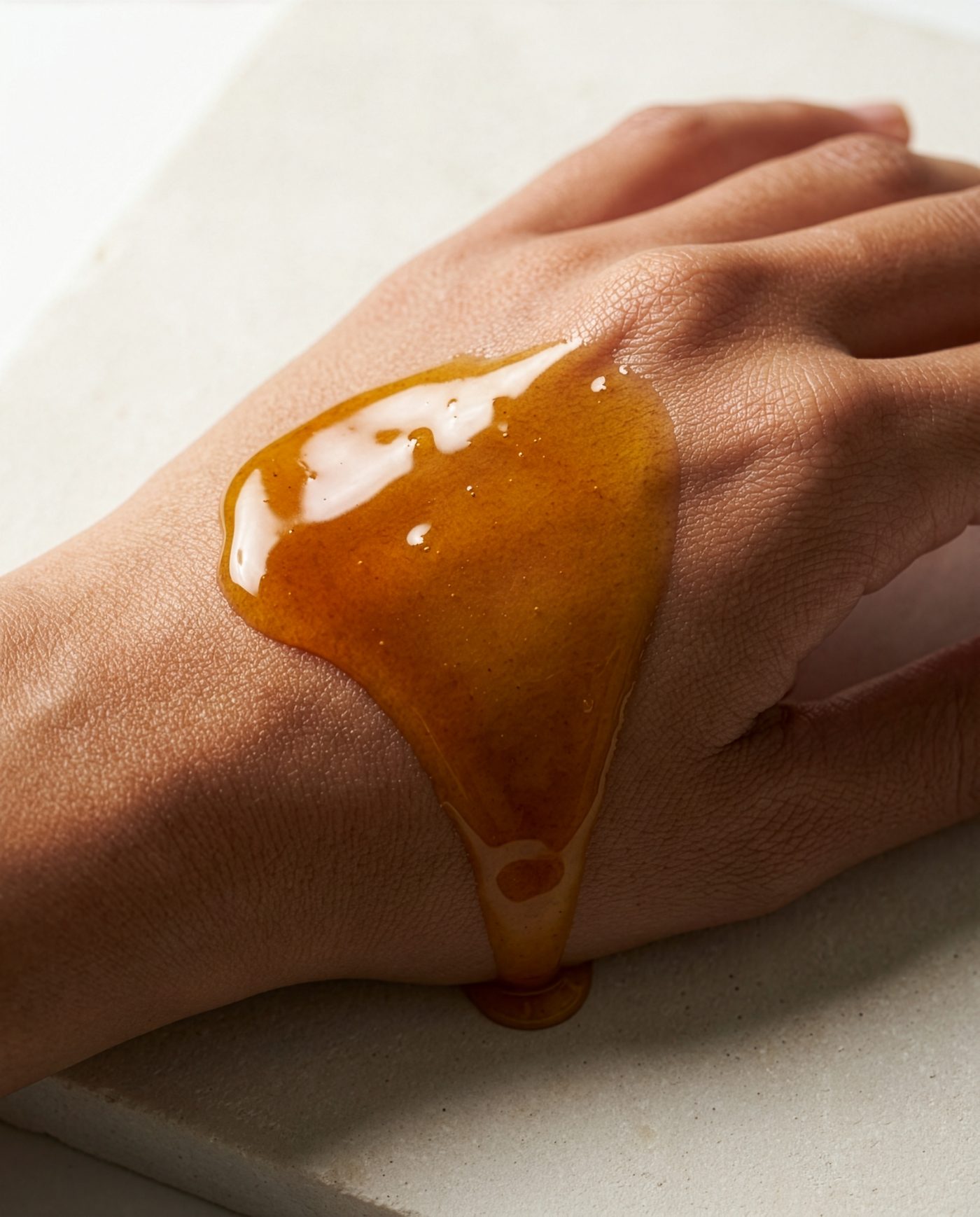
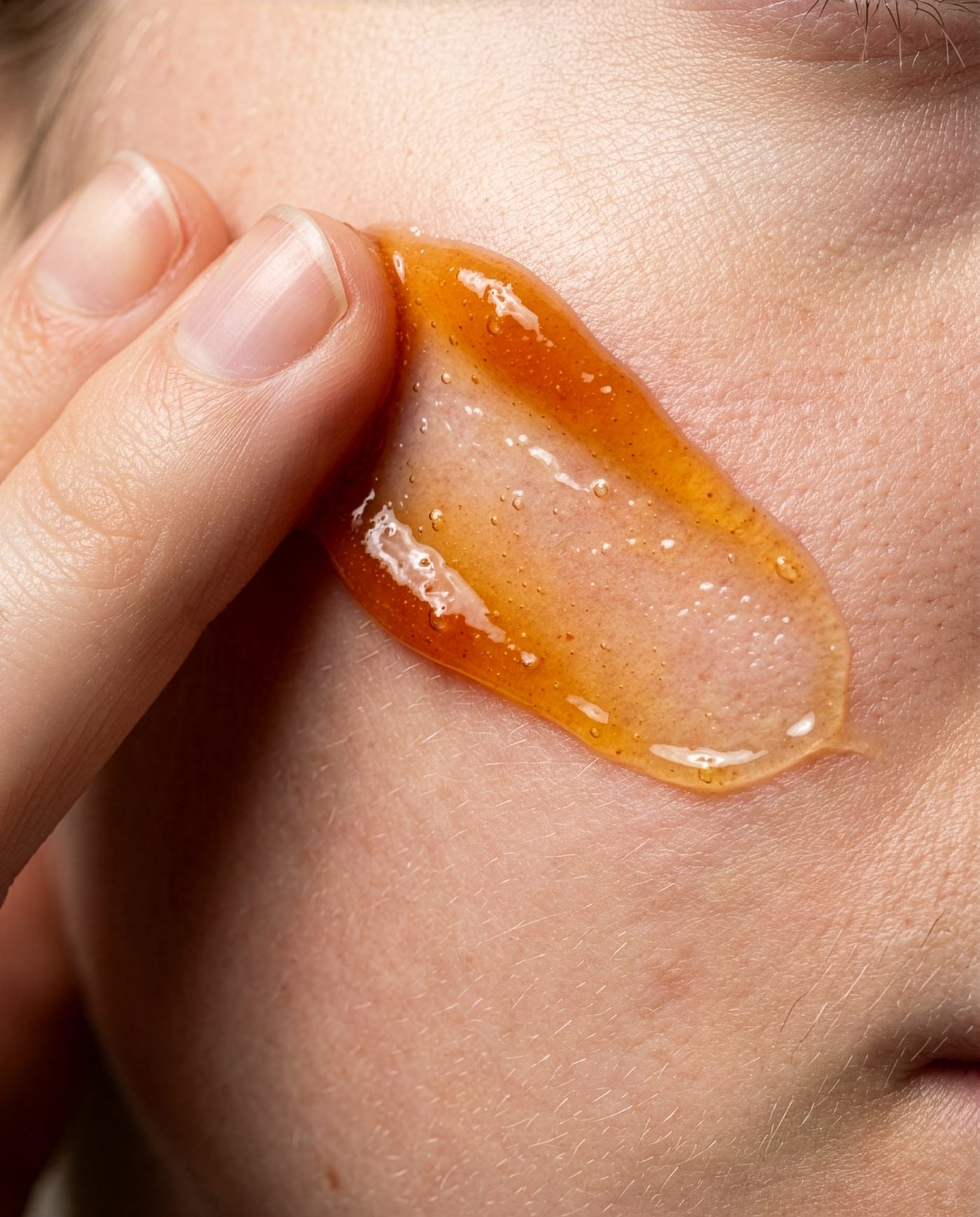
The same four formulas as flat swatch fields — the frames a PDP, an A+ module or an ingredient banner actually needs.
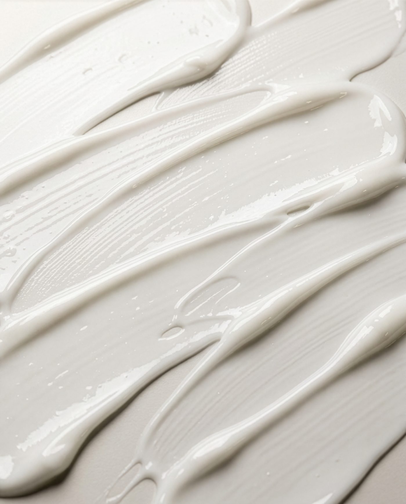
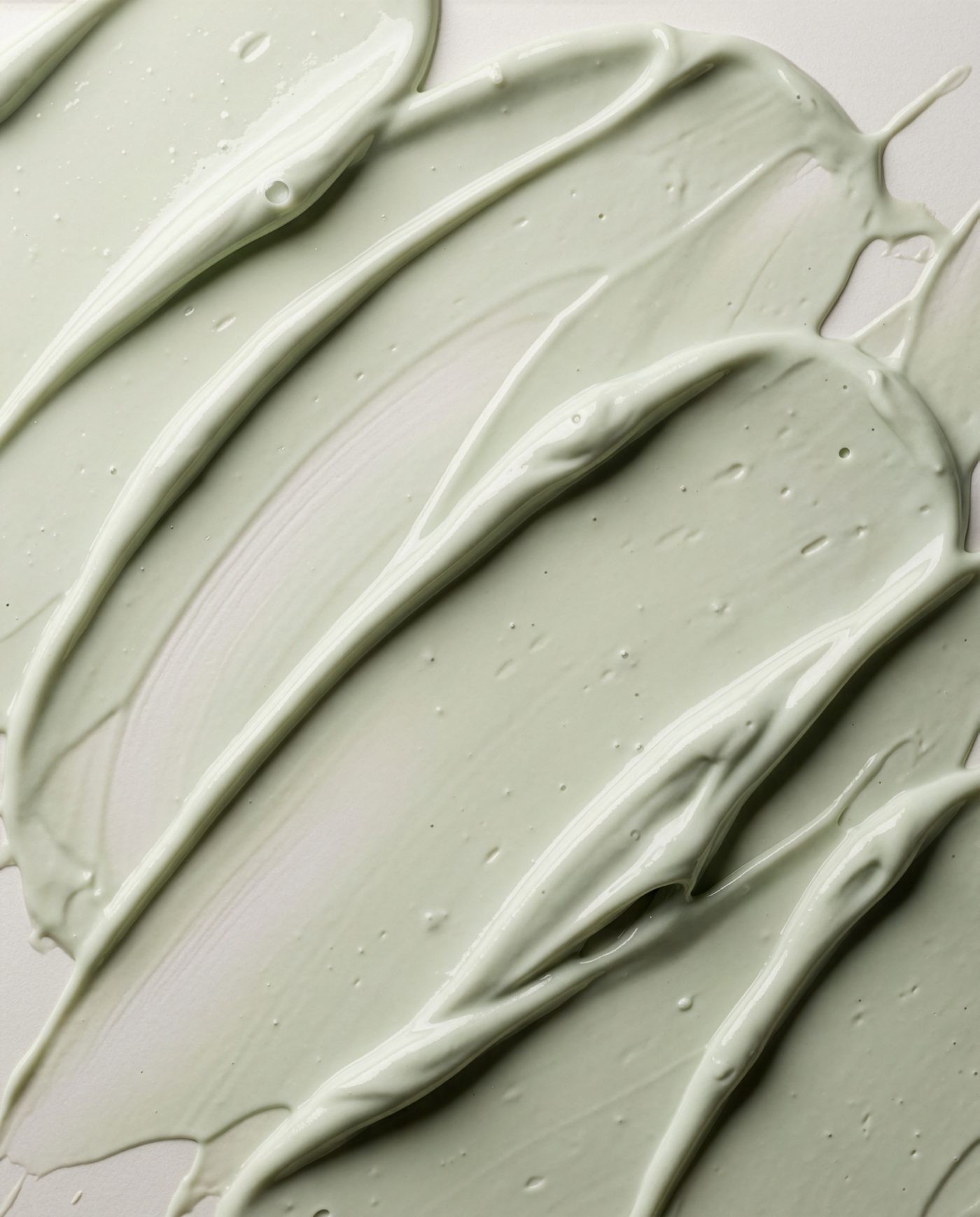
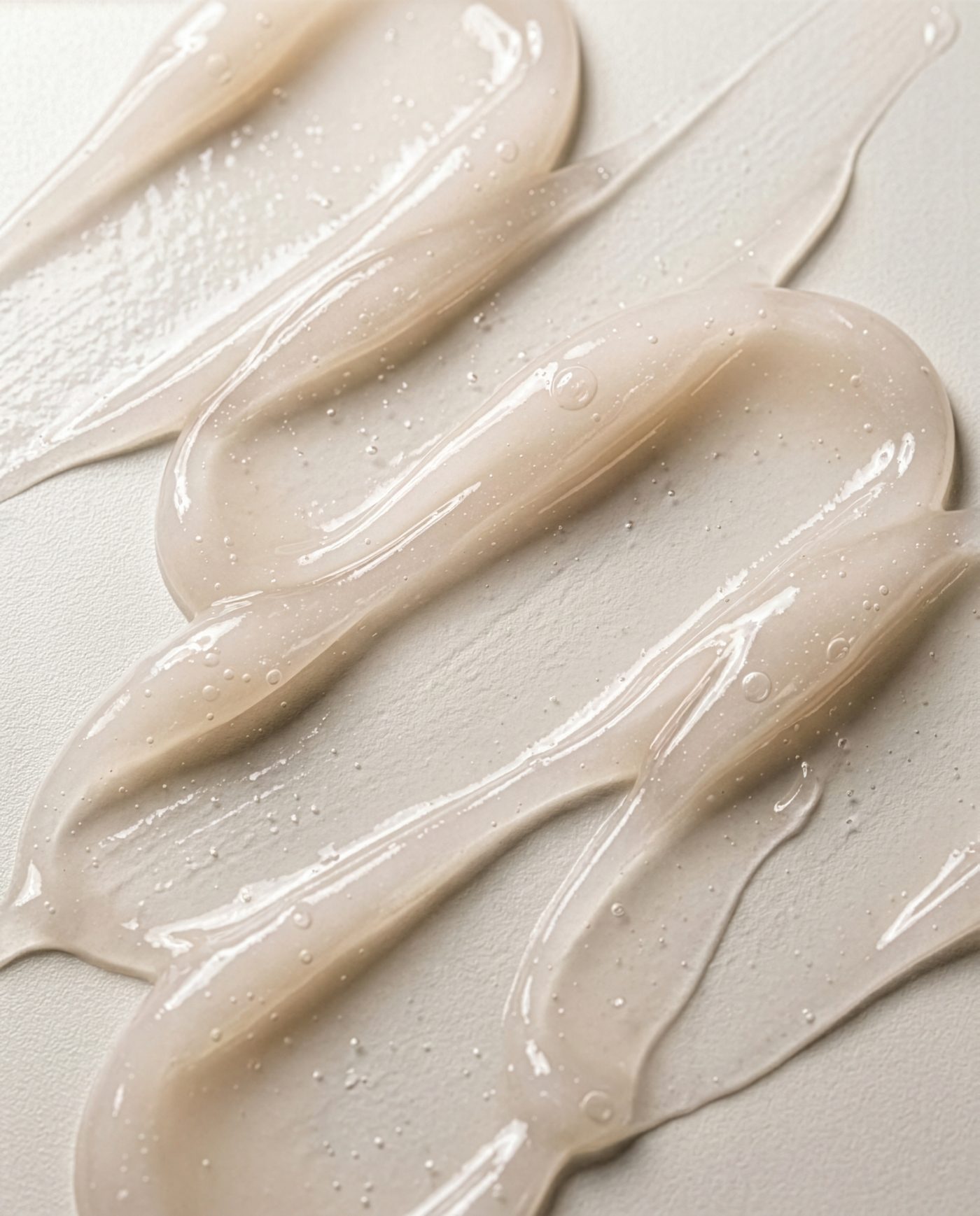
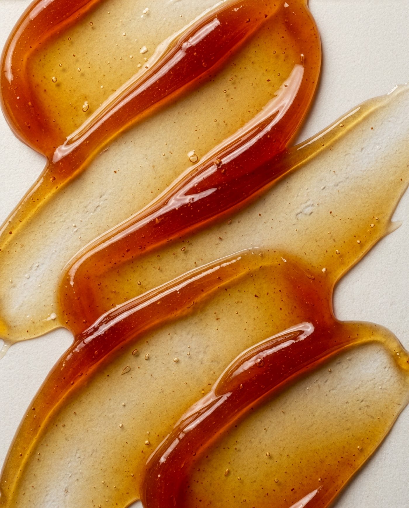
Photographed, then generated — now touchable. The swatch fields above run as a live shader. Drag through them and each formula answers at its own viscosity: the cream holds the smear, the primer drags, the jelly gives back part of the push and keeps the rest, the oil pack stretches the farthest and stays glossy.
Better by touchScan to feel the texture on your phone
KISS · 2021 · Brand Identity & Packaging & Digital
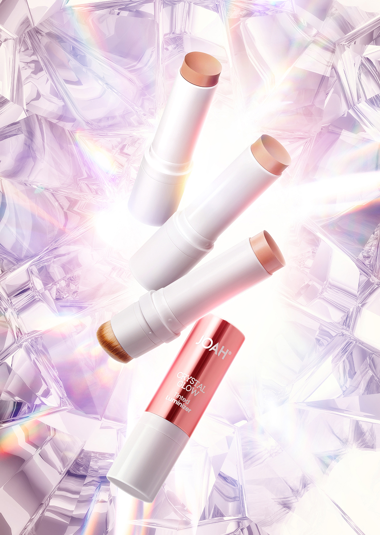
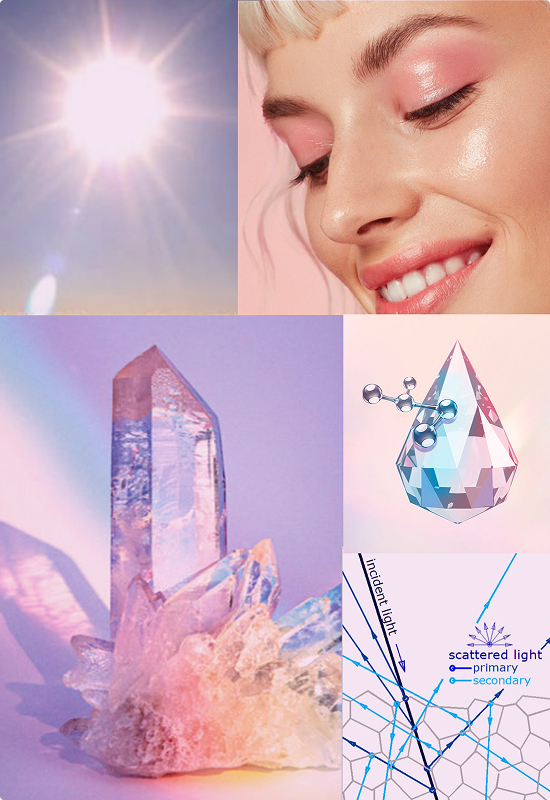
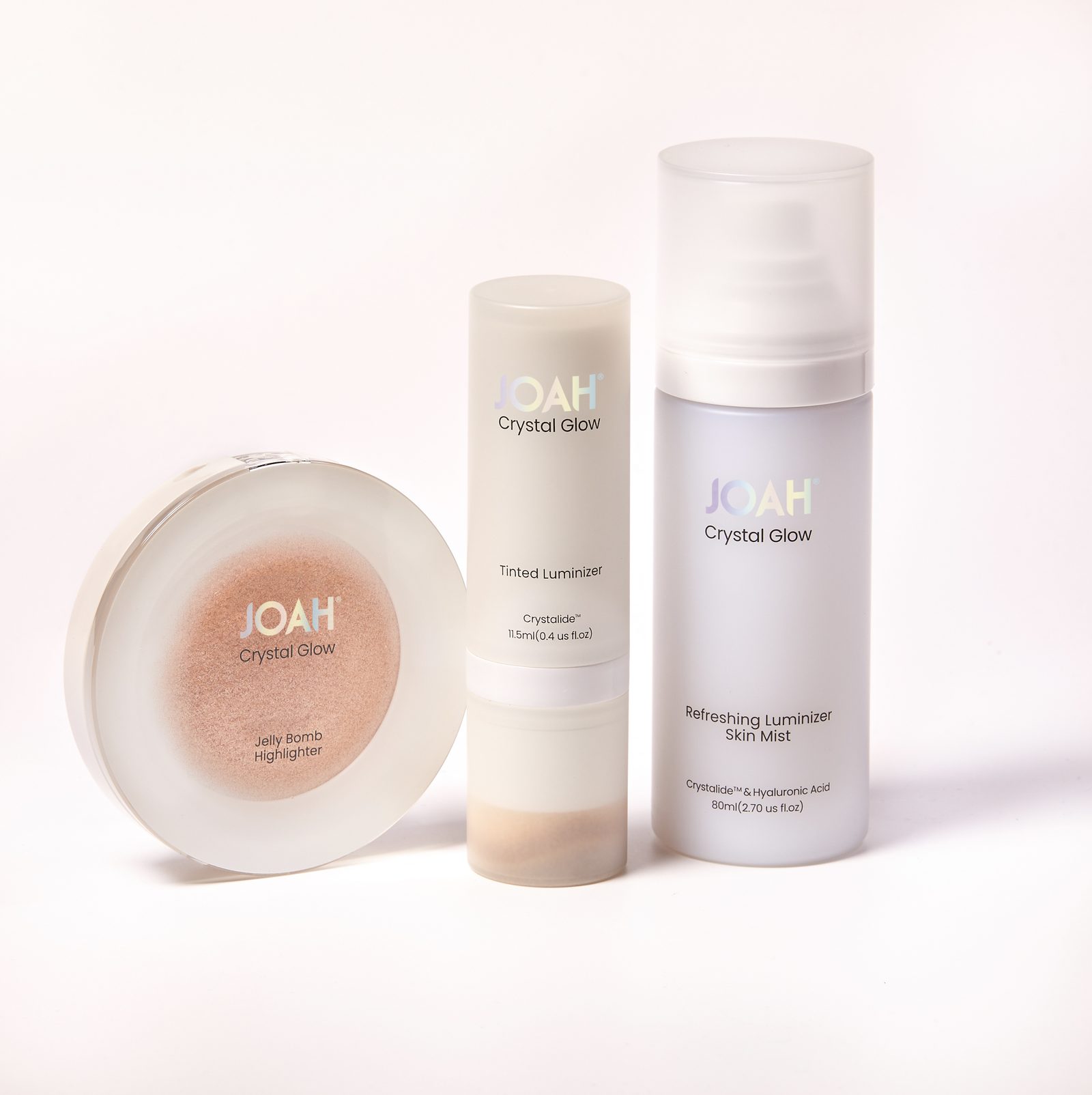
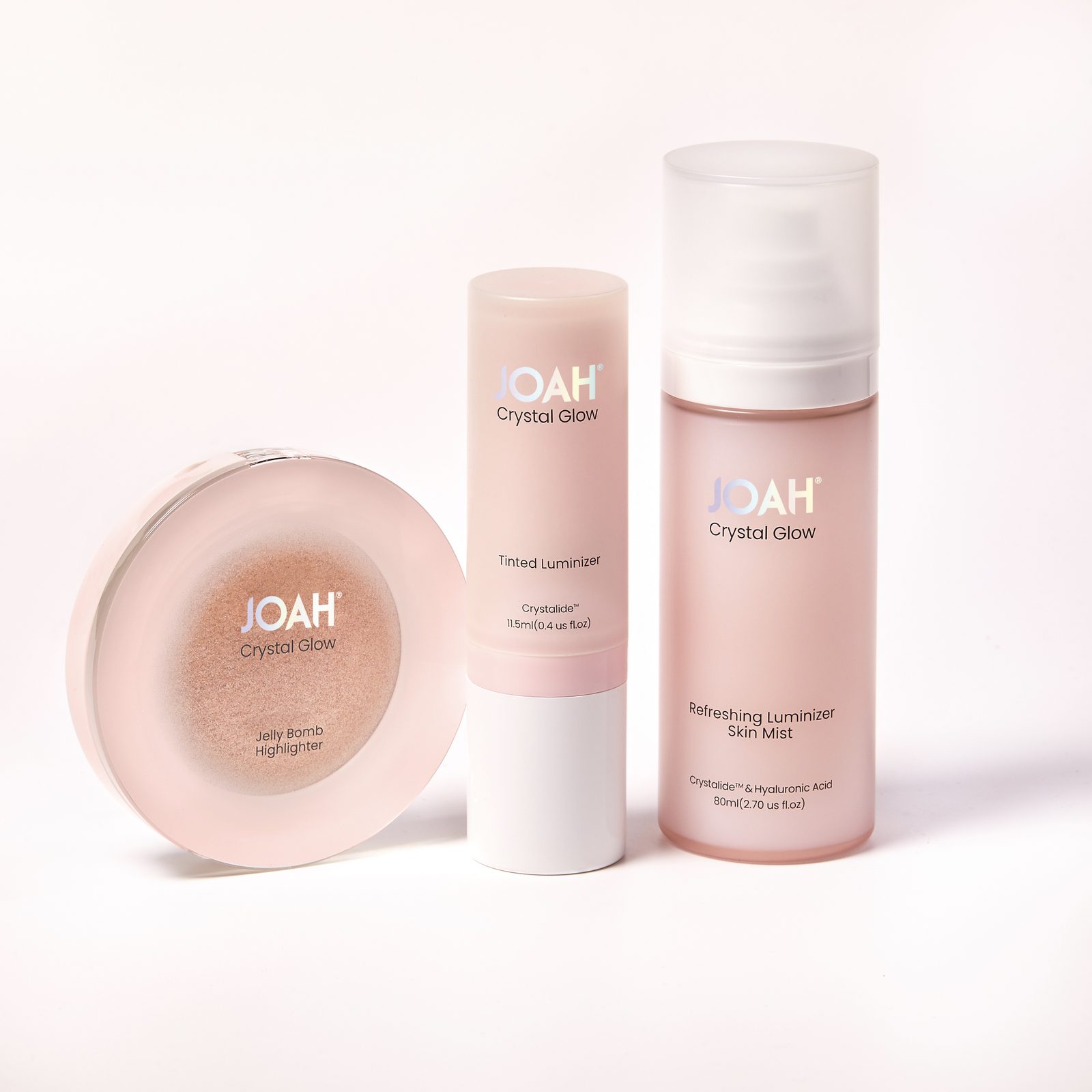
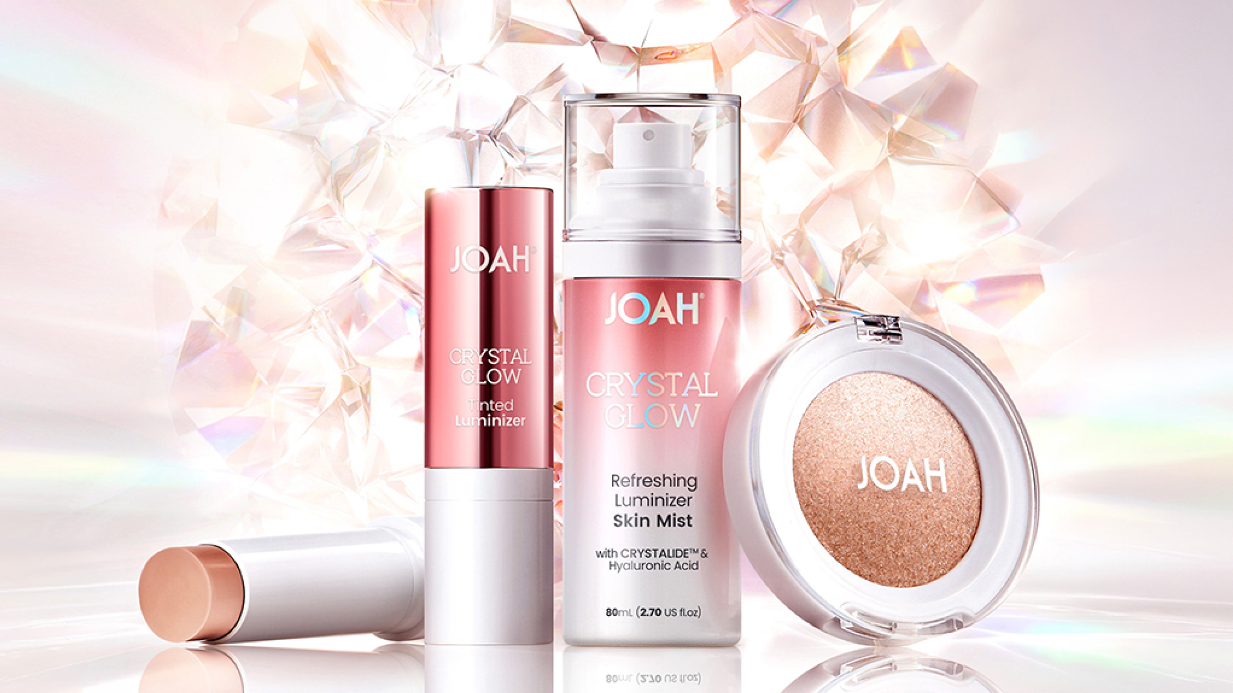
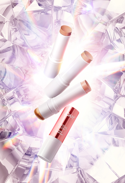
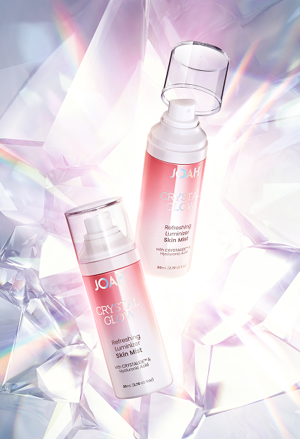
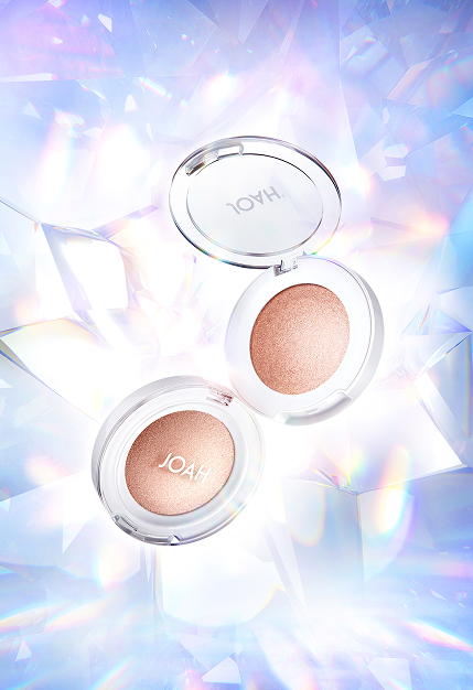
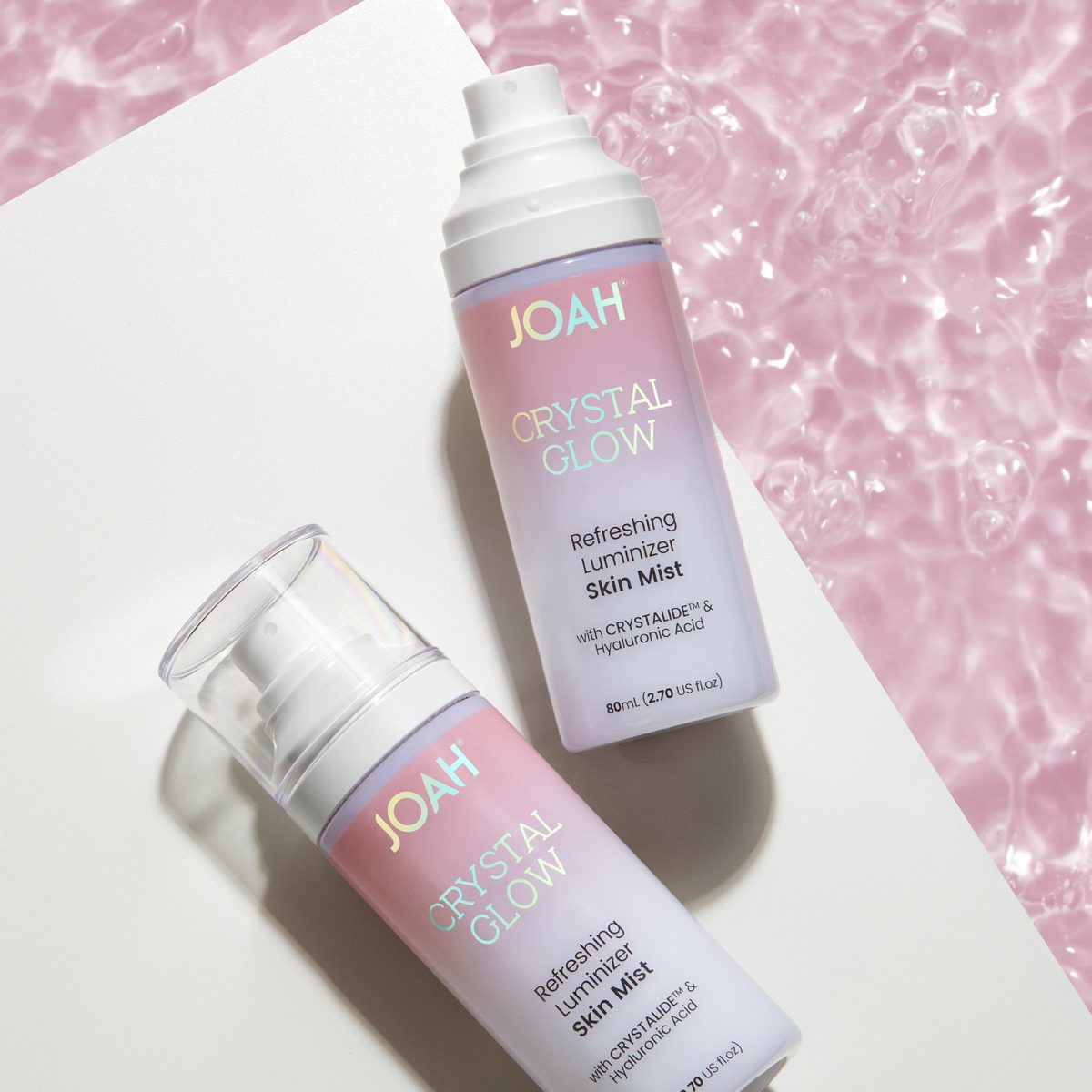
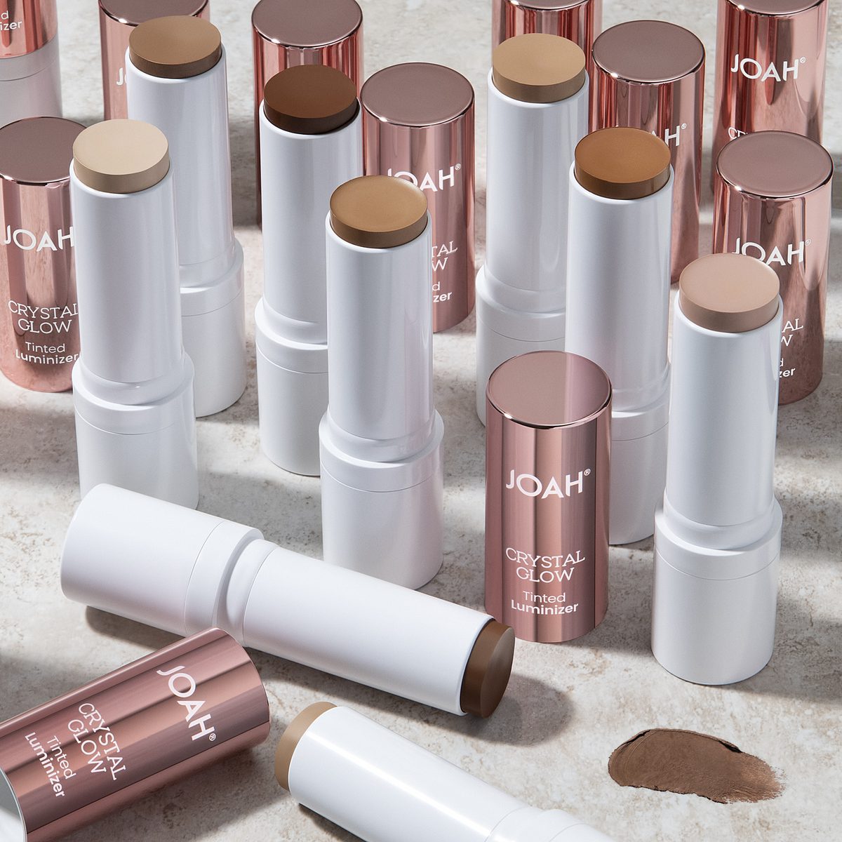
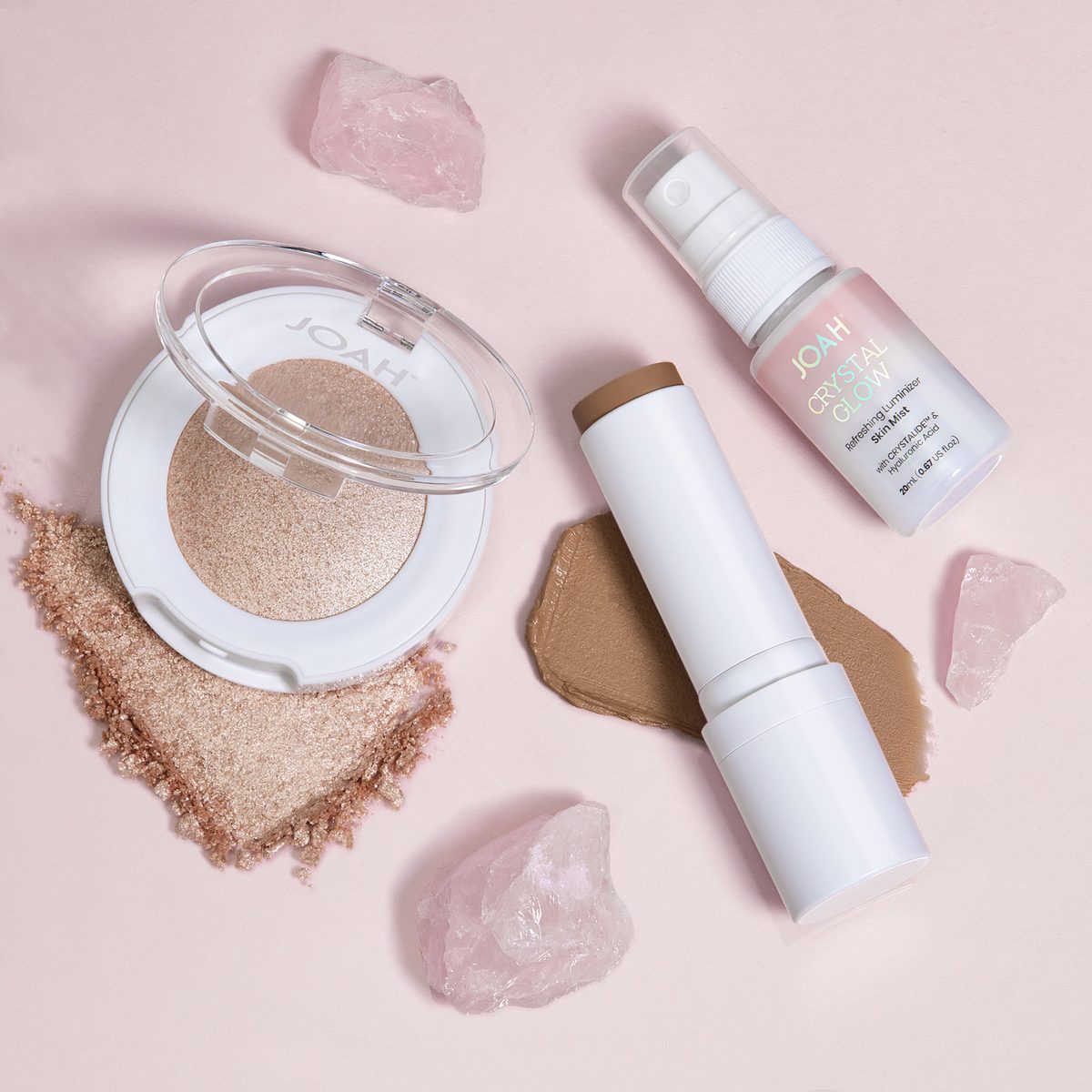
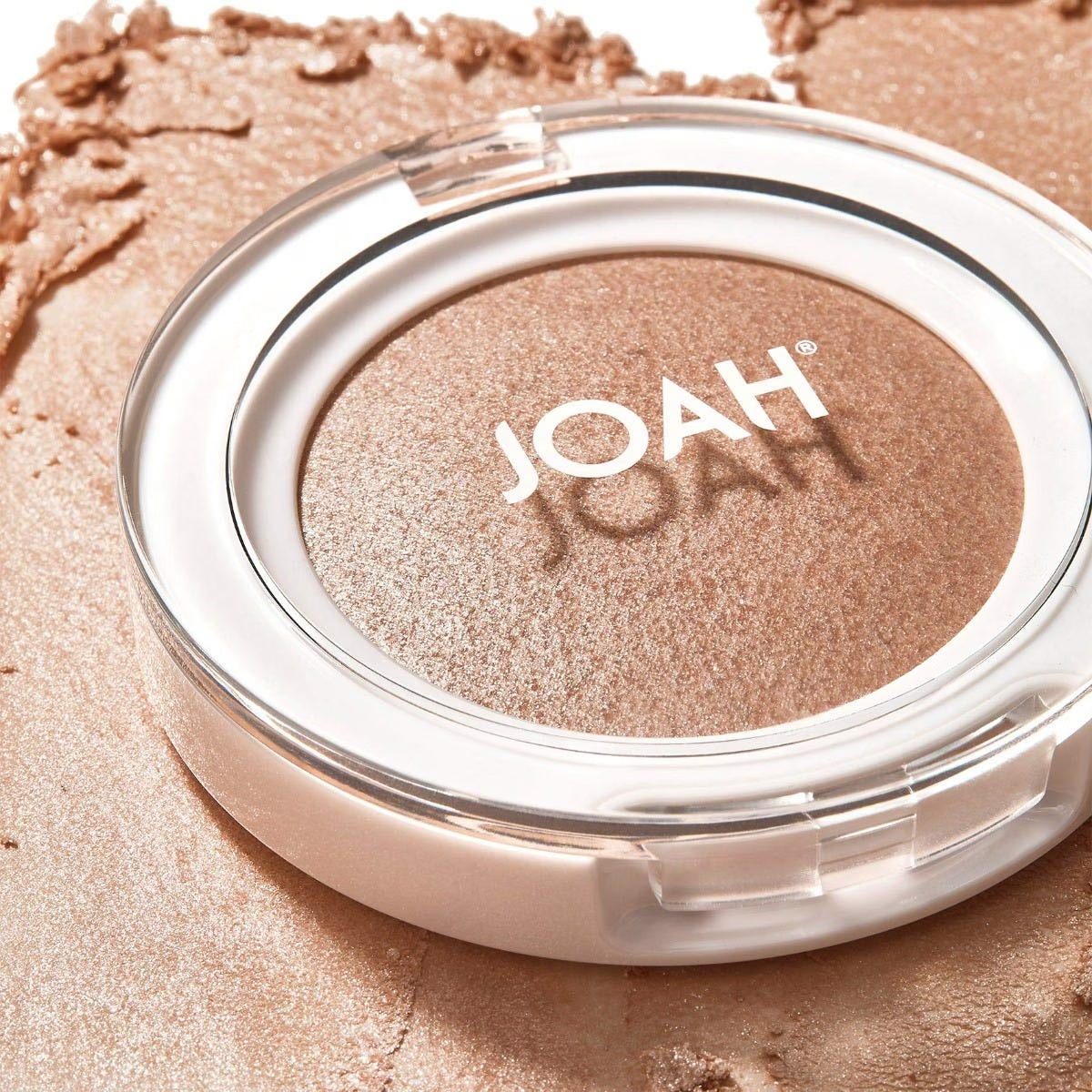
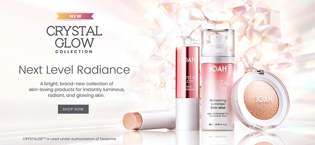
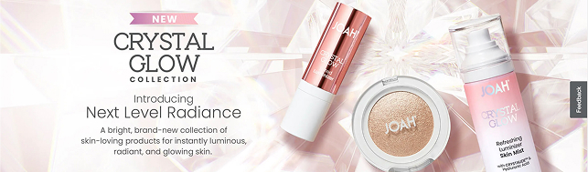
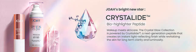
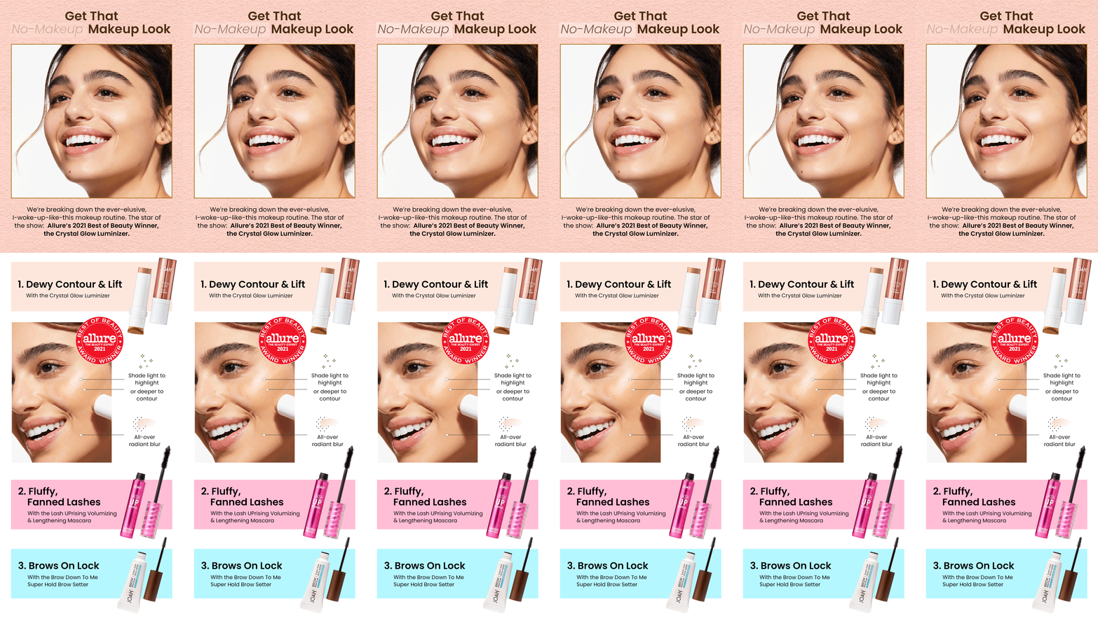
KISS was launching a glow collection built on Crystalide peptide — a science story that had to read as beauty, not biotech, at a mass-retail price point. The packaging had one job: make an invisible ingredient visible.
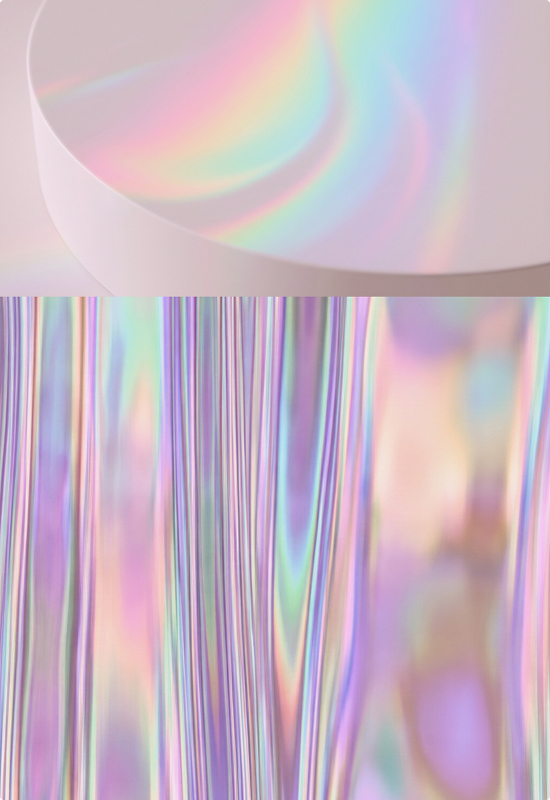
Led identity, packaging, and digital. Built the system around the peptide's actual behavior — scattered, iridescent light. Holographic crystal as the hero surface, iridescent pink-to-white packaging, and a banner system that carried the language through D2C.
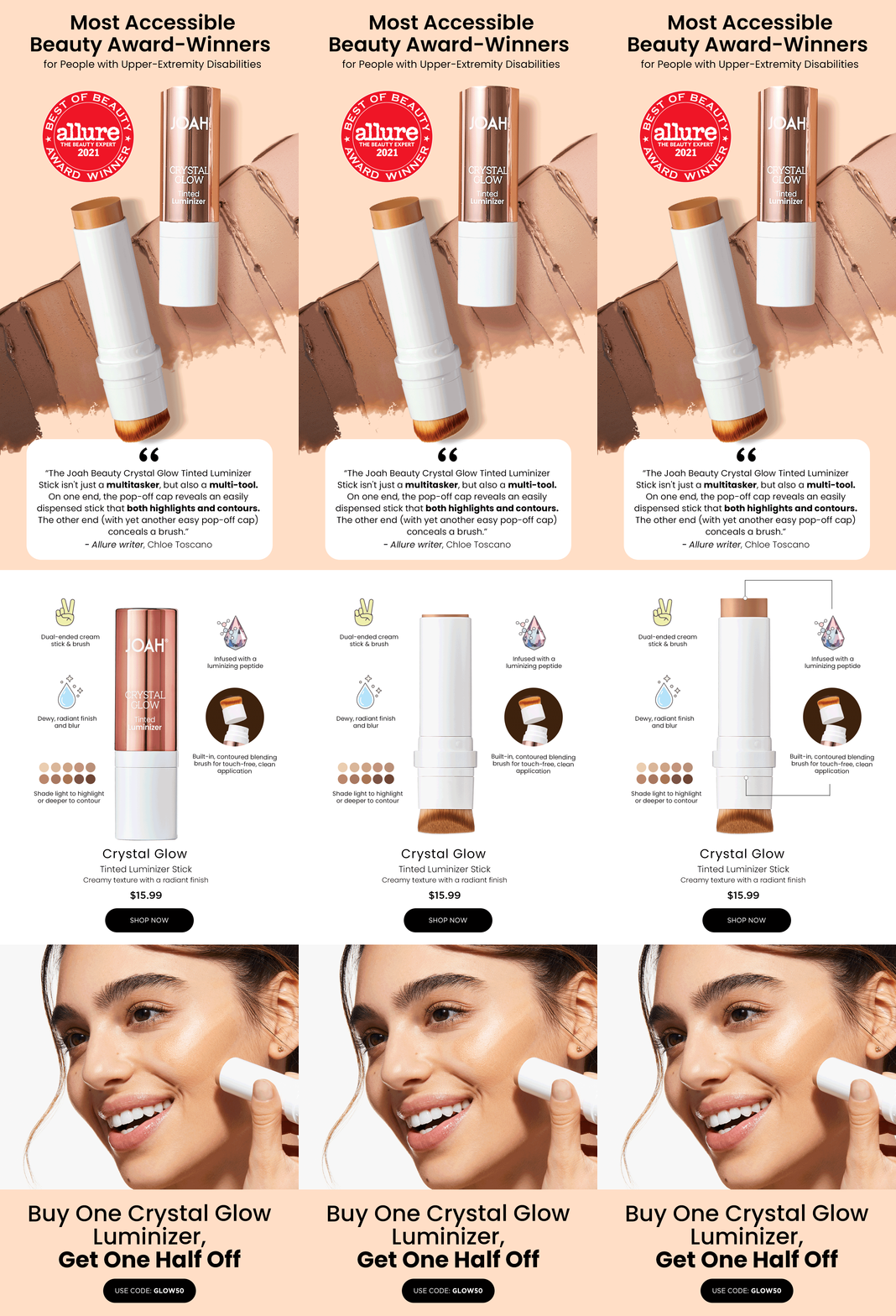
Allure Best of Beauty 2021 Award Winner.
Crystalide isn't named after crystals by accident — the peptide creates the same quality of light: scattered, iridescent, alive. The KV was built around that logic. Crystal structures stand in for the ingredient itself. A holographic palette shifts with the angle. The science becomes physical before you read the claim.

Ralph Lauren Fragrance / L’Oréal · 2025 · Packaging · GWP · CGI Direction
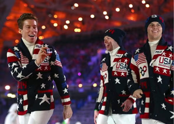
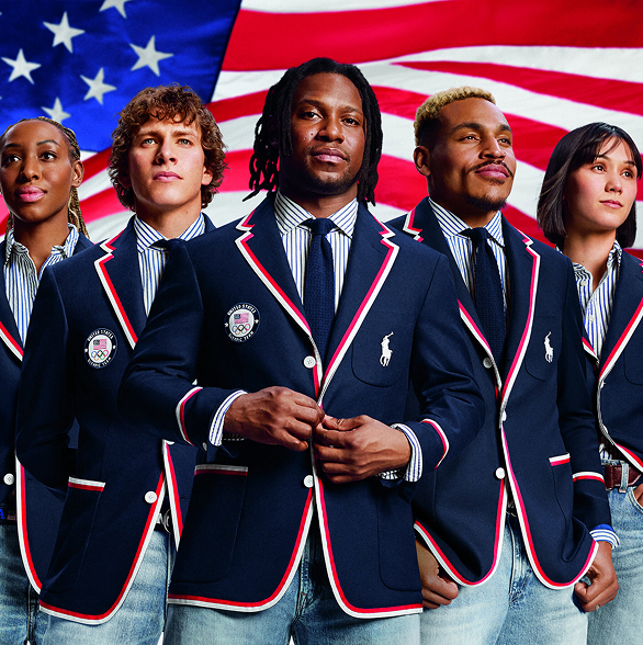
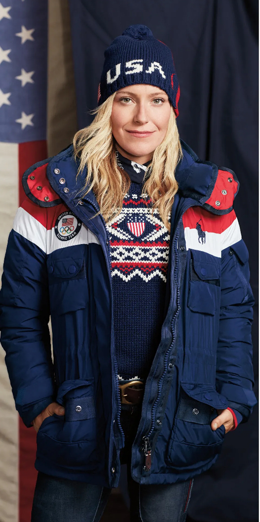
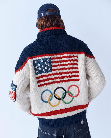
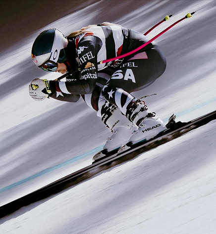
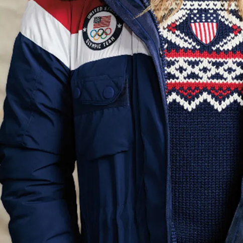
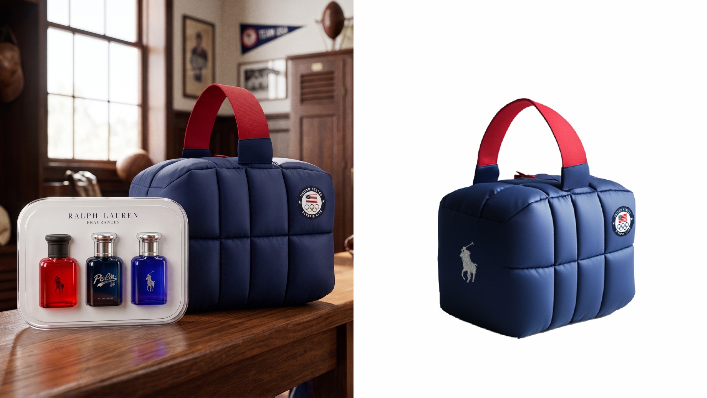
Ralph Lauren has dressed Team USA since 2008 — navy blazers, white trousers, flag motifs, American prep reinterpreted for every Games. For the 2026 Winter Games, the fragrance team decided to carry that same spirit: a promotion designed around the Olympic look itself, not just the event.
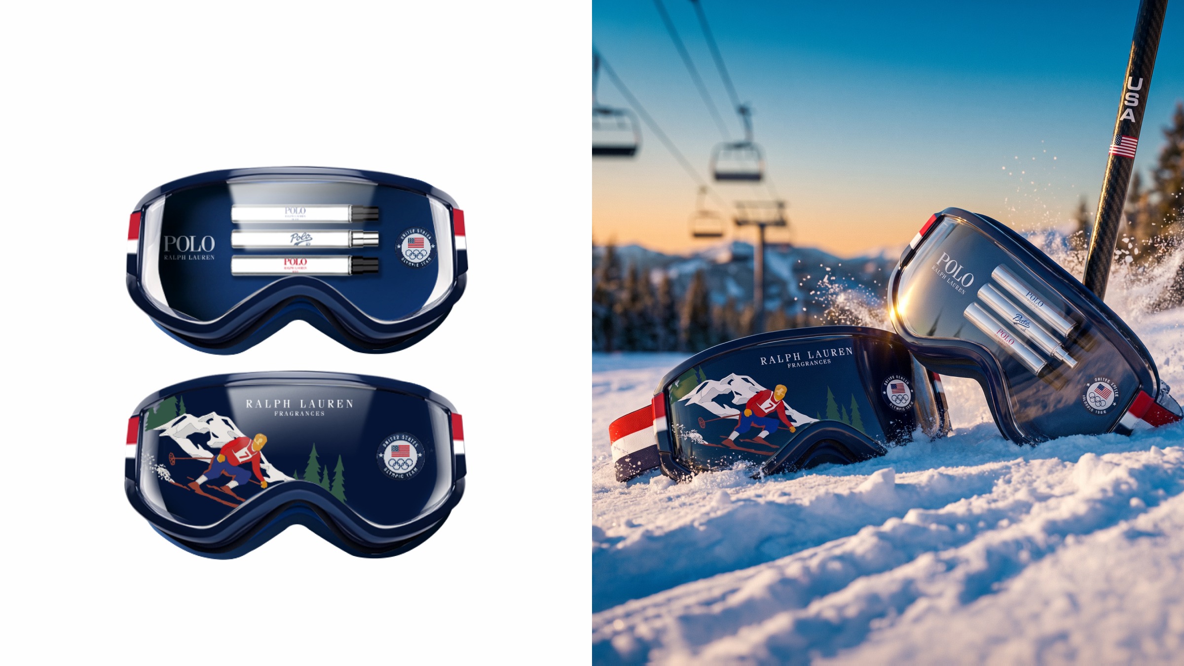
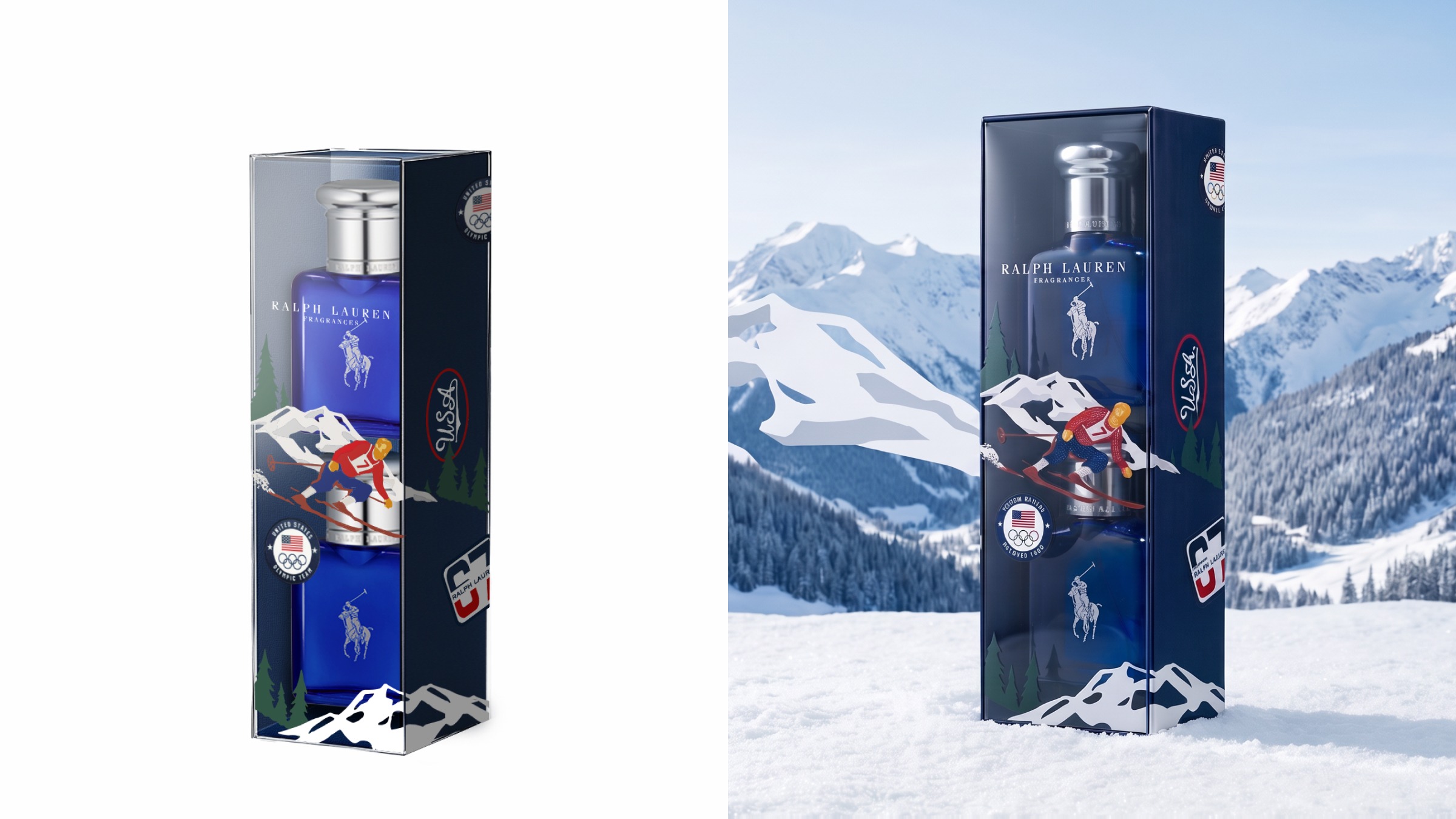
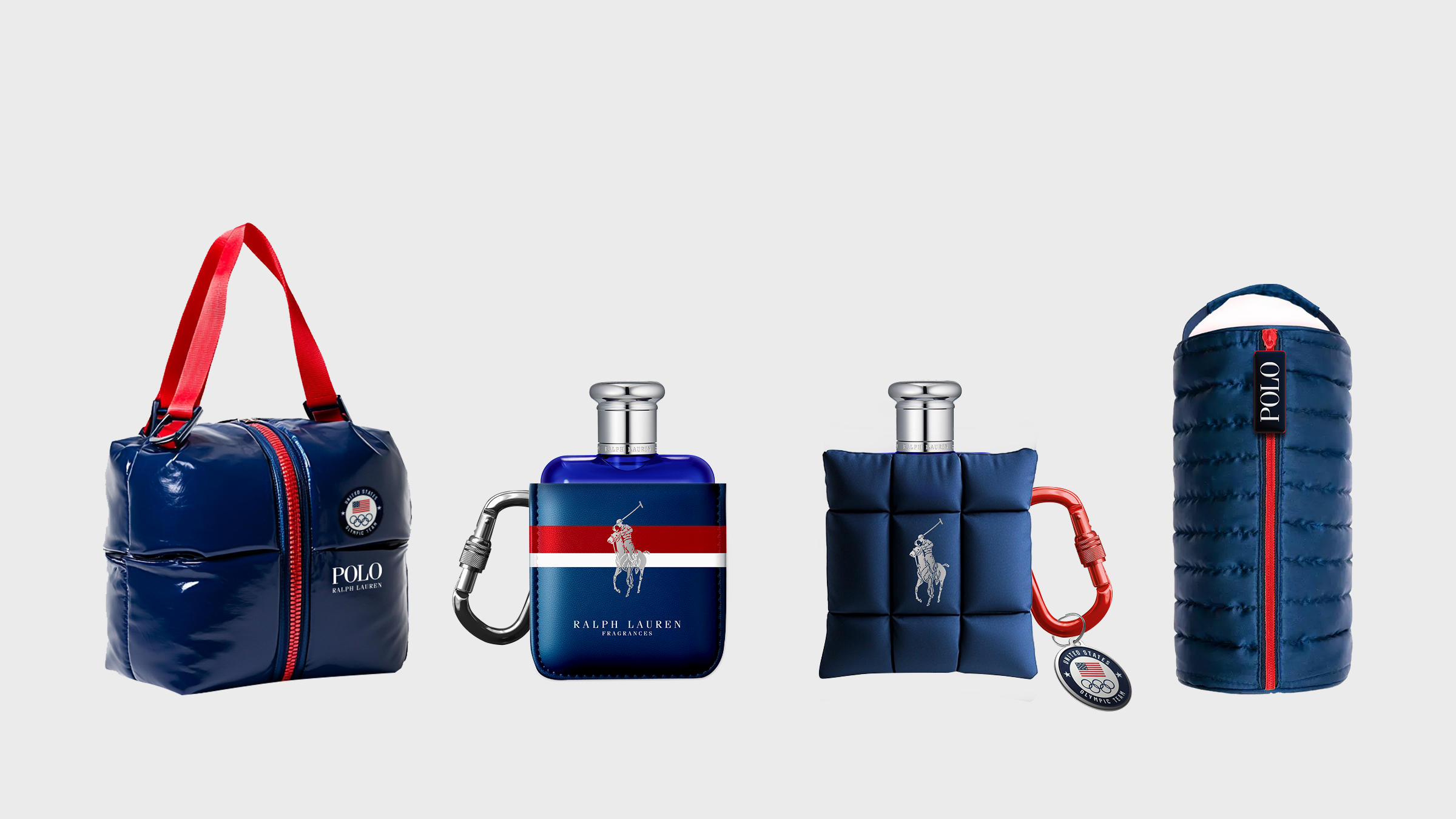
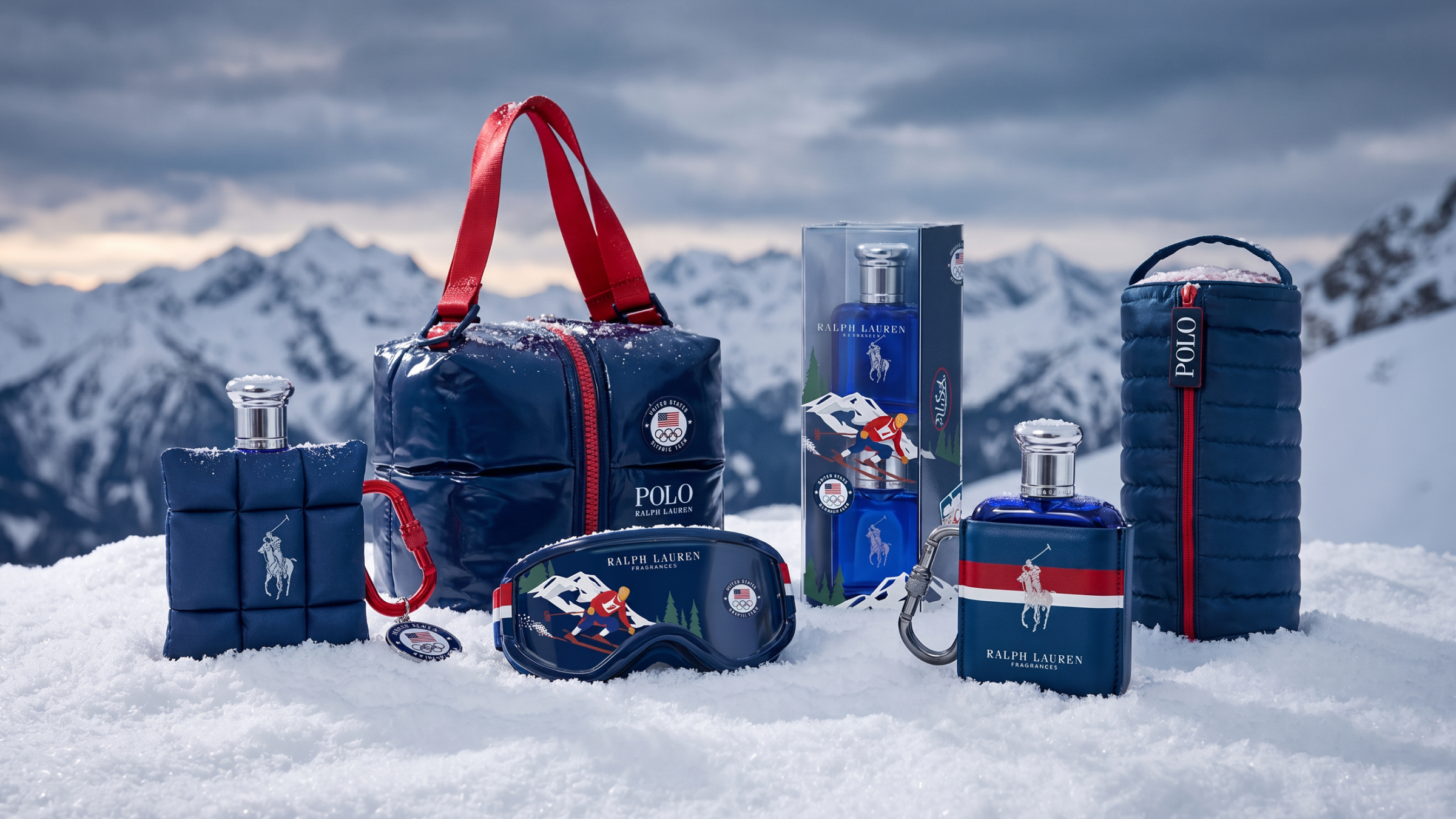
Led concept design for the Olympic promotion and GWP packaging, translating the symbolism of the Olympic look into the pack itself — padding, blocking, hardware. The program was discontinued before production, but it stands as a serious study in how a fragrance brand activates a global sporting moment, from capsule concept to gifting suite.
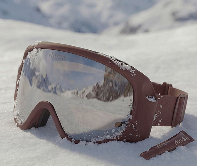
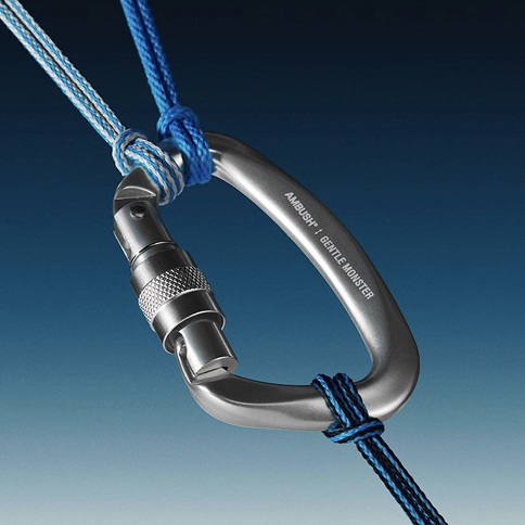
Full capsule developed — goggle coffret, puffer pouches, carabiner holders, gifting suite — with photoreal CGI direction replacing sampling rounds.
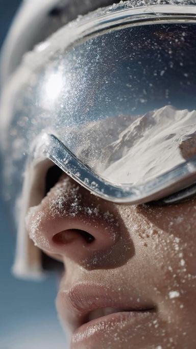
The capsule borrows its construction from the mountain, not the gift aisle. The uniform's winter padding becomes puffer packaging. Team USA's blocking sets the palette. Carabiners, zippers, goggles — the hardware athletes actually carry — become the functional details of the pack.

Ralph Lauren Fragrance / L’Oréal · 2025 · Brand Store · Landing Pages · Sponsored Display
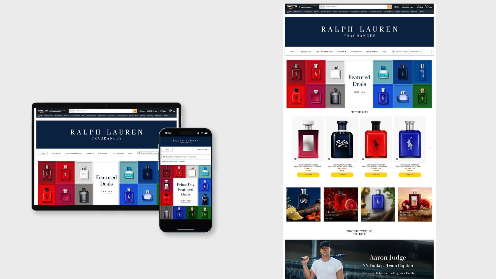
Prime Day is the year's biggest e-commerce event — and its loudest. Every brand discounts at once, and the feed becomes a wall of red banners and percent signs. The task: compete at deal speed across every Amazon touchpoint simultaneously, without breaking the luxury codes Ralph Lauren holds everywhere else.
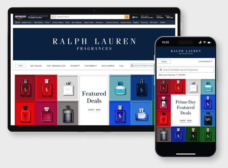
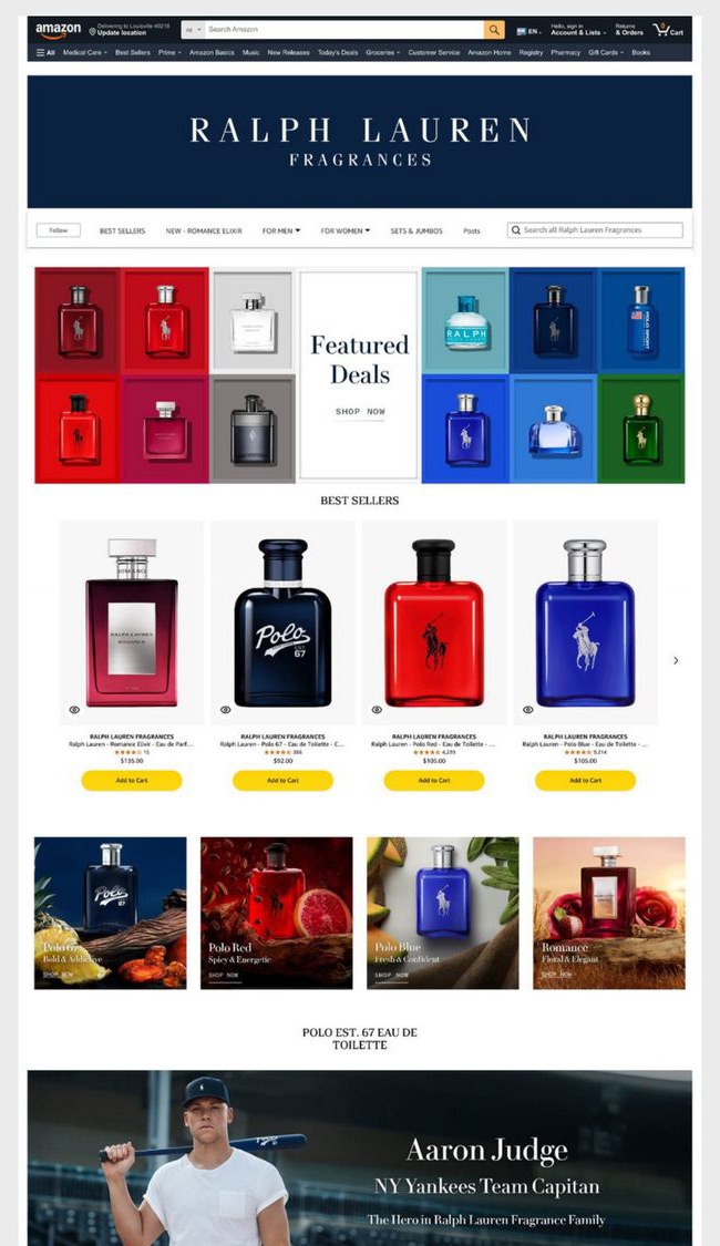
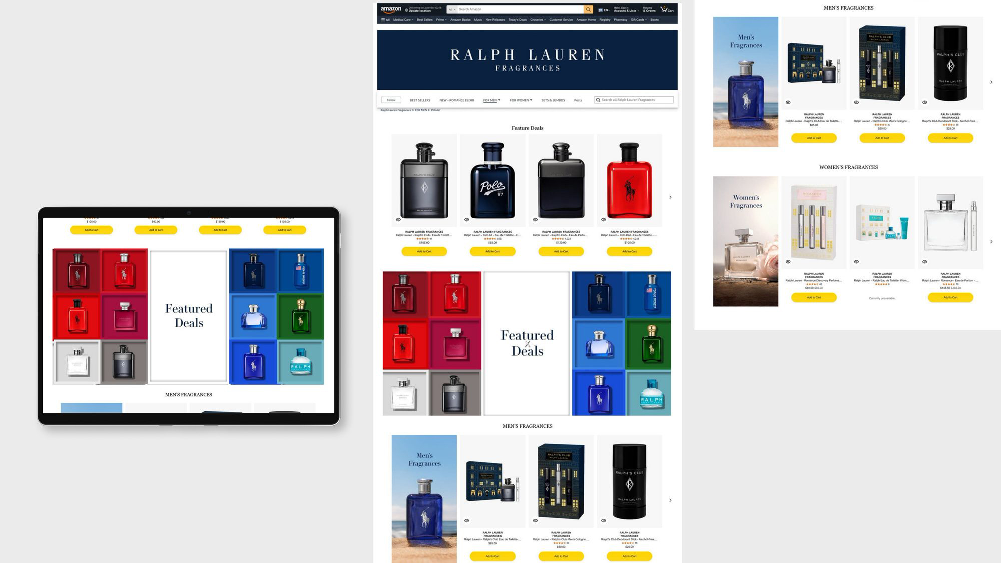
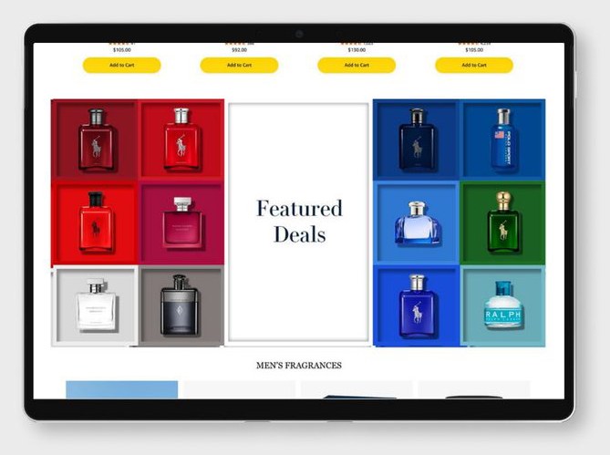
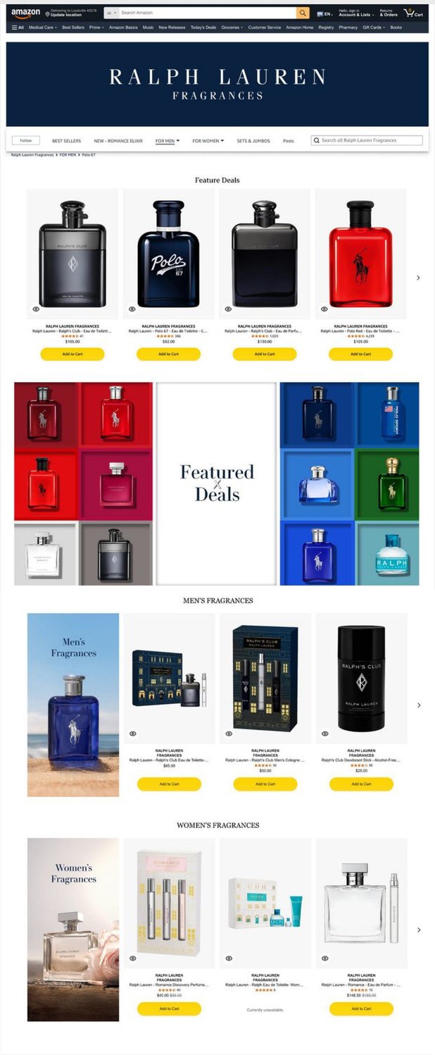
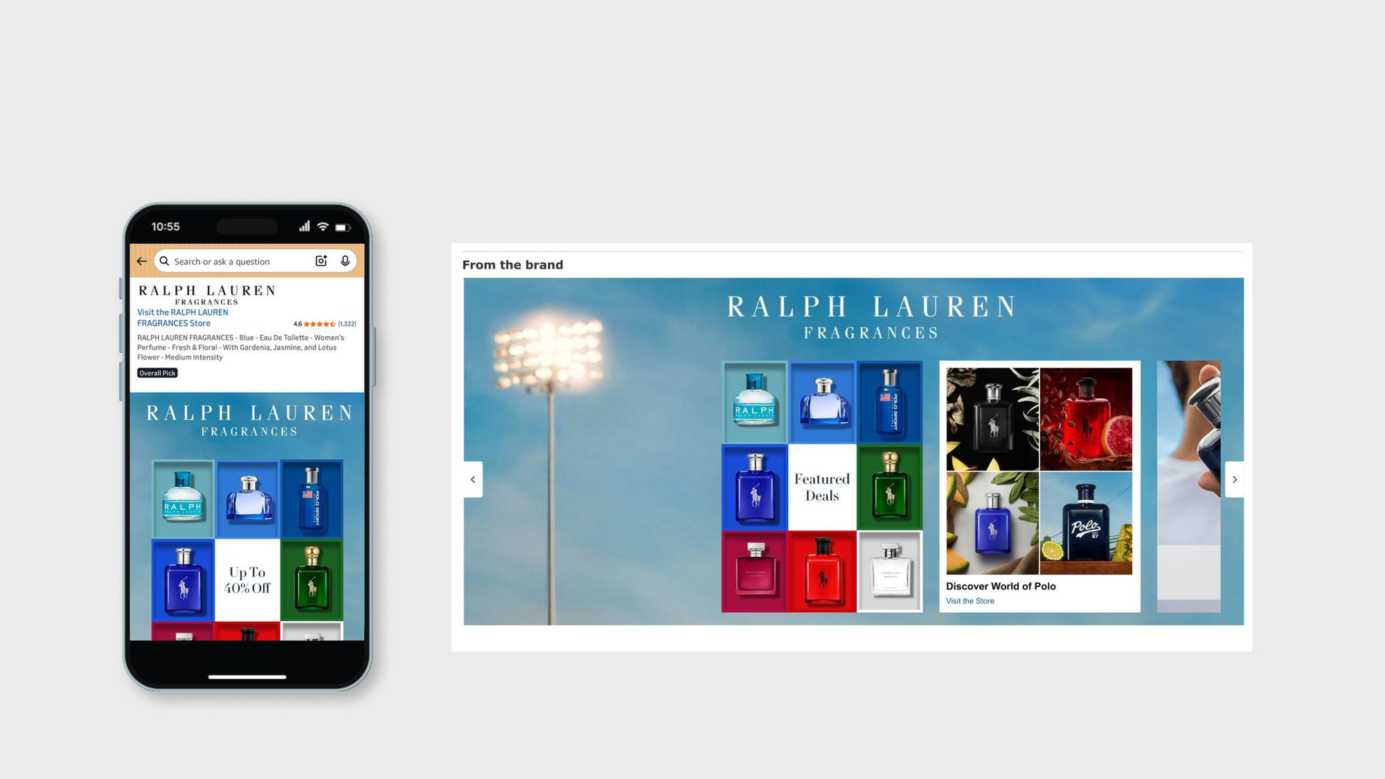
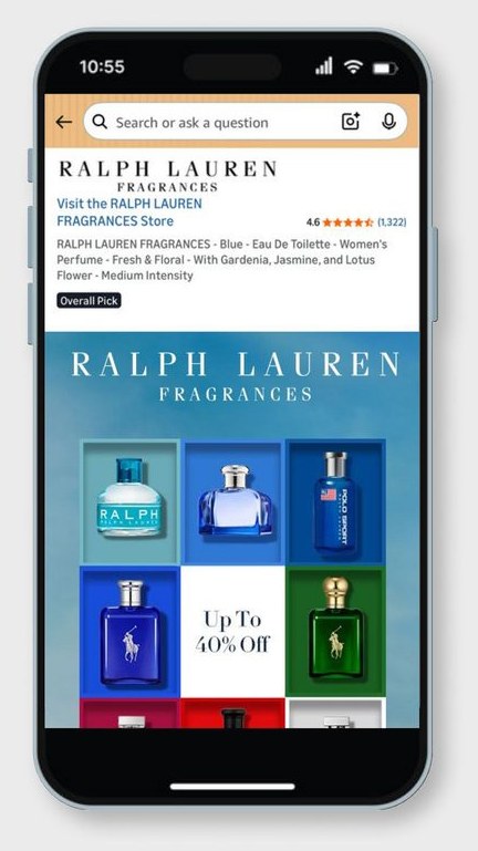
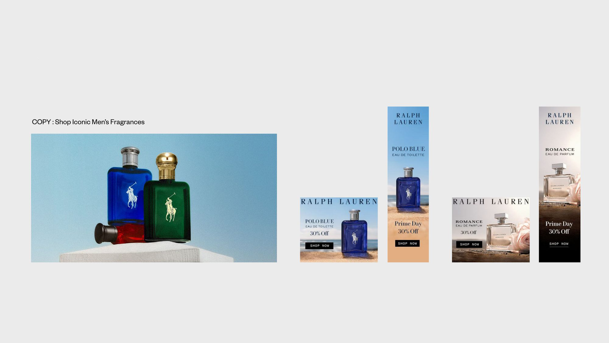
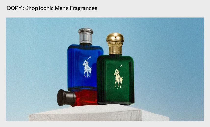
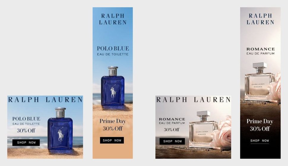
Built the full Prime Day creative system — Amazon Brand Store takeover (HP, LP, PDP), landing pages, Sponsored Brand display, and DSP programmatic banners.
The campaign closed at 138% of the sales plan, and the system was selected as the template for EU Prime Day 2026.
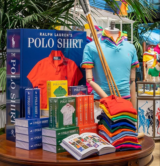
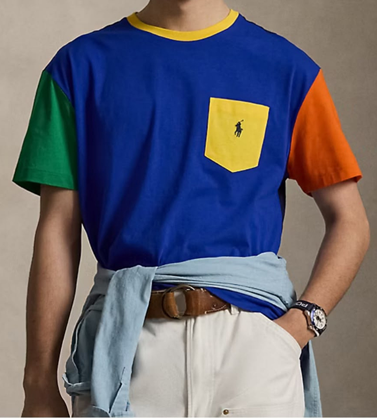
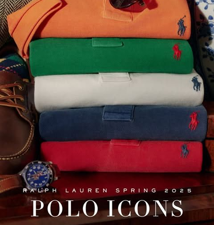
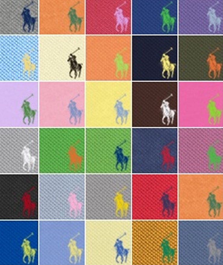
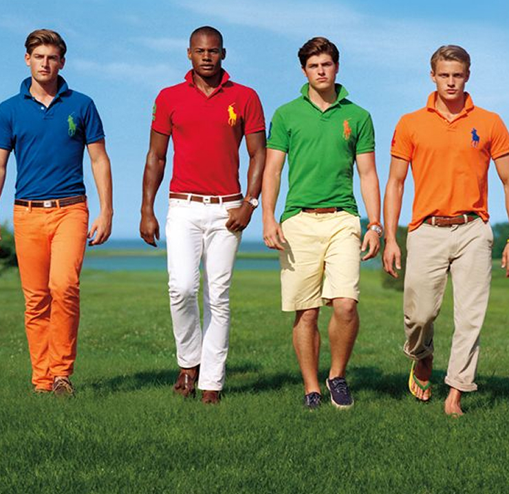
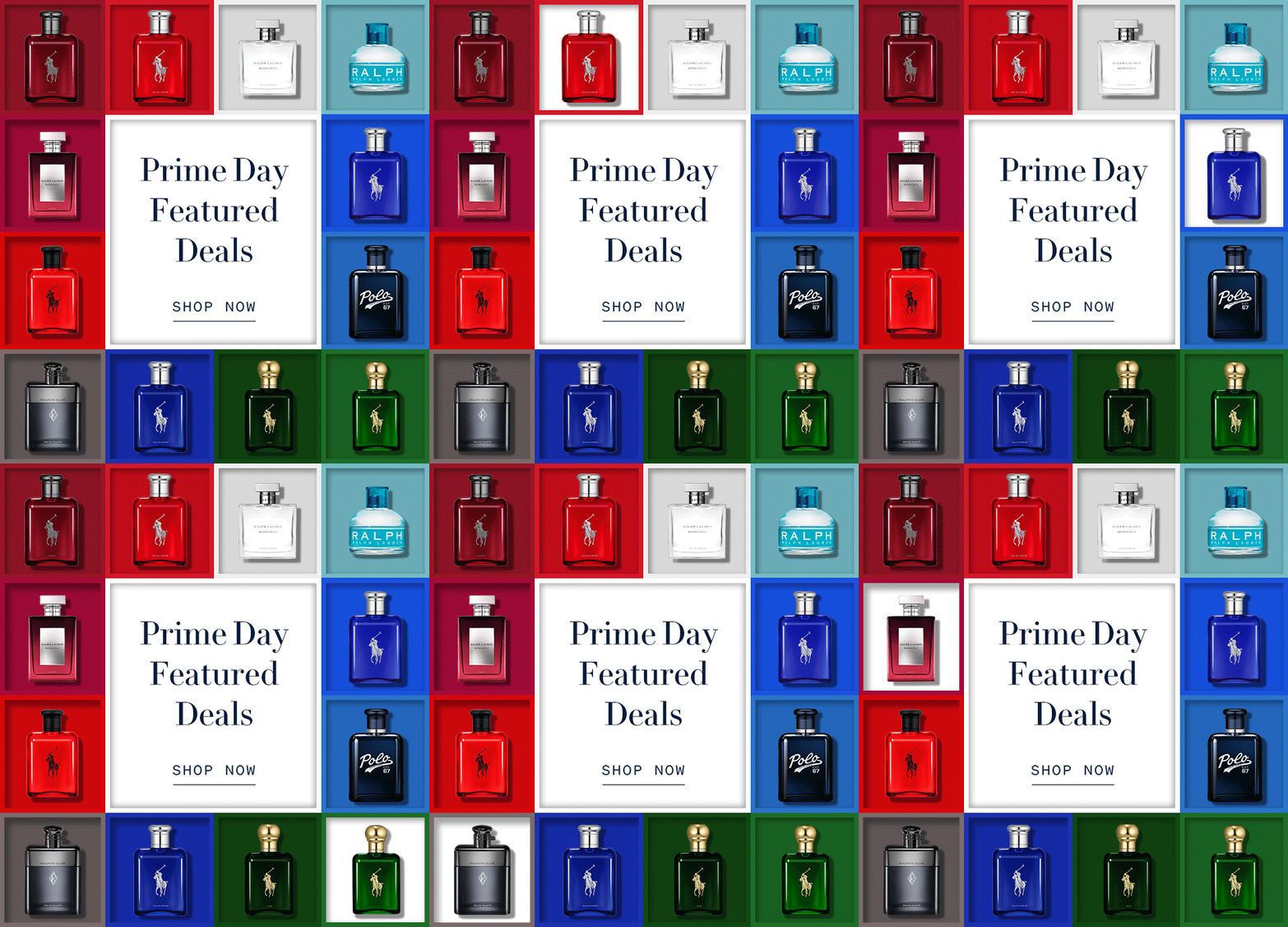
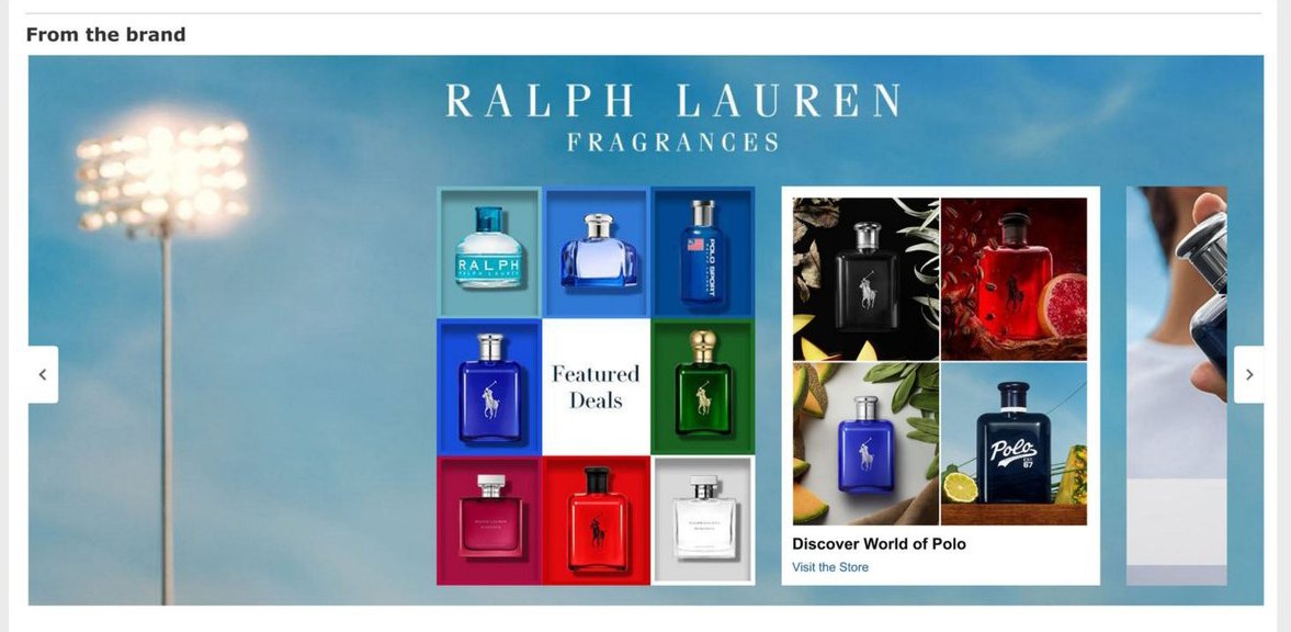
A color-block tile grid drawn from the Polo shirt wall, turning the full fragrance portfolio into one shoppable composition — luxury codes held intact at deal speed.
KISS · 2023 · Brand Identity · Packaging · Photo Direction
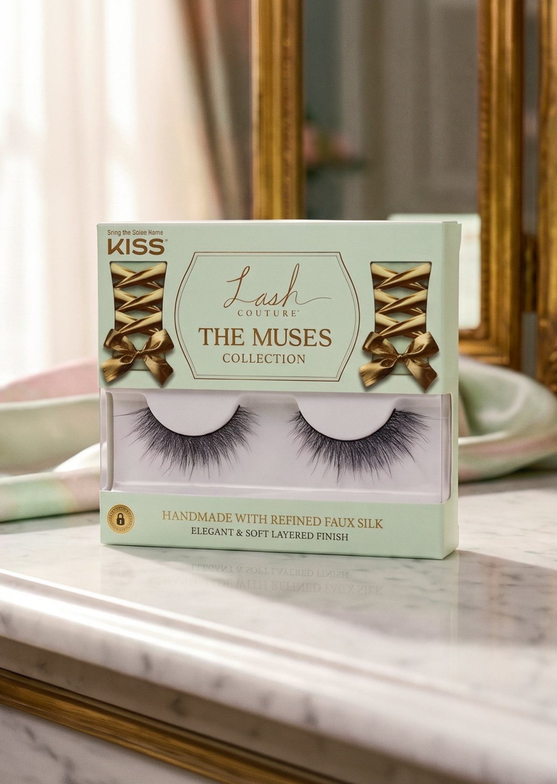
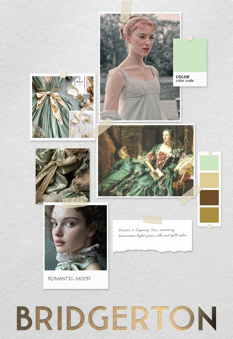
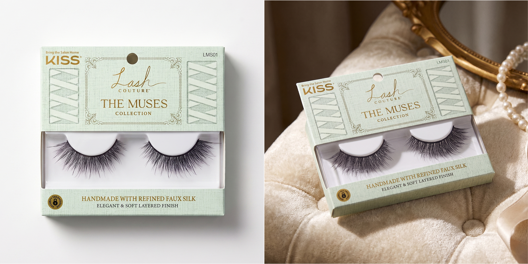
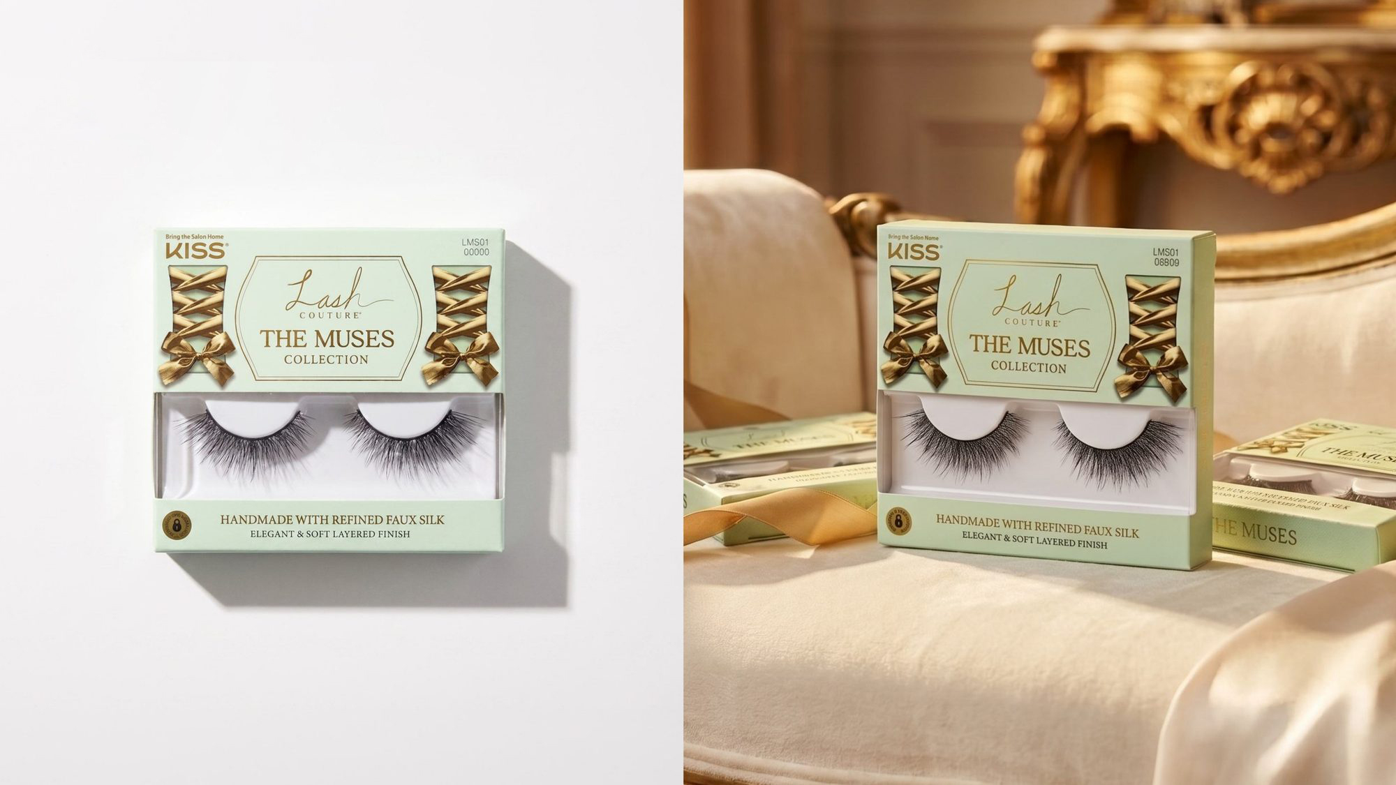
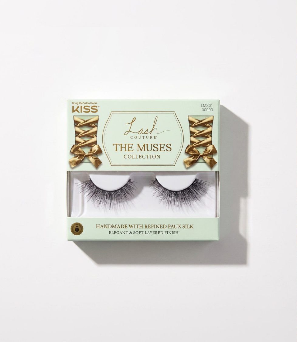
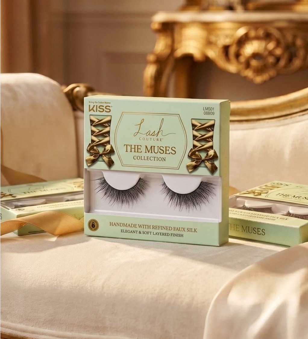
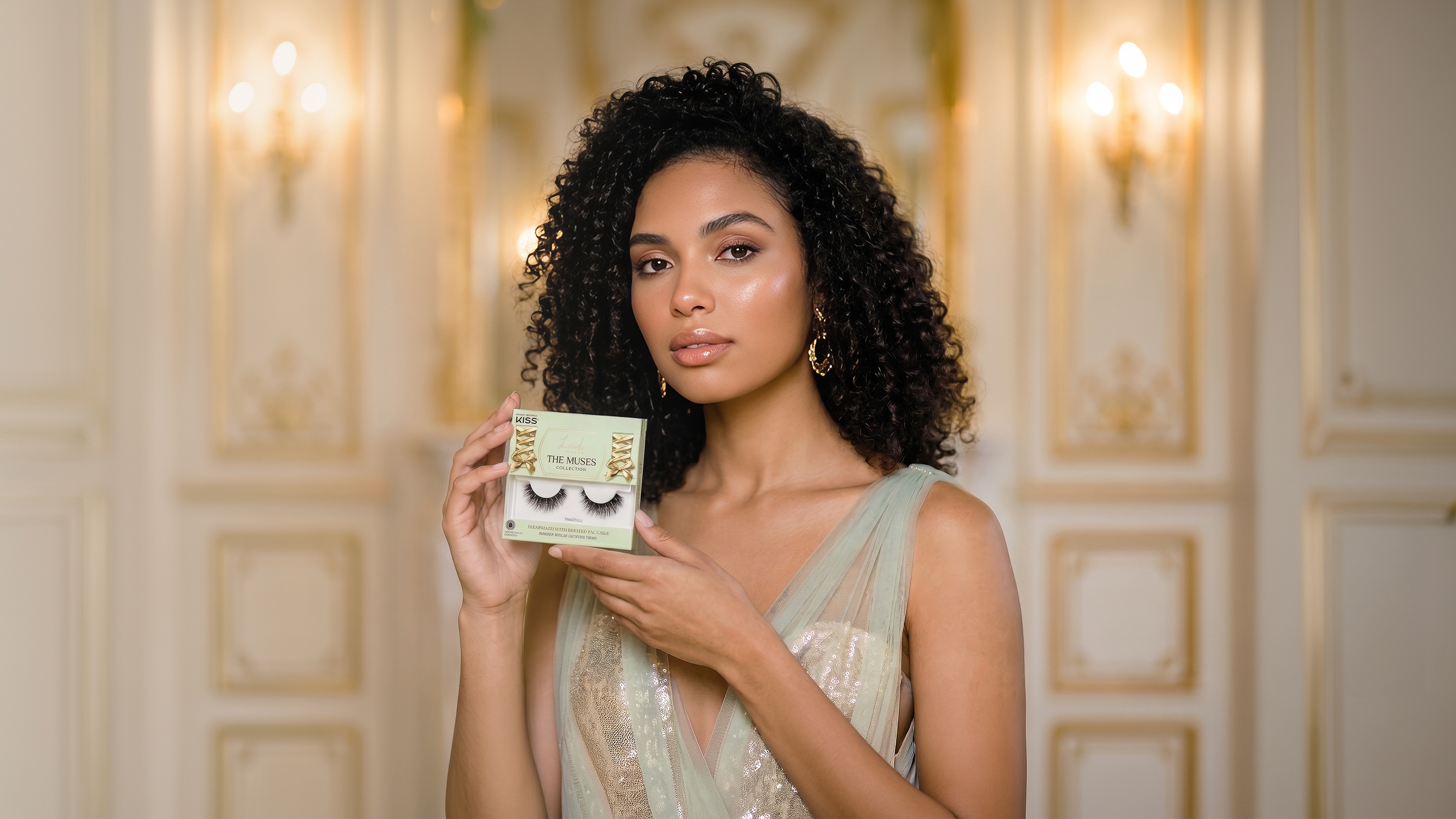
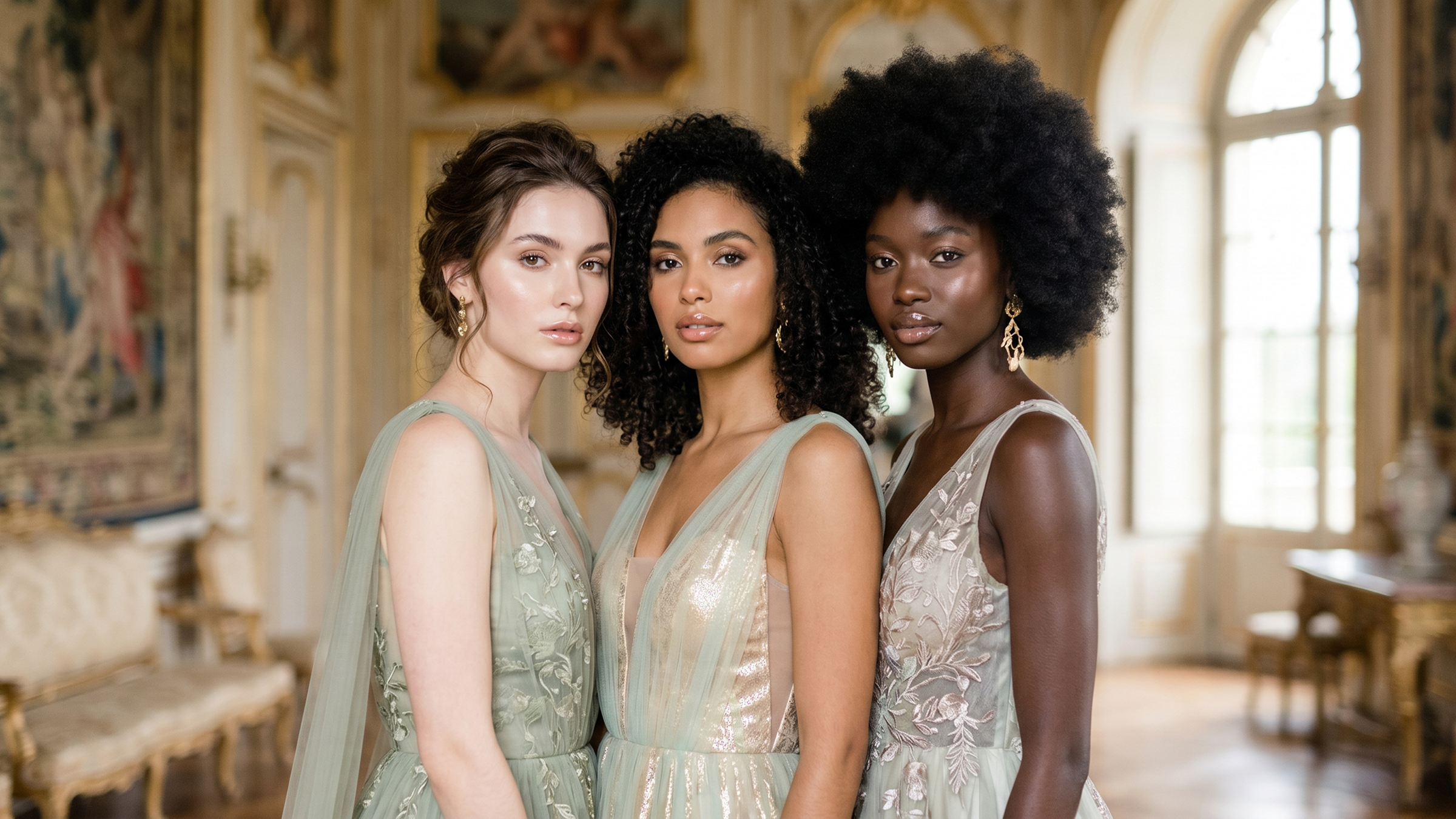
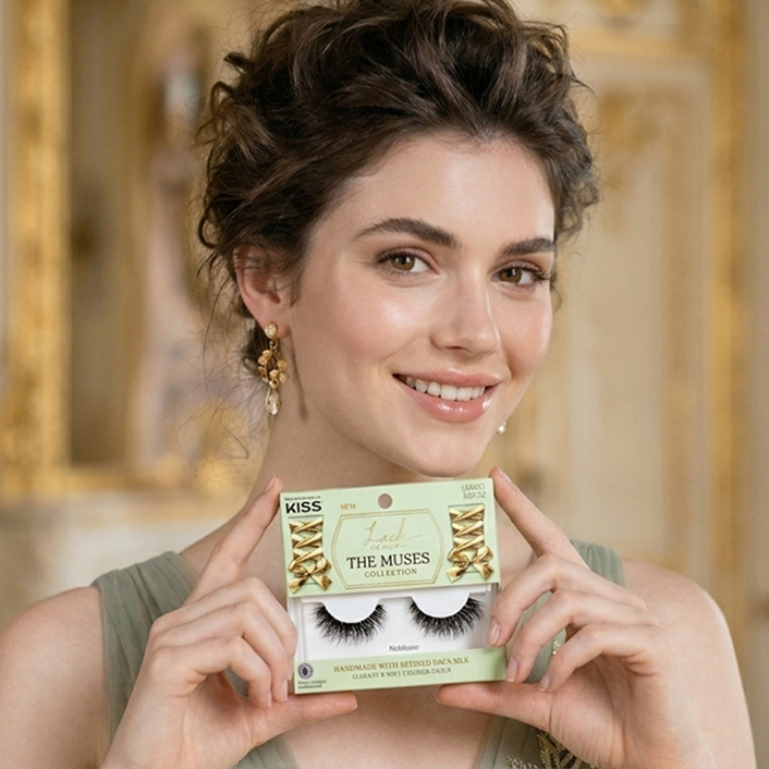
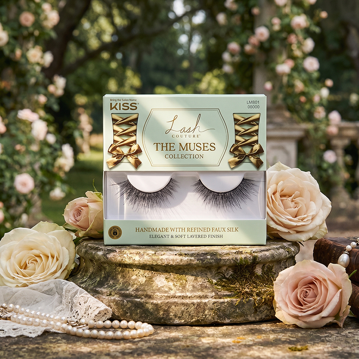
At the height of Bridgerton, KISS greenlit a period-inspired lash collection. The challenge was scale: bringing a costume-drama world onto a palm-sized lash package — refined enough to avoid costume-party kitsch, yet unmistakable at arm's length on a mass-retail shelf. Nothing in the lash category had ever borrowed another era's visual language.
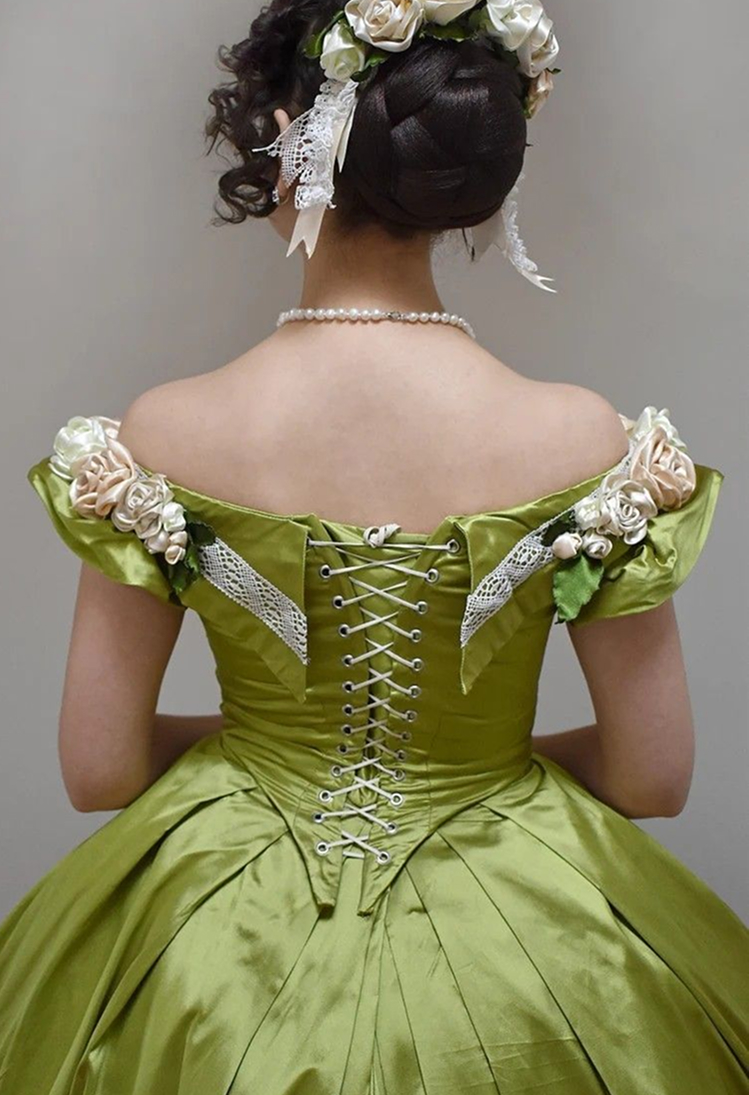
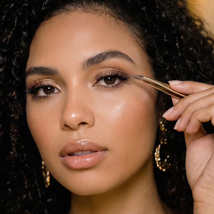
Led identity and packaging from research through production. Built a period reference library and developed three directions. The final direction visualized the corset-laced back of a noblewoman's gown. Directed photography by concept — 'Photo Intention' briefs defining mood and framing.
2023 Allure Best of Beauty Award Winner.
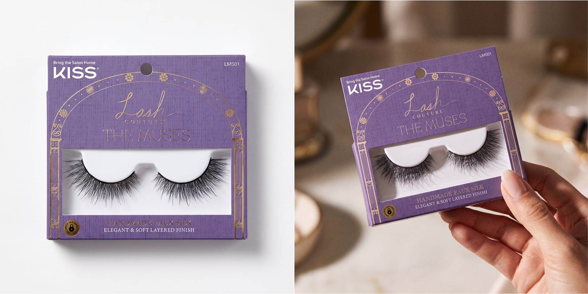
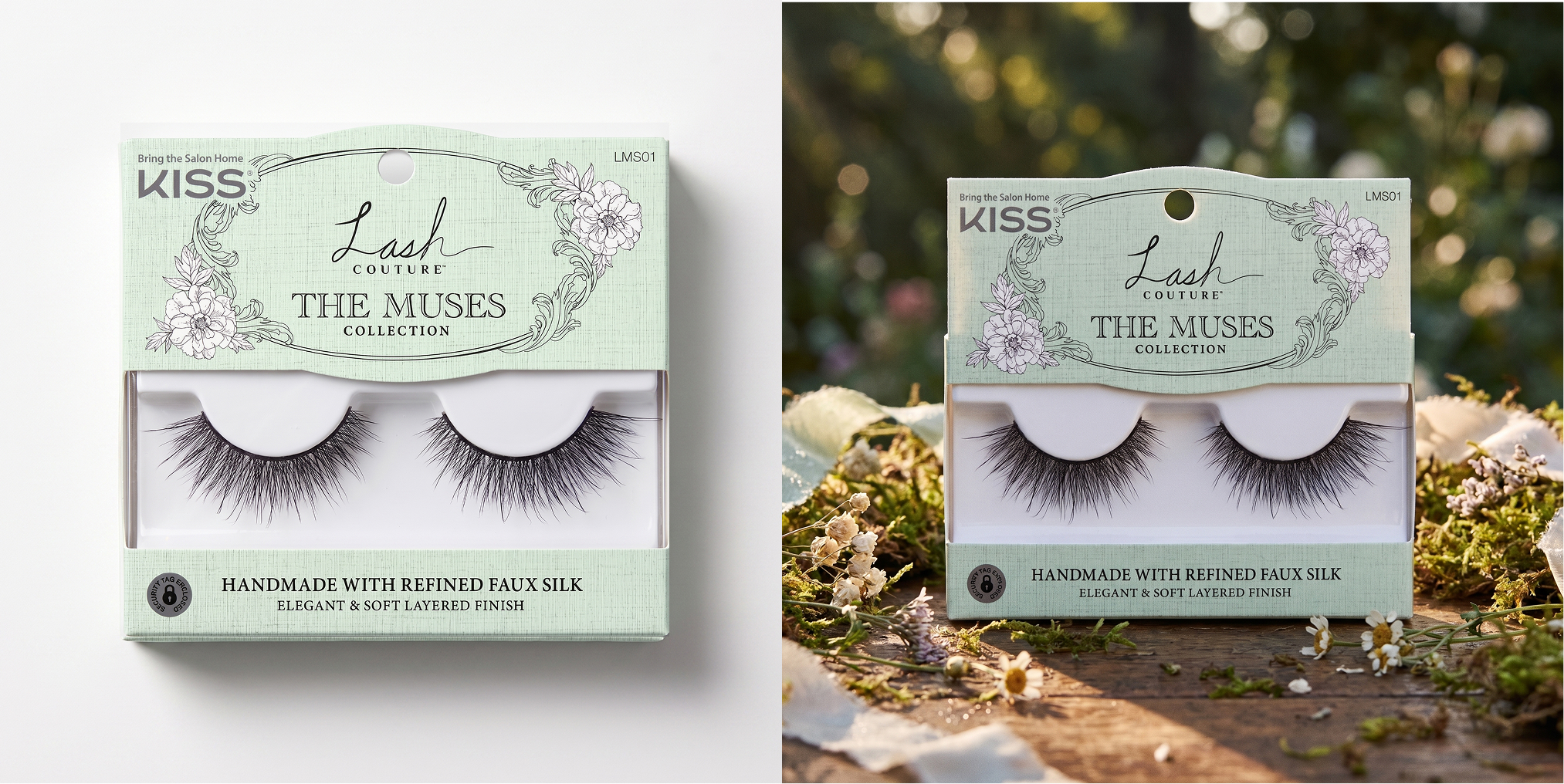
Three directions from the reference library — the garden arch, a period floral frame, ribbon work from the era's dresses. Direction C won: the ribbon-laced corset of a period gown, translated into the package's central motif. Light green — the color of the lead family's gowns — became the collection color.